
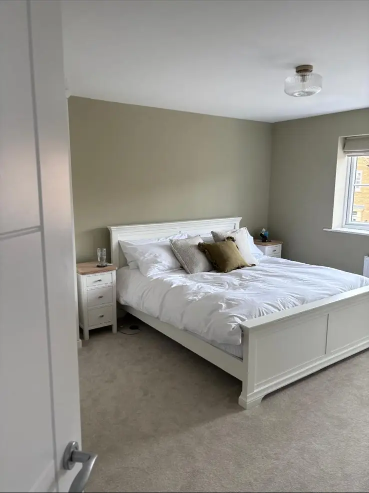
No paint colour is proven to make you sleep, but a bedroom that stays dark, cool and calm helps, and colour plays its part in that. Muted greens, soft blue-greys, warm plaster pinks and deeper shades in a flat matt finish reflect less light and feel restful under a lamp. Choose the shade for your window direction and test it at night, because that is when you use the room.
Which bedroom colours help you sleep?
No paint colour has been shown to put you to sleep. What the health advice agrees on is the room itself: the NHS suggests a bedroom that is “quiet, dark and cool”, and The Sleep Charity says heat, light and noise can stop you dropping off and wake you in the night. Colour helps by keeping the room dim and calm. That points to soft, muted shades in a flat finish, and away from bright, saturated or shiny walls.
You may see claims online that one colour gives you the longest sleep. Unless a claim links to a published study, treat it as marketing rather than evidence. The more useful question is: how much light will these walls bounce around at 6am in June, and will the colour still feel restful under a bedside lamp at 11pm?
Light walls reflect more light and dark walls soak it up. Dulux sells a matt that it says will reflect up to twice as much light as its conventional emulsions, which is great for a gloomy landing and the opposite of what a light sleeper needs. In a bedroom, a mid or deep tone does part of the blackout blind’s job for you.
Bedroom colour ideas that look good and feel restful
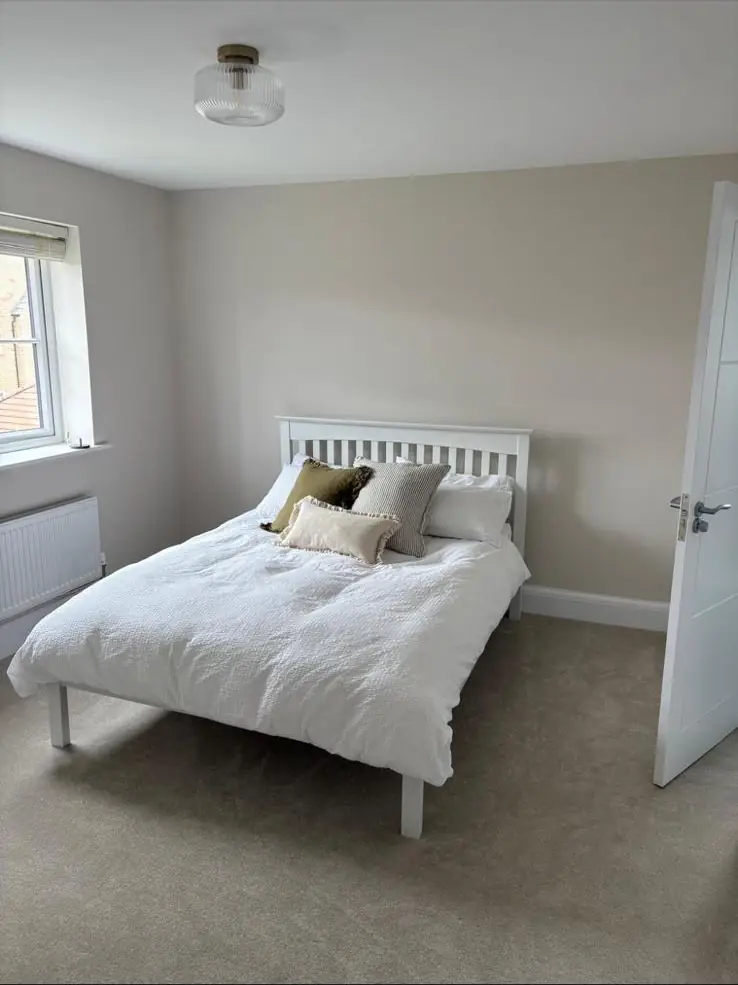
The colours that work best in bedrooms are muted greens, soft blues and blue-greys, warm plaster pinks, earthy neutrals and, for a dark room, inky blues, deep greens and soft blacks. Each has a “grey” or “dirty” edge that stops it shouting. Farrow & Ball, for example, says soft neutrals and aquatic shades are “particularly adept at creating a soothing environment for sleep”. Pick the family first, then the exact shade in your own light.
Real shades worth sampling, all from Farrow & Ball’s own bedroom and colour pages:
- Muted green: Cromarty No. 285, which the maker calls “neutral yet atmospheric”, for a soft grey-green.
- Richer green: Calke Green No. 34, a “rich and traditional green”, for a cosier room.
- Green-blue: Pavilion Blue No. 252, described as a “fresh green blue”, for a south-facing room.
- Plaster pink: Setting Plaster No. 231, a “dusty pink” that warms up a cool room.
- Stone neutral: Skimming Stone No. 241, a “stony off white” that is softer than brilliant white.
- Moody blue-grey: Inchyra Blue No. 289, which the maker says can read “more grey, blue or even green depending on the light”.
- Soft black: Railings No. 31, “a soft black with blue undertones”, for a fully dark room.
Other makers have close equivalents. Take the idea (a greyed green, a dusty pink) to whichever range you prefer and sample it the same way.
| Colour family | How it feels | Suits | Watch out for |
|---|---|---|---|
| Warm whites and off-whites | Fresh, plain, easy | Small rooms, rentals, south-facing rooms | Brilliant white bounces light and can feel stark at night |
| Plaster pinks and soft terracotta | Warm, cosy, flattering at night | North-facing and west-facing rooms | Can turn sugary if the pink is too clean |
| Muted sage and grey-greens | Calm, natural | Most rooms, pairs well with oak and linen | Can go cold and flat in north light |
| Soft blues and blue-greys | Cool, quiet | South-facing rooms with plenty of warm sun | Turns icy in a north-facing room |
| Greige and stone neutrals | Relaxed, goes with anything | Couples who can’t agree, rooms with busy fabrics | Hidden pink or green undertones show on four walls |
| Deep blues, greens and soft blacks | Enclosed, cocooning | Rooms used mainly at night, awkward small rooms | Needs good prep; shows scuffs and patchy rolling |
Greens are a forgiving choice. Mid and muted greens sit well with wood floors and white bedding, and they don’t date the way a strong feature wall can. Farrow & Ball’s green bedroom ideas split them into light greens for a relaxed feel and dark greens such as Green Smoke No. 47 or Studio Green No. 93 for a richer room.
Blues are a classic bedroom choice, but pale blues are easy to get wrong. A pale blue that looks gentle on a card can look like a fridge on a north-facing wall. Blues with a touch of green or grey in them are more forgiving.
Plaster pinks and warm neutrals look soft in the day and warm under a lamp, and a bedroom is mostly used in lamplight.
Should you paint a bedroom a dark colour?
Yes, if you mainly use the room at night and the walls are in decent condition. Dark colours make a bedroom feel enclosed and cosy, they hold back stray light from streetlamps and early summer mornings, and they hide the corners so a small room stops feeling boxy. Farrow & Ball pushes this hard, saying “dark bedrooms invite relaxation and promote better rest”, though that is a paint maker’s view rather than sleep research.
Where a dark bedroom goes wrong is in the painting, not the colour. Deep shades need a suitable basecoat so you are not fighting a white wall, often an extra full coat compared with a pale colour, and careful rolling in one direction with a wet edge. Any filler that wasn’t sanded flush, or a patch-up done later from a different batch, will show. A dark colour on a wall full of cracks and old nail holes just draws your eye to them.
A sensible halfway house is going dark behind the bed only, or painting the lower half of the wall in a deep shade and the top half and ceiling in a softer tone. It gives the cocooning feel at pillow height without making the whole room dark during the day.
Match the colour to your window direction
Window direction has a big effect on how a bedroom colour reads. Farrow & Ball’s guide to how light affects colour says northern light “tends to bring out the cooler tones within a colour”, so pale blues and greys can turn cold, while in fine weather south-facing rooms “can be filled with warm light from dawn until dusk”. East and west rooms change between morning and evening.
- North-facing bedrooms: go warmer (pinks, yellow-based whites, warm stones) or embrace the cool light with a deep shade. Farrow & Ball suggests deep colours here can create a “cosy, cocooning feel”.
- South-facing bedrooms: cooler greens, blue-greys and soft blues hold their own against the sun.
- East-facing bedrooms: bright in the morning, muted in the evening. Since a bedroom is mostly an evening room, Farrow & Ball’s tip of light blues and greens that work with cooler evening light fits well.
- West-facing bedrooms: Farrow & Ball says the light is cooler in the morning and brighter in the afternoon, so check samples at both ends of the day.
In Northampton’s Victorian terraces the back bedroom is often small, north or east-facing and shaded by the next-door outrigger. That room is the one where a pale grey goes dingy, and where a warm mid-tone or a deep colour tends to look better than another attempt at “brightening it up”.
Does colour drenching work in a bedroom?
Colour drenching works very well in bedrooms, especially small or awkward ones. Farrow & Ball says it “simply means painting everything the same shade”: walls, woodwork, ceiling and even radiators. It blurs the line where walls meet ceiling, so a sloping or boxy room looks calmer, and in a darker shade the maker describes “a cosy cocoon of colour” that suits rooms used in the evening.
There are two practical points. First, woodwork can’t take the same tin as the walls unless the product is made for both, so you need a matching colour in a wood finish, mixed to the same reference. Second, the ceiling needs the same care as the walls, because a dark ceiling shows every roller line in the raking light from a window. This is careful, slow work, and it is where a decorator’s skill shows.
Loft conversions, the box rooms in 1970s estate houses around Northampton and new-build bedrooms with sloped ceilings all suit drenching, because the drench hides awkward angles that would otherwise be picked out by a white ceiling line.
Which paint finish is best for a bedroom?
For bedroom walls, a flat or durable matt is best. Dulux says matt emulsion “helps to hide imperfections on less-than-perfect walls”, and that because matt surfaces don’t reflect light they “make all colours look as similar as they can be” as the light changes. That matters in a bedroom, where a lamp throws light across the wall. Use a wipeable matt on the wall behind the bed, because headboards and hands mark it.
Not all matts are equal. Farrow & Ball’s Estate Emulsion is a chalky 2% sheen that is “gently wipeable but not washable” and is meant for low-traffic areas. Its Modern Emulsion is a 7% sheen sold as washable and scuff and stain resistant, and Dead Flat is a 2% sheen sold as durable, scuff resistant and washable, for walls, woodwork and metal. Other brands have similar ranges, so check the washability wording on the tin or datasheet before you choose a chalky finish for a wall that gets touched.
| Surface | Sensible finish | Why |
|---|---|---|
| Ceiling | Flat matt | Hides the plaster and shows least roller marking |
| Main walls | Matt or durable matt | Flat look, even colour under lamps |
| Wall behind the bed | Durable or washable matt | Headboard rub and hand marks |
| Children’s bedroom walls | Washable matt | Crayon, stickers and sticky hands |
| Skirting, door, frames | Satin or eggshell (or a matt wood finish for a drench) | Low sheen looks calmer than gloss in a bedroom |
High-gloss woodwork against dark matt walls can look striking, but in a small bedroom it can also catch the light from the landing, so a lower sheen usually looks calmer. For the woodwork itself, our page on door and skirting painting covers the prep that makes the difference.
Bulbs and lamps change how bedroom paint looks
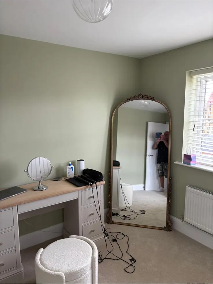
Your bulbs change a wall colour noticeably. Farrow & Ball’s light guide says halogen and incandescent bulbs “emit yellow light”, which warms colours, while cool white bulbs give off a bluer light. Because a bedroom is mostly lit by lamps, choose the colour under the bulbs you actually use, and use warm, dim bedside lighting at night.
The lighting choice matters for sleep too. Harvard Health says that while any light can suppress melatonin, blue light at night does so more powerfully, that even dim light can interfere with your body clock, and that red light is less likely to. In practice that means warm, low lamps in the evening, not a bright cool-white ceiling light. A soft colour on the walls under a warm lamp is a calmer setting than a white room lit like an office.
How should you test bedroom colours before you commit?
Test bedroom colours at night, under your own lamps, as well as in the day. Paint large samples with two coats on card or lining paper, keep a white border round each, and move them between the wall behind the bed and the wall opposite the window. Live with them for a few evenings before you buy the full tins.
A sample viewed at midday tells you little about a room you mostly see by lamplight. A decorator’s usual method for bedrooms is:
- Pick no more than three shades from the same family. Comparing a green with a pink tells you nothing useful.
- Paint each on an A4 card or lining paper, two coats, so you can move it around.
- Look first thing in the morning, mid-afternoon and at night with the bedside lamps on and the main light off.
- Hold them against what’s staying: the carpet or floor, the headboard, curtains and bedding.
- Check the darkest corner. If the colour looks muddy there, go a shade warmer or a shade deeper, not lighter.
If you’d like a second pair of eyes, Dean gives colour and finish advice in your own rooms when you book decorating with us, looking at light, undertones and sheen together.
Can you sleep in a freshly painted bedroom?
With a low-VOC water-based emulsion, the room is usually fine to sleep in once the paint is dry, the smell has cleared and the room has been aired. Keep a window open while painting and drying, and if anyone in the house has asthma or is sensitive to smells, leave it longer.
Many water-based wall paints are now very low in solvents. The datasheet for Dulux Trade Vinyl Matt, a standard trade matt, says it contains a maximum of 0.3g/l VOC against an EU limit value of 30g/l for its category, and gives a recoat time of 2 to 4 hours. Oil-based woodwork paints and some specialist primers smell for far longer, so plan the woodwork for earlier in the job or use a water-based alternative.
In older homes, take care with the woodwork. Lead pigments were used in house paint until the 1960s and only fully removed from decorative paint by the early 1980s, according to the British Coatings Federation. UKHSA says exposure is only likely when old paint is deliberately removed or sanded during redecorating, and that children shouldn’t be present until the dust is cleared and the room ventilated. In a Victorian or Edwardian bedroom with original doors, skirting or sash windows, don’t dry-sand old layers. Test them or get a decorator who works lead-safe.
Should you paint your bedroom yourself or get a decorator?
A pale or mid colour on sound walls is a reasonable DIY job over a weekend. Get a decorator when you’re going dark, colour drenching, dealing with cracked or patched plaster, painting a ceiling in a strong colour, or working on old woodwork that might contain lead. Those are the jobs where finish quality shows most.
New-build bedrooms are a common case in point. Homes at places like Upton are often handed over with a basic contract matt on new plaster that marks easily and soaks up a new colour unevenly, so dark shades need proper preparation and extra coats.
Whoever paints it, choose the colour at night under your bedside lamps, because that is when you will see it most. Dean is a painter and decorator in Northampton who can help you settle the colour, then prepare and paint the room with our interior painting service. Call 07539 779 036 to book a visit and a free quote.
Sources
- How to fall asleep faster and sleep better, NHS Every Mind Matters (accessed 2026-10-09)
- Sleep hygiene, The Sleep Charity (accessed 2026-10-09)
- Blue light has a dark side, Harvard Health Publishing (accessed 2026-10-09)
- How light affects colour, Farrow & Ball (accessed 2026-10-09)
- Bedroom ideas, Farrow & Ball (accessed 2026-10-09)
- Dark bedroom ideas, Farrow & Ball (accessed 2026-10-09)
- Green bedroom ideas, Farrow & Ball (accessed 2026-10-09)
- Colour drenching, Farrow & Ball (accessed 2026-10-09)
- Dead Flat finish, Farrow & Ball (accessed 2026-10-09)
- Estate Emulsion finish, Farrow & Ball (accessed 2026-10-09)
- Modern Emulsion finish, Farrow & Ball (accessed 2026-10-09)
- Dulux Light & Space Matt, Dulux (accessed 2026-10-09)
- Dr Dulux: paint finishes explained, Dulux (accessed 2026-10-09)
- Dulux Trade Vinyl Matt technical datasheet (411, issued 08/25), AkzoNobel / Dulux Trade (accessed 2026-10-09)
- Lead: information for the public, UK Health Security Agency (GOV.UK) (accessed 2026-10-09)
- Cromarty No. 285, Farrow & Ball (accessed 2026-10-09)
- Calke Green No. 34, Farrow & Ball (accessed 2026-10-09)
- Pavilion Blue No. 252, Farrow & Ball (accessed 2026-10-09)
- Setting Plaster No. 231, Farrow & Ball (accessed 2026-10-09)
- Skimming Stone No. 241, Farrow & Ball (accessed 2026-10-09)
- Inchyra Blue No. 289, Farrow & Ball (accessed 2026-10-09)
- Railings No. 31, Farrow & Ball (accessed 2026-10-09)
- Green Smoke No. 47, Farrow & Ball (accessed 2026-10-09)
- Studio Green No. 93, Farrow & Ball (accessed 2026-10-09)
- HS 032 Lead in painted surfaces: repainting and removal, guide for the general public (December 2015), British Coatings Federation (hosted by the Painting & Decorating Association) (accessed 2026-11-16)
Last updated by Dean, DH Painter & Decorator.


