
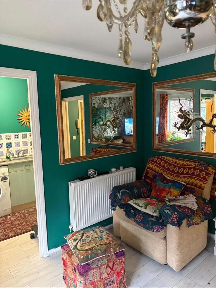
The best living room colour depends on which way the main window faces and when you use the room. North-facing lounges suit warm colours with red, pink or yellow undertones, south-facing rooms can take almost anything and suit cooler blues, greens and greys, and east or west-facing rooms should be chosen for the light at the time you sit in them, often the evening. Test two-coat samples on card or paper around the room before you buy.
What colour should I paint my living room?
Start with the direction the main window faces and the time of day you actually sit in the room. North-facing living rooms suit warm colours with red, pink or yellow undertones. South-facing rooms can take almost anything, and cooler blues, greens and greys keep the strong sun in check. East and west-facing rooms depend on whether you use them in the morning or the evening.
The paint makers broadly agree. Dulux’s advice on north and south-facing rooms says spaces that face south get “strong clear natural light, so all colours work well”, while north-facing rooms have “a cooler natural light, and generally less of it”.
How do I work out which way my living room faces?
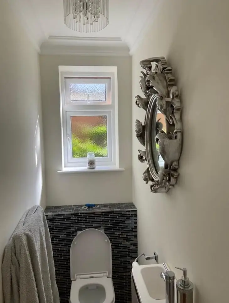
Stand at the largest window, face out, and check a compass (the one on your phone is fine). Whichever direction you are looking is the room’s orientation. That is the method in Lick’s guide to north, east, south and west-facing rooms. If the room has windows on two sides, it is dual aspect and gets light from both, which gives you more freedom with colour.
This matters in Northampton’s Victorian terraces, where front and back rooms have often been knocked through into one long lounge. One end might face north onto the street while the other faces south over the garden, so a single colour can look like two different shades from one end to the other. In older streets such as those in Kingsley, a decorator will usually check this first. Judge your samples at the darker end. If the colour works there, it will usually work in the brighter half too.
Best colours for a north-facing living room
Choose colours with a warm undertone: soft pinks, creams, warm whites, ochres, terracotta and warm greys. North light is cool and indirect, so it pulls out any blue, green or grey in a colour. Rust-Oleum’s colour guidance says to avoid blue, grey or green undertones there, or “the space will appear flat and cool”, and Dulux’s north-facing room advice says warmer shades “counteract the blue-tinged northern light.”
Shades the makers name for north-facing rooms: Dulux suggests Copper Blush, Summer Linen and Blush Pink, and from its Light & Space range Desert Wind and Morning Light. Rust-Oleum suggests Warm Clay, and Lick’s guide includes Pink 01 for north-facing rooms.
There is a second route: go deep. A north-facing lounge will never be bright, so a rich, warm dark can make it feel deliberate and snug. Lick’s advice on brightening a dark room says dark colours can give “the illusion of more space by blurring the edges of the walls.” Where it tends to go wrong is the middle ground. A cool mid-grey in a north-facing room can look neither light nor cosy, just grubby. If you want grey, pick one that leans warm.
What colours suit a south-facing living room?
Almost any colour works in a south-facing living room, because it gets good light for most of the day. The thing to watch is warmth.
Rust-Oleum notes that colours “may appear more yellow because of the abundance of warm light,” and that cool whites look more neutral there. So creams can look buttery, and cooler blues, greens and greys balance the sun without making the room feel cold. Lick puts it simply: “If you’re going to go bold, do it in a south facing room.”
Shades the makers name for south-facing rooms: Dulux suggests Nordic Sky, Willow Tree and Rock Salt. Rust-Oleum suggests Tea Leaf and Steamed Milk, and Lick includes Grey 02.
One caution: very pale colours can wash out in full sun and look like a dirty white by midday. If you are choosing a light shade here, go a step or two deeper on the card than you think you need.
East-facing living rooms: decorate for the afternoon
East-facing rooms get warm sun first thing and cooler, flatter light from late morning onwards. Many living rooms are mostly used in the afternoon and evening, so for a lounge you are usually decorating for that cooler light. That points towards warmer colours: soft pinks, warm greens, earthy neutrals and warm whites.
Lick’s advice for east-facing living rooms is to “look for warming tones”, and it names Pink 01, Pink 02 and Green 01. Dulux groups east and west-facing rooms together and suggests shades such as Crushed Aloe and Goose Down. If your east-facing lounge is mainly an evening room, test samples under lamplight, not in the morning sun.
West-facing living rooms: plan for golden evenings
West-facing living rooms are flat in the morning, then get warm, golden light later in the day, when lounges tend to be used. Colours that sit well in both kinds of light tend to work best: soft greens, muted yellows and warm neutrals, with whites that lean slightly grey or blue so they don’t turn peach at sunset.
Lick recommends “a white with a grey or blue undertone, like White 01 or White 02“, because they look cool in the morning and neutralise the warmer light later. Dulux’s article on how light affects wall colours says west-facing rooms are “dramatically lit in the evening” and to avoid blue shades, “which can make west-facing rooms feel cold.” That advice is about blue wall colours; a white with a faint grey or blue lean still reads as white, and only cools the room slightly. Dulux’s east and west list also includes Chic Shadow. Judge west-facing samples between late afternoon and sunset, because that is the light you will live with.
Living room colour ideas by direction: quick comparison
In short: warm colours for north-facing lounges, almost anything for south-facing ones, warm neutrals for east-facing rooms used in the afternoon, and soft greens or grey-leaning whites for west-facing rooms that catch the evening sun. Dual-aspect rooms should be chosen for the darker side. Use the table to shortlist two or three shades, then test them on your own walls. Colour families and example shades come from the maker guides linked above.
| Window faces | Light you get | Colours that usually work | Example shades | Watch out for |
|---|---|---|---|---|
| North | Cool, indirect, less of it | Warm whites, creams, soft pinks, ochre, terracotta, warm greys; or a rich warm dark | Dulux Copper Blush, Summer Linen; Rust-Oleum Warm Clay | Blue-greys and cool mid-greys going flat and grubby |
| South | Strong, clear light for much of the day | Almost anything; cool blues, greens and greys balance the warmth | Dulux Nordic Sky, Rock Salt; Rust-Oleum Tea Leaf | Creams turning yellow; very pale shades washing out |
| East | Warm sun in the morning, cooler afternoon light | For a lounge: warm neutrals, soft pinks, warm greens | Lick Pink 02, Green 01; Dulux Crushed Aloe | Cool colours that look fresh at 9am and cold at 7pm |
| West | Flat in the morning, golden in the evening | Soft greens, muted yellows, whites with a grey or blue lean | Lick White 01, White 02; Dulux Goose Down | Warm creams and pinks going orange or peach at sunset |
| Dual aspect | Light from two directions | Most colours; choose for the darker side | Pick from the darker side’s row | Colour reading differently at each end of a through-lounge |
Should I go light or dark in a living room?
Go light if you want the room as bright as possible during the day and have little daylight to work with. Go dark if the room is mostly used in the evening, or will never be bright anyway and you would rather it felt cosy. A colour’s light reflectance value, or LRV, tells you how light it will read. Tikkurila describes LRV as a scale “of 0 (black) to 100 (white)”.
LRV helps when two pale colours look the same on a chip: the higher number bounces more light around a gloomy room. Tikkurila does not publish its LRVs online but will give one by email, and notes that “any colour will look lighter when hit with direct natural or artificial light”, which is why a shade that seems right in a bright shop can look a step darker on a north wall at home.
Dulux says its Light & Space Matt can “reflect up to twice as much light back into your room” compared with its conventional emulsions. Worth a look for a dim lounge, but a cold colour in a light-reflecting paint is still a cold colour.
How your light bulbs change a living room colour
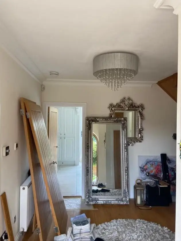
In a living room, artificial light often matters as much as daylight, because evenings are when the room gets used. Dulux notes that “incandescent bulbs produce a yellow light that intensifies warm tints” and that LED bulbs come in “many shades of white light”. Warm bulbs push colours warmer; cool white bulbs push them cooler and greyer.
Before you pick a paint, check the colour temperature on the box of the bulbs you already have. It is given in kelvin (K), and a lower number means a warmer, yellower light. Dulux’s north-facing advice suggests layering light, with “a bulb with a warm glow” in table lamps to help the space feel cosy. Then test your samples with the curtains closed and those lamps on. A soft grey that looks calm in daylight can look clinical under a cool white LED ceiling light.
Should the ceiling, skirting and woodwork be the same colour?
They don’t have to be, but it is worth deciding on purpose instead of defaulting to brilliant white. A stark white ceiling and gloss skirting can make a warm wall colour look dirty beside them. Many decorators now soften trims and ceilings to an off-white with the same undertone as the walls, or go the whole way and colour drench.
Colour drenching means painting the walls, ceiling, skirting and sometimes the radiators and fireplace in one colour or close tones of it. Dulux’s guide to colour drenching a living room says matching the skirting “works particularly well with darker colours, where white skirting boards can be a stark contrast”, that light shades are ideal for a first attempt, and that a working fireplace needs “a suitable heat-resistant paint.” Valspar’s colour drenching ideas suggest a slightly lighter door in a tonal shade of the walls.
Drenching means more cutting in and more coats on woodwork, and dark colours on old, uneven walls show every flaw if the finish is shiny. A flat matt hides far more than silk.
How to test living room paint colours
Paint large samples with two coats, put them on more than one wall, and look at them over a full day and evening. Small dabs on the old colour tell you little, because the surrounding colour changes how you see a sample. A decorator giving colour advice would usually work like this:
- Shortlist two or three colours from the right family for your room’s direction, using the table above.
- Paint them on card or paper. Farrow & Ball’s sampling guide says to apply two coats onto “thick paper or card, the bigger the better”. Rust-Oleum suggests a 30x30cm swatch, and Dulux suggests A4 sheets, one on each wall.
- Space them out. Farrow & Ball warns against putting samples “directly next to each other like a patchwork quilt”, because each one distorts the next.
- Move them around. Put one on the darkest wall and one beside the window, and hold them against the floor, sofa, curtains and anything else that is staying.
- Look at them when you use the room, including the evening. Farrow & Ball suggests closing the curtains and turning on a lamp.
- Check the undertone. Hold the sample next to plain white printer paper. A lean towards green, pink, yellow or blue usually shows up straight away.
What goes wrong when choosing a living room colour?
Common regrets come down to choosing from a screen or a small chip, ignoring the undertone, judging the colour in the wrong light, and forgetting what is staying in the room. A nice colour can still look wrong beside an orange-toned oak floor, a grey carpet or a red-brick fireplace.
The old colour can also show through: going from dark red to pale cream usually needs extra coats, and patchy coverage changes how the new colour reads. Our page on interior painting in Northampton explains how we prepare and finish living room walls so the colour you chose is the colour you get.
When to choose yourself and when to ask a decorator
If the room is simple, gets reasonable light and you are happy to sample properly, choosing the colour yourself is very doable. A second opinion is worth having when the room is a through-lounge with two aspects, it is dark and north-facing, you are going dark or colour drenching, or the walls are old and uneven.
One habit prevents most colour regrets: look at your two finalists in the room at the time of day you use it most, with the lamps you actually switch on. When you book us, Dean gives colour and finish advice in your own room, checking the light and the undertones against what is staying. He is a painter and decorator in Northampton, and our guide to decorating prices explains what moves the cost. For a free written quote, call Dean on 07539 779 036.
Sources
- Dr Dulux: how to decorate north and south-facing rooms, Dulux (accessed 2026-10-09)
- Dr Dulux: how to decorate a north-facing room, Dulux (accessed 2026-10-09)
- Colour know-how: how lighting can affect your wall colours, Dulux (accessed 2026-10-09)
- How to colour drench your living room, Dulux (accessed 2026-10-09)
- Best colours for north and south facing rooms, Rust-Oleum (accessed 2026-10-09)
- North, east, south and west facing rooms, Lick (accessed 2026-10-09)
- How to brighten up a dark room, Lick (accessed 2026-10-09)
- How to sample, Farrow & Ball (accessed 2026-10-09)
- Light reflecting values (FAQ), Tikkurila (accessed 2026-10-09)
- Colour drenching ideas, Valspar (accessed 2026-10-09)
- Copper Blush colour details, Dulux (accessed 2026-10-09)
- Warm Clay paint, Rust-Oleum (accessed 2026-10-09)
- White 01, Lick (accessed 2026-10-09)
- Summer linen, dulux.co.uk (accessed 2026-10-09)
- Blush pink, dulux.co.uk (accessed 2026-10-09)
- Desert wind, dulux.co.uk (accessed 2026-10-09)
- Morning light, dulux.co.uk (accessed 2026-10-09)
- Pink 01, lick.com (accessed 2026-10-09)
- Nordic sky, dulux.co.uk (accessed 2026-10-09)
- Willow tree, dulux.co.uk (accessed 2026-10-09)
- Rock salt, dulux.co.uk (accessed 2026-10-09)
- Tea leaf, rustoleumcolours.co.uk (accessed 2026-10-09)
- Steamed milk, rustoleumcolours.co.uk (accessed 2026-10-09)
- Grey 02, lick.com (accessed 2026-10-09)
- Pink 02, lick.com (accessed 2026-10-09)
- Green 01, lick.com (accessed 2026-10-09)
- Crushed aloe, dulux.co.uk (accessed 2026-10-09)
- Goose down, dulux.co.uk (accessed 2026-10-09)
- White 02, lick.com (accessed 2026-10-09)
- Chic shadow, dulux.co.uk (accessed 2026-10-09)
- Dulux Light & Space Matt, Dulux (accessed 2026-10-09)
Last updated by Dean, DH Painter & Decorator.


