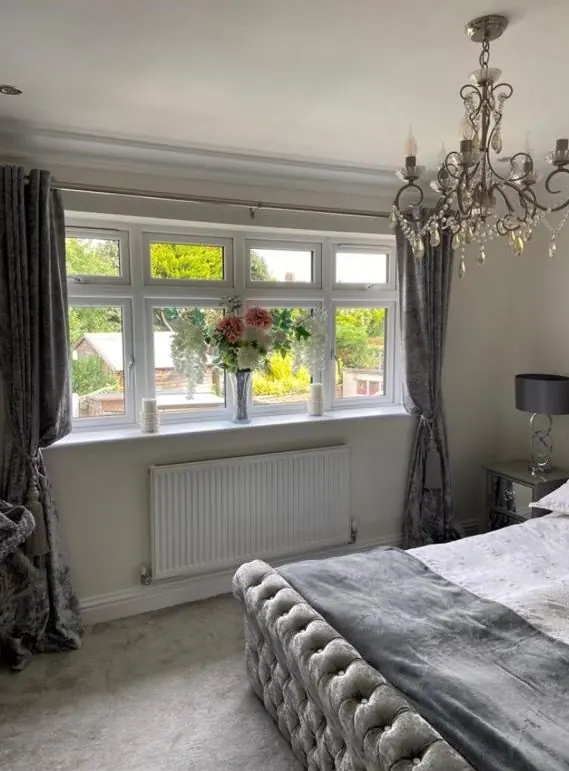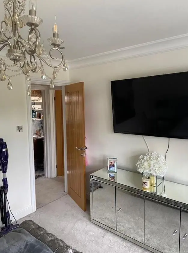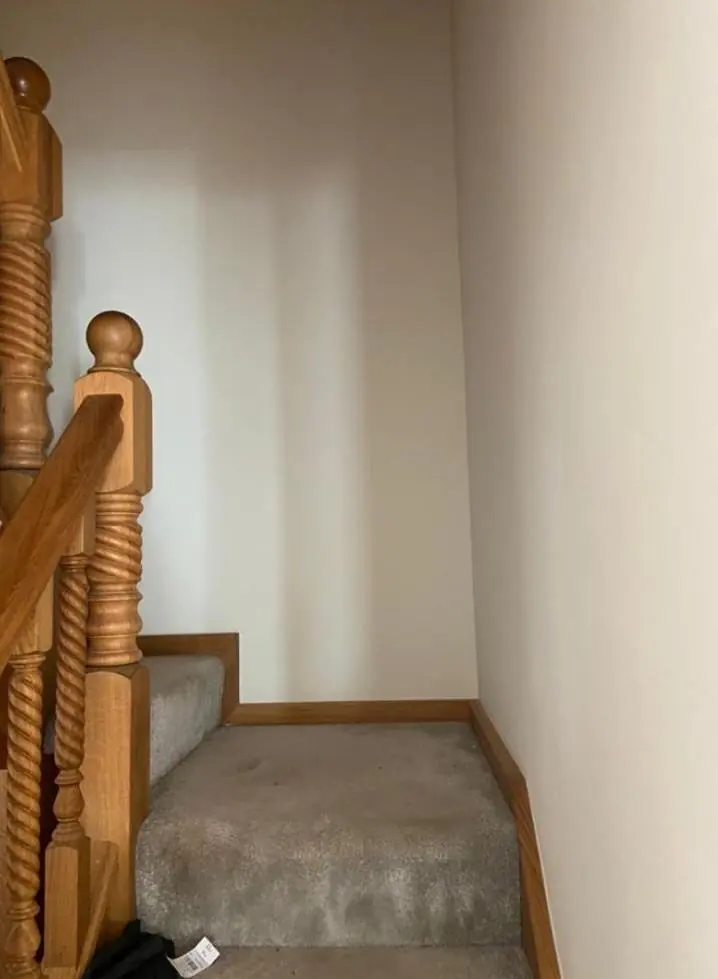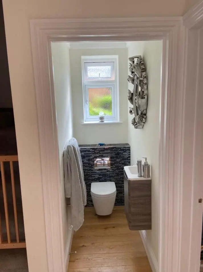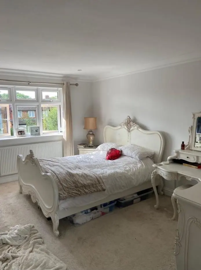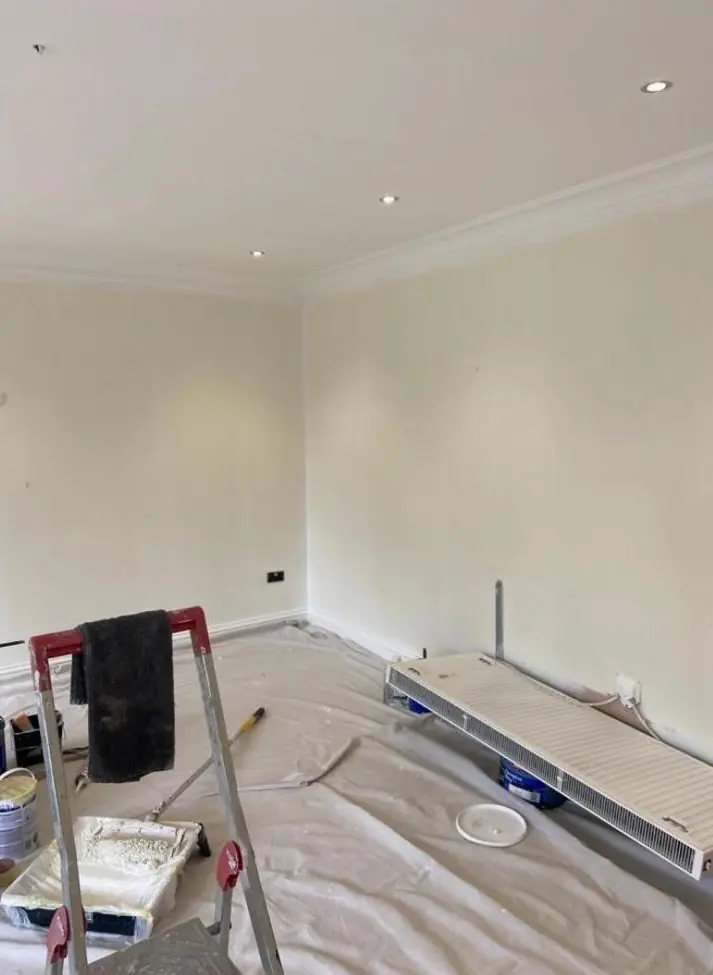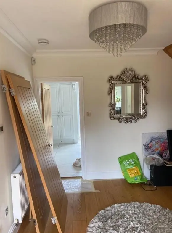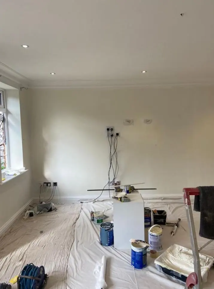
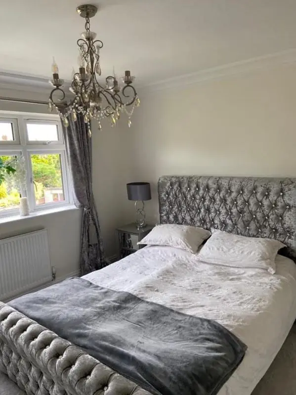
DH Painter & Decorator offers colour consultation in Northampton and the surrounding villages. Dean visits your home, looks at how light falls in each room, checks undertones against your floors and fittings, and recommends shades and sheen levels that suit the surface. With over 30 years' experience, advice comes with a free quote.
Colour consultation in Northampton from a working decorator
Plenty of decorating jobs go wrong before a brush is lifted. A shade that looks calm on a card can turn cold and grey on a north-facing wall, or go almost yellow in a sunny lounge. DH Painter & Decorator offers colour consultation in Northampton so the advice comes from someone with three decades of seeing colours on real walls, in real light.
Dean looks at each room at the time of day you use it and gives straight answers on shade, undertone and finish. Most customers book it alongside our interior painting service, but it is just as useful before committing to a whole-house repaint.
Why light direction matters more than the colour chart
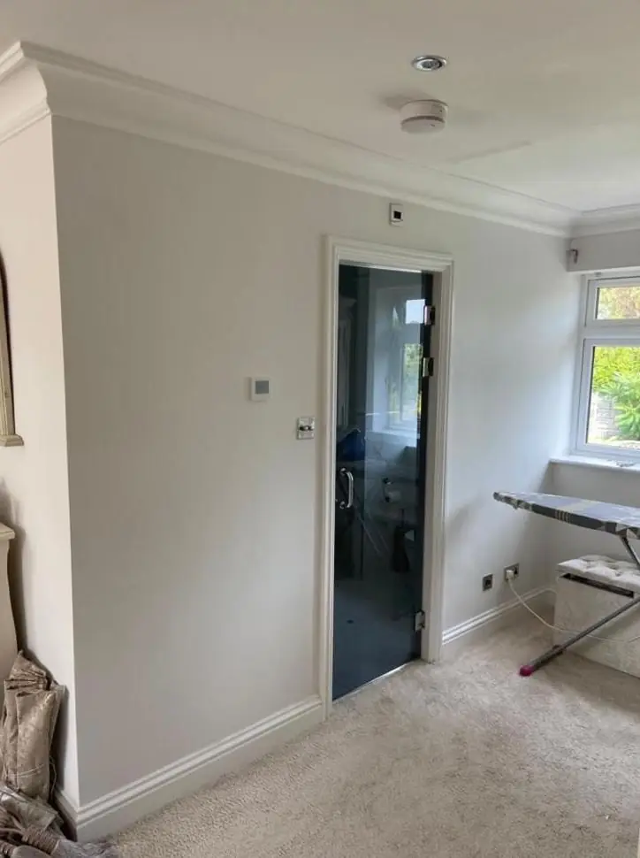
The biggest factor in how a colour reads is the light hitting it. North-facing rooms get cool, indirect light that pulls out any grey or blue and can make a pale neutral look flat. South-facing rooms get warm, direct sun that brightens colours and can wash out very pale shades. East and west-facing rooms swing between the two depending on the hour.
- North-facing: warmer undertones (a hint of red or yellow) usually stop whites and greys going cold.
- South-facing: cooler greys, greens and blues hold up well, and deeper colours don’t feel heavy.
- East-facing: think about when you use the room. A breakfast room reads very differently to a bedroom used mostly at night.
- West-facing: evening light can push creams towards peach, so judge samples in the late afternoon.
Bulbs matter too. Cool white LEDs can make a soft grey feel clinical.
Undertones: why grey never looks quite like grey
Almost every neutral has an undertone. Greys lean green, blue or purple. Whites lean yellow, pink or blue. Beiges and greige shades lean pink or green. The undertone is often invisible on a thumbnail swatch and obvious once it covers four walls.
Hold the swatch against plain white paper and the lean shows up. We also check it against what is staying in the room, such as flooring, kitchen units, worktops or a stone fireplace. A cool blue-grey beside a warm honey oak floor can look like a mistake even when both are lovely on their own.
Sample patches done properly
Small dabs painted straight onto the old colour tell you very little, because the surrounding colour distorts what you see. This is how we suggest testing:
- Paint samples at least A4 size, with two coats so the colour is true.
- Put one on the darkest wall in the room and one on the brightest.
- Leave a white border around each, or paint them on lining paper or card you can move about.
- Look at them morning, afternoon and evening over two or three days, remembering a matt tester looks different from the same colour in eggshell.
Choosing the right sheen for each surface
Sheen changes how a colour looks and how well a surface copes with daily life. Higher sheen makes colours look slightly lighter and richer, but it shows every dent and ripple in the plaster.
| Finish | Sheen | Where it suits | Watch out for |
|---|---|---|---|
| Flat matt | Very low | Ceilings, period rooms, bedrooms | Marks easily unless it’s a durable type |
| Matt emulsion | Low | Living rooms and most walls | Budget matts won’t take scrubbing |
| Eggshell or soft sheen | Low to mid | Kitchens, bathrooms, busy walls | Highlights uneven plaster |
| Satinwood | Mid | Doors, skirtings, frames, banisters | Brush marks if poorly laid off |
| Gloss | High | Traditional woodwork, front doors | Shows every flaw in the timber |
Durable matt emulsions give the soft look of matt with far better wipeability, which is often the best answer for family rooms and hallways.
Period homes and modern homes need different thinking
Northampton has a real mix of housing. Victorian and Edwardian terraces in areas such as Abington, St James and Kingsthorpe tend to have taller ceilings, deep skirtings, picture rails and cornicing. Those rooms can carry deeper, more historic colours, and often look best with wall, rail and ceiling treated as separate bands.
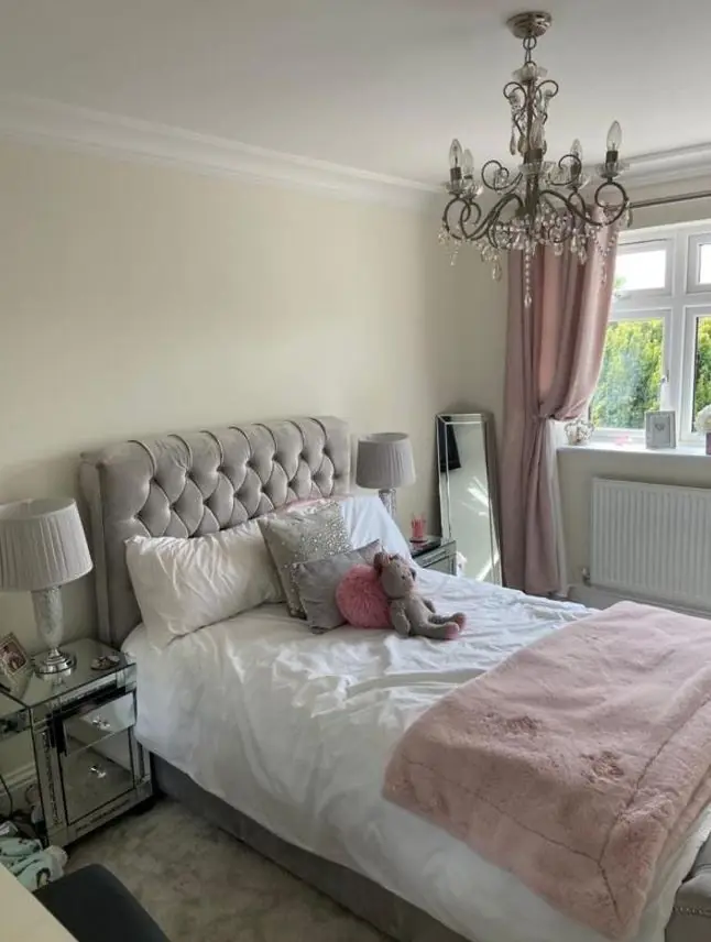
Newer homes, such as the modern estates you find around Duston and Moulton, usually have lower ceilings, open-plan layouts and more glass. There the job is mostly about flow, because you can see three rooms from one spot. We often suggest one base neutral through connecting areas, with stronger colour saved for rooms with a door you can close.
Coordinating woodwork, ceilings and walls
Brilliant white woodwork next to a warm off-white wall can make the wall look dirty. A white with the same undertone as the walls, or a few shades darker, usually looks more considered.
Options we often talk through include painting skirtings in the wall colour to make a small room feel taller, colour drenching walls and woodwork in one shade with different sheens, or keeping traditional white trim in a softer white. If woodwork is changing colour or switching from oil-based to water-based paint, the prep matters, and our door and skirting board painting page explains how we handle it.
What happens during a colour consultation
Dean walks through the rooms, asks how you use them and looks at light, fixed finishes and anything you’re keeping. You come away with a shortlist of colours and finishes for each area, advice on testing them, and a clear idea of the prep each surface needs.
There’s no tie to any paint brand, and we’ll tell you honestly where a trade-quality product earns its keep. If you want a feature wall with more character than flat colour, the conversation often carries on into our decorative finishes.
Booking a colour consultation in Northampton and nearby
We cover Northampton and the surrounding towns and villages, including Brixworth. As a painter and decorator in Northampton with over 30 years behind us, we’d rather help you pick something you’ll still like in five years than chase this year’s shade. If you’ve been searching for colour consultation near me, one visit usually settles decisions that have sat on a pile of swatches for months.
For colour advice and a free quote, call Dean on 07539 779 036 or ask for a free quote online.