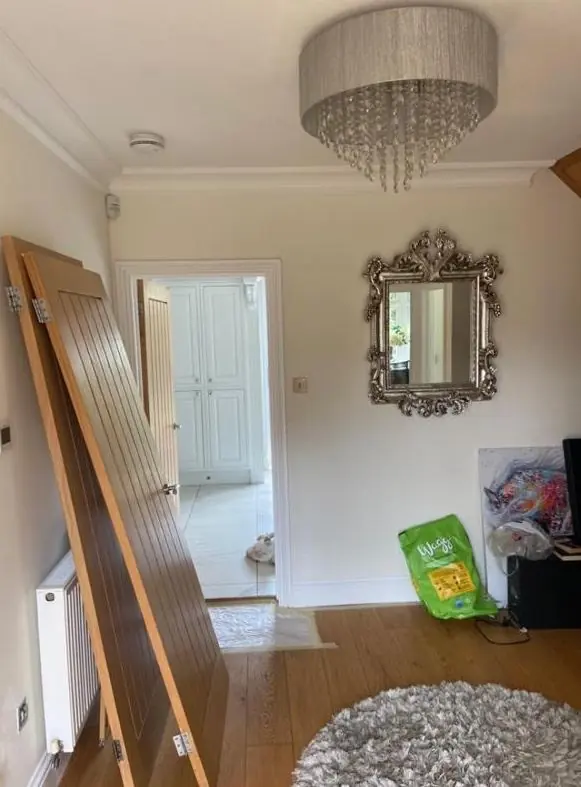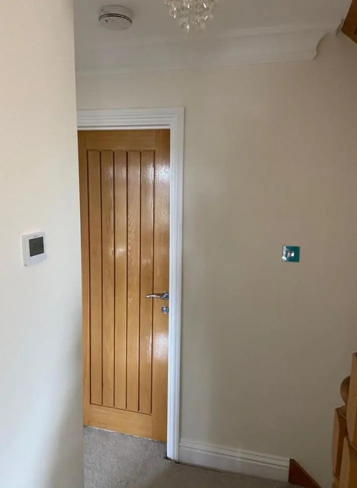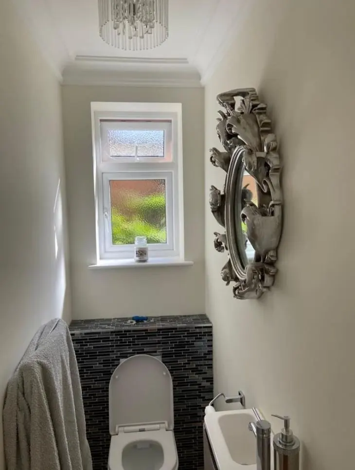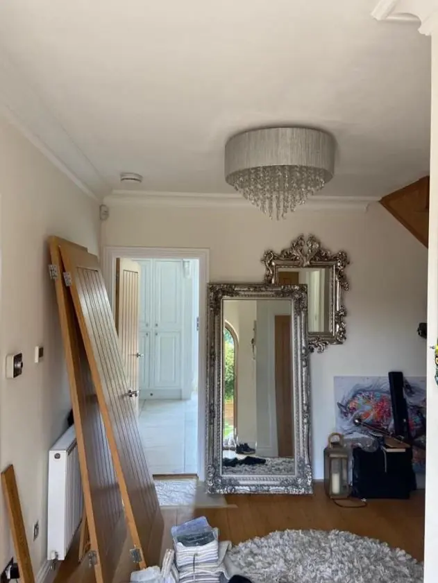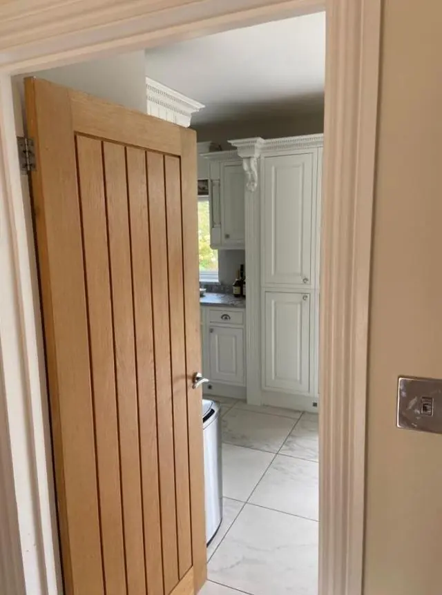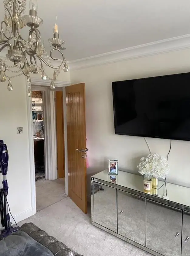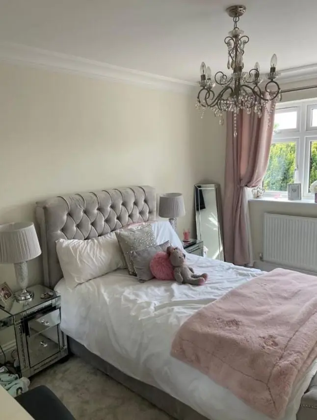
Dean gives colour and finish advice as part of decorating jobs in Ecton Brook, the NN3 5 estate about 4.1 miles east of Northampton town centre. There are no conservation controls on the estate, so the advice is about rooms, light and how your door sits with the rest of the row.
A free choice, with neighbours in view
Nothing on this estate is listed or inside a conservation area, so no planning rules limit the colour of your front door, windows or exterior woodwork. Great Billing Conservation Area, on the other side of Great Billing Way, covers the old village there, not the estate. Here, the decision is yours.
The squares do make it a little more involved. In Foxwell Square, Normead Square, Horsemoor Square and the others, terraces face each other across a shared green or path, and front doors are seen side by side. A colour that looks right on a sample card can jar next to the doors either side of yours. Before choosing, we suggest walking along your row and deciding whether you want to blend in or stand apart on purpose. Either works, as long as it’s a decision rather than an accident.
Garage doors and woodwork on the detached roads
On Raisins Field Close, Riverwell and Parkside, homes come with driveways, single garages and more exterior timber than the terraces. The garage door is often the biggest painted surface on the front, so its colour carries more weight than the front door. Garage door, front door and fascia in one considered colour, or a clear contrast between door and garage, look better than three unrelated shades. Sheen matters too. Next to smooth uPVC windows, a high-gloss door can look out of place, and a satin often sits better.
Compact rooms with ordinary ceilings
Indoors, the estate’s 1970s-80s houses have small rooms and standard-height ceilings. That affects colour choices in practical ways:
- A deep shade on all four walls can close in a small terraced living room. On one wall it adds depth without that effect.
- Painting the ceiling in the wall colour, or a tint lighter, blurs the line between them, which helps in a low room.
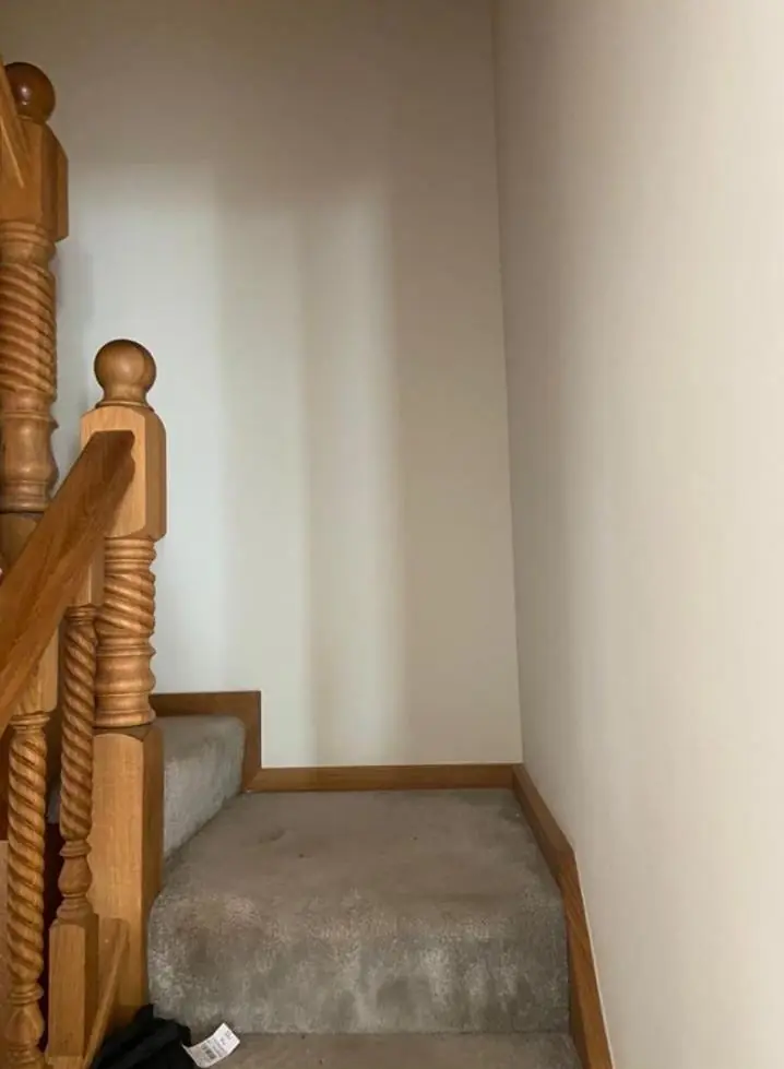
- In a narrow hall where the first stair is a step inside the door, a mid-tone that hides scuffs is more sensible than a pale one that needs repainting every year.
- Through rooms with windows at both ends get two kinds of light, so samples should be checked at each end.
Light direction changes from one square to the next, so we don’t assume it. Dean looks at samples in the room at the time of day you actually use it.
Sheen is part of the same conversation. Walls in a house that has been filled and patched by several owners since the 1980s rarely look perfect under a raking light, and a flat matt hides those repairs far better than silk, which shows every ripple. Kitchens and bathrooms need something tougher, such as a washable matt or eggshell, and woodwork usually looks most current in satin.
Neutral schemes for lets and housing-provider homes
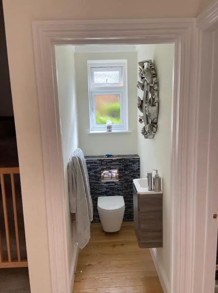
Private landlords, HMO owners and housing providers on the estate need something different: a neutral that suits the next tenant, hides marks and is easy to match when touching in. Our advice is to pick one wall colour and one woodwork colour for the whole property and write down the exact product names, so the next turnaround is faster. In shared houses, the communal hall and kitchen need a durable finish more than an interesting shade.
Colour advice comes with booking us to decorate. Our main colour and finish advice page explains how Dean thinks about undertones, light and sheen. Dean travels out to the estate, roughly 4.1 miles east of the town centre, to look at colours in place, and our painting and decorating in Ecton Brook page covers the other work we take on there.
Last updated by Dean, DH Painter & Decorator.