Dean gives colour and finish advice to Blackthorn homeowners and landlords as part of a decorating job, about 3.8 miles north-east of Northampton town centre. On this mid-1970s estate the main questions are how a front door sits within a terrace row and how to keep small rooms light.
A front door is judged against the whole row
Blackthorn’s houses were built as matching terraces and semis from the mid-1970s, and in parts of the ward nearly two thirds of homes are terraced. Many fronts face a shared footpath rather than a road, so you see a run of doors side by side as you walk past. A colour that looks fine on a sample card can look out of step when it sits between two neighbours’ doors in a row of identical fronts.
There are no conservation areas in Blackthorn, so you are free to choose. The practical test is to look at the row, not just your door. We suggest:
- holding a large painted sample against your door and looking at it from the end of the walk, not from your step;
- checking it beside any replacement uPVC doors and windows nearby, which are common on right-to-buy houses and come in fixed whites, greys and woodgrains;
- choosing a satin or gloss finish for exterior timber, since a flatter sheen picks up grime from a busy footpath.
Shade, trees and light on the western edge
Lings Wood runs along the estate’s western side, and houses facing it get mature trees overhead and longer periods of shade. Rooms on that side read cooler than the same room on the open side of a court. In practice that means steering away from pale greys with a blue or green base, which can turn flat and cold under filtered light. Whites and neutrals with a little warmth in them hold up better.
Houses on the open side of the estate get more direct light, and cooler shades will look as intended there. Because these are standard house types, the light is set by which way your rooms face rather than by window size, so Dean looks at the rooms at the time of day you use them before suggesting anything.
Carrying one scheme through a small house
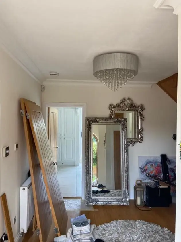
The 1970s houses here have modest halls, stairs and landings, and from the hall you can often see into the living room and up to the landing at once. Using a different colour on every surface makes that view busy and the space smaller. A single warm neutral through the hall, stairs and landing, with stronger colour kept for individual rooms, links the house together. The woodwork can then run in one white or soft off-white throughout, which also makes later touch-ups simple.
Picking a sheen that copes with daily wear
Choosing a colour is half the decision; the finish decides how it wears. Our guidance for the homes on this estate:
| Surface | Finish we usually suggest |
|---|---|
| Living room and bedroom walls | Matt or a durable matt that can be wiped |
| Hall, stairs and landing walls | Scrubbable matt or soft sheen |
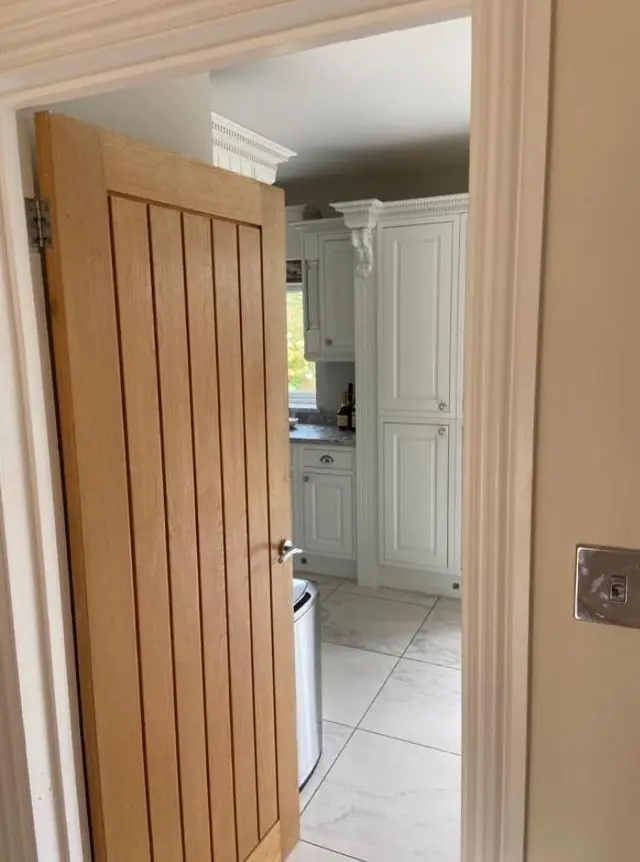
| Flush or moulded internal doors, skirtings | Satinwood or eggshell rather than high gloss |
| Kitchens and bathrooms | Moisture-resistant emulsion |
For a privately let house, the same table applies, with an emphasis on colours that are easy to match when a wall needs patching between tenants. More detail on how light direction affects colour is on our colour and finish advice page, and our Blackthorn page covers the estate’s housing in general. Colour advice comes as part of the decorating quote, not a separate fee. If you are unsure between two shades, we paint large sample patches on the wall at the quote stage so you can live with them for a few days first.
Last updated by Dean, DH Painter & Decorator.