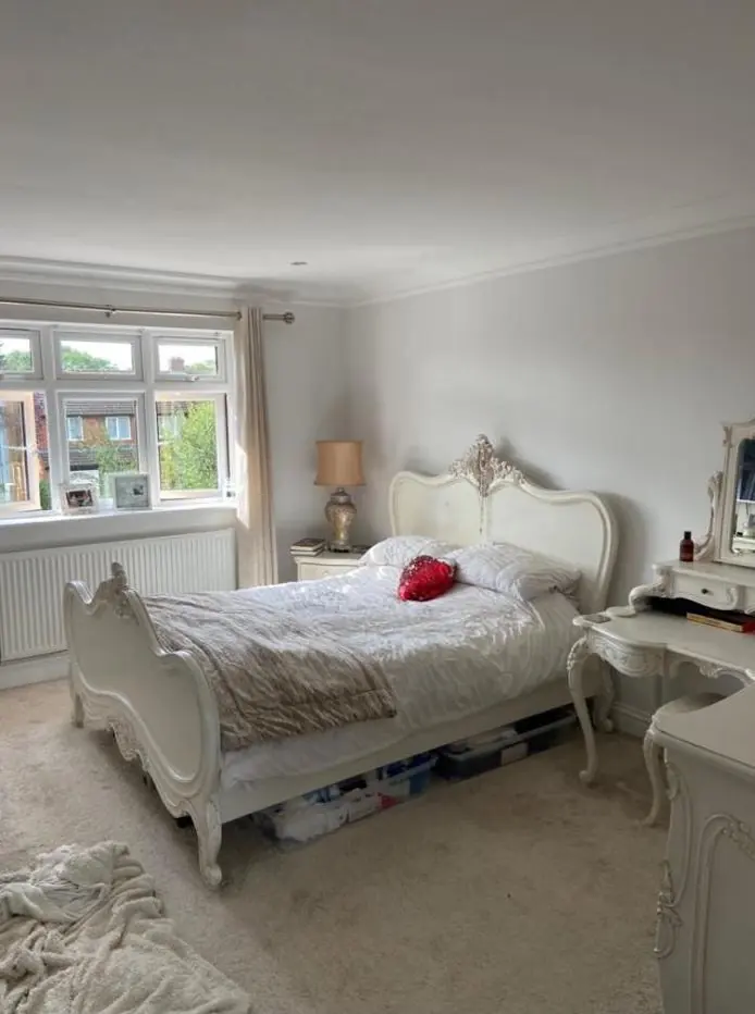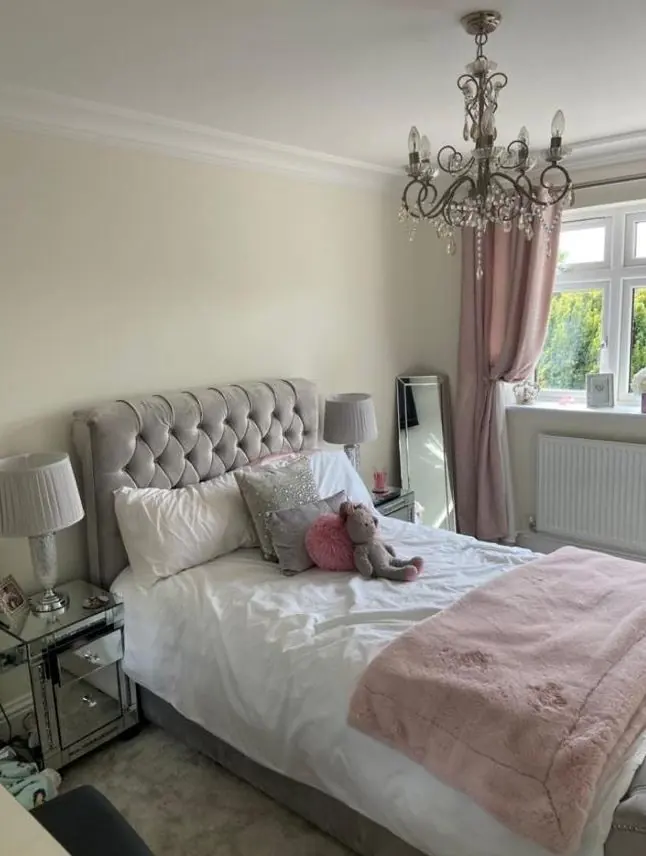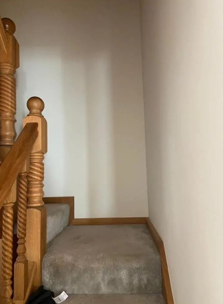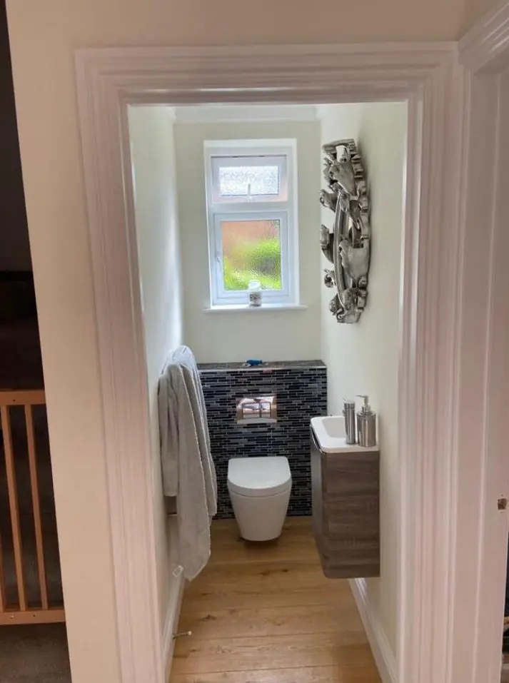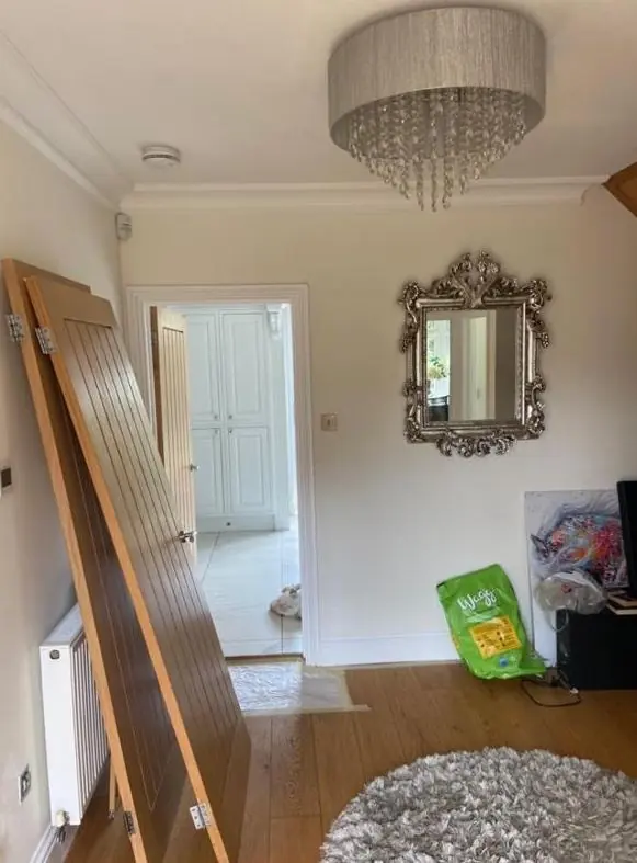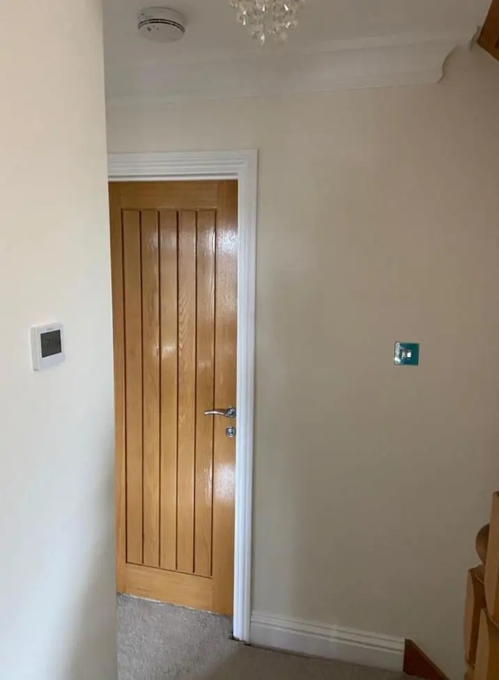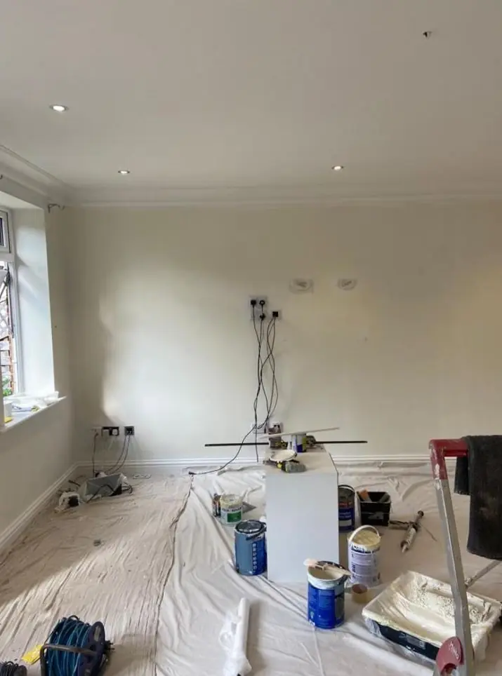
When Dean decorates in Upton, about 2.1 miles west of Northampton town centre, he helps you choose colours and finishes as part of the job. Here that means exterior colours that fit a street planned to look consistent, and interior whites chosen for whether a room faces the park or the back.
A neighbourhood planned to look of a piece
Upton was not built house by house. The 2005 Upton Design Code, produced through the Prince’s Foundation “Enquiry by Design” process, set rules that kept eight separately built development sites consistent with each other. The mix of tenures was deliberate too: affordable homes were designed to look the same from outside as private ones. The result is a street scene where one front door, garage door or run of cladding in an odd colour stands out more than it would on an older, mixed street.
No conservation area covering the new-build neighbourhood was found, so in planning terms most exterior repaints are straightforward. Still, before choosing a bold exterior colour it is worth checking your deeds or any estate management rules, and looking at what the neighbours have done. Our usual advice outside is:
- keep timber cladding and garage doors close to the colour the street was built with, unless the whole terrace is changing together;
- let brick and stone stay as they are and use colour on the joinery instead;
- on Site C, where brick, stone and clay sit next to zinc, metal and timber, choose shades that work with the grey of the zinc rather than fighting it.
Park side and back rooms need different whites
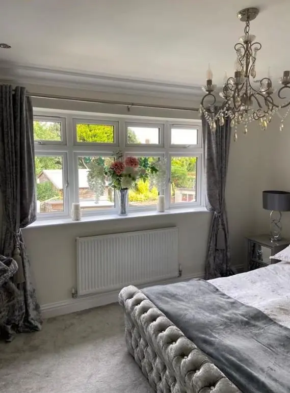
Homes along the southern edge look across Upton Country Park towards the Nene, and the Site C villas were angled deliberately to soak up sun. A bright white in a front room there can look glaring at midday. The same house often has rooms at the back, or on the shaded side of a mews, that get cool north light all day, and the same white goes grey and flat.
| Room aspect | What happens to colour | Direction to try |
|---|---|---|
| South, facing the open park | Strong warm light washes out pale colours | Softer whites, cooler greys and greens hold their colour |
| North or shaded by Ashby Wood | Cool light brings out grey and blue | Whites and neutrals with a warm, yellow or red base |
| Double-height sun space | Light changes across the height of the wall | Test samples at eye level and up high before deciding |
We paint sample patches on the real walls and look at them at the time of day you use each room. The general method is explained on the colour and finish advice page.
Sheen choices for glass-heavy rooms
Large areas of glazing, roof windows and glazed gables put light across walls at a low angle. In those rooms sheen matters as much as colour. A flat matt hides the slight unevenness of plasterboard joints and roller laps, while a silk or eggshell picks out every one. In kitchens, halls and children’s rooms we suggest a durable matt that can be wiped without the shine of a silk.
Woodwork is the other half of the finish question. Skirtings and doors in Upton homes are often still in the developer’s original white finish, which can look stark next to newer matt walls. Satin or eggshell on the woodwork gives a softer contrast, and in the open-plan layouts common here it keeps one consistent sheen across rooms that run into each other.
Outdoor colours that face the sun
South-facing timber and cladding across the country park gets strong UV, and darker colours fade and heat up more there. A mid-tone or a UV-stable microporous product will look right for longer, and recoats come round less often. Elevations close to the A45 and A4500 also collect traffic grime, which makes very pale exterior colours look dirty sooner.
For other Upton services, see the Upton area page.
Last updated by Dean, DH Painter & Decorator.