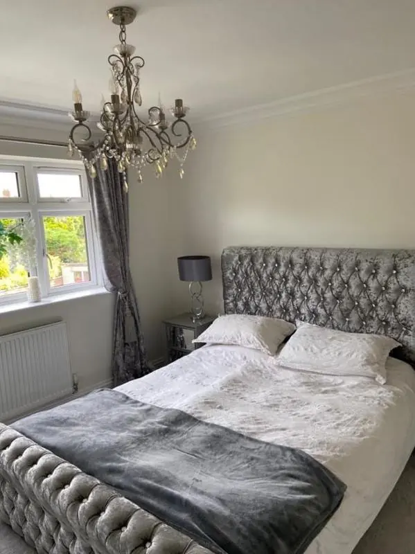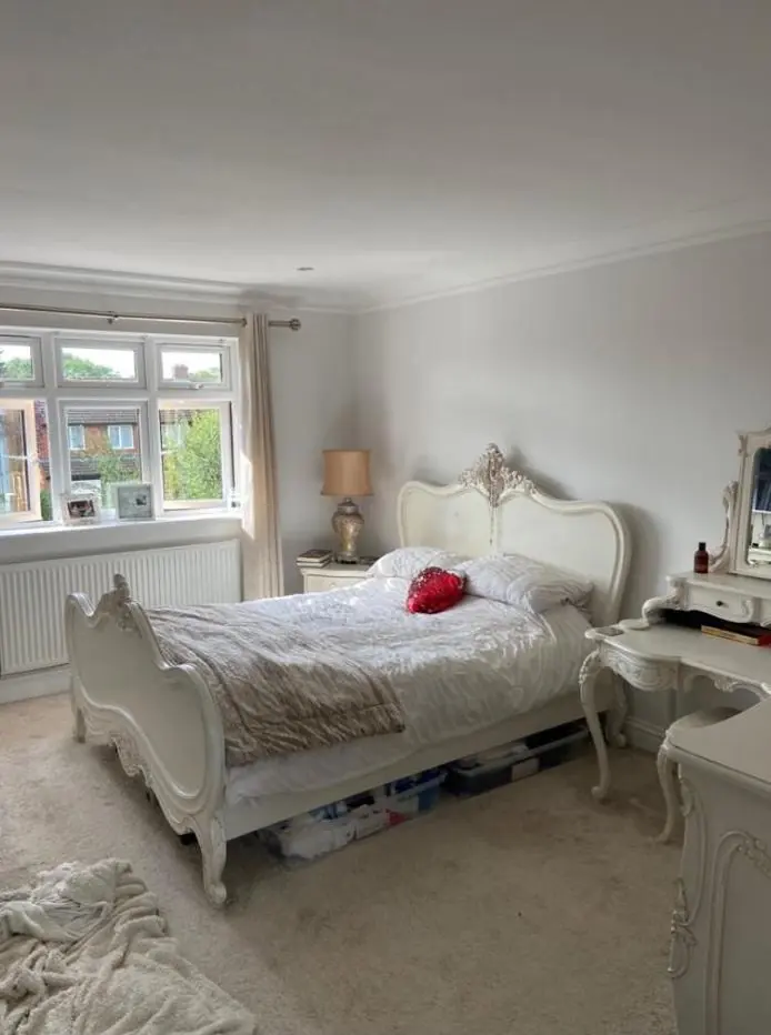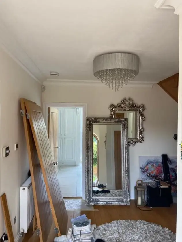
When Dean decorates in Duston, on Northampton's western edge 2.1 miles from the centre, he helps you choose colours and finishes as part of the job. In Duston that advice is shaped by the conservation area's ironstone and render, and by the Neighbourhood Plan's interest in consistent estate frontages.
What the old village already decides for you
In the Duston Conservation Area, the starting palette is set by the buildings themselves. The 2009 appraisal describes coursed ironstone rubble, cream render on The Old Vicarage, stucco on Duston House, and limewashed or whitewashed walls on cottages such as The Cottage on Squirrel Lane and 7 to 11 Main Road. Exterior colours for joinery, doors and render here should sit quietly alongside those warm browns, creams and whites.
In practice that points towards:
- Off-whites and soft creams for render and stucco, rather than brilliant white, which looks harsh against ironstone.
- Deep greens, dark blue-greys, black or muted reds for front doors and gates.
- Traditional whites and stone tones for sash windows, which the appraisal values as original features.
Ironstone walls themselves are left unpainted. An existing limewash is renewed in the same pale tone, not switched to paint.
Keeping a Kerrfield or Limehurst street in step
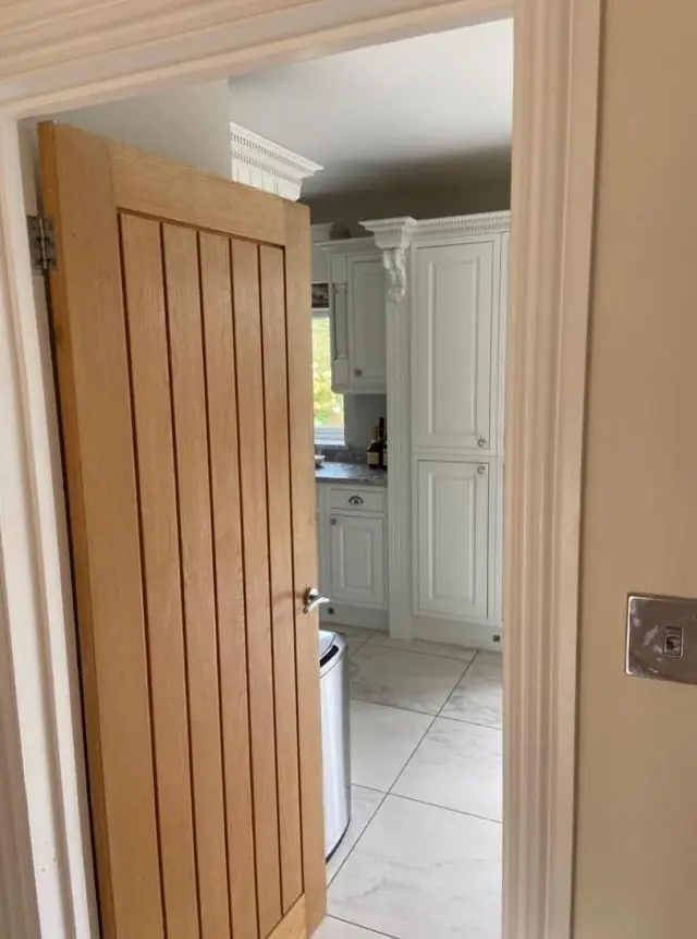
Outside the conservation area, the Duston Neighbourhood Plan (2015) sets design expectations for each character area. On Kerrfield, it notes brick, pebbledash, slate, hedges and picket fences. For Limehurst and Eastfield and the Chiltern Way area, it picks out regularly spaced windows and doors. That regular rhythm is what gives these streets their look, and a front door or garage in a jarring shade breaks it more than it would on a mixed street.
Nothing stops you choosing a bold colour, and the plan is guidance rather than a ban. Our advice is to pick a door colour that stands out from the neighbours by tone, not by clashing, and to keep fascias, soffits and window frames in the white or neutral shade the rest of the row uses. Pebbledash on Kerrfield semis looks right in pale stone, cream or soft grey, which also keeps a repainted semi from looking out of place beside its unpainted twin.
Inside: low light, deep walls and modern boxes
Interior advice depends on which Duston you live in. Cottage rooms behind thick ironstone walls often have small windows and low ceilings, so they read darker than the chart suggests. Warm off-whites and soft earth tones suit them, while cold greys can turn gloomy. In a listed interior, sheen matters too: a flat or matt finish on old plaster looks more at home than a modern silk, and it shows fewer undulations.
The newer houses on the former Timken site and the two former middle-school sites present the opposite problem. Rooms are bright and regular, often painted throughout in one builder’s shade, and the challenge is giving them some character without making small rooms feel boxed in. Here we look at which way each room faces and what time of day you use it.
Finish choices for a busy road frontage
| Situation in Duston | Finish we would suggest | Why |
|---|---|---|
| Frontages on Main Road | Dirt-resistant exterior paints, mid tones on doors | Through-traffic leaves grime on light colours |
| Newton Road weatherboarding | Microporous stain or paint in a shade close to the original | Keeps the 1960s-70s estate consistent |
| Shopfronts in the Village Centre | Heritage colours, traditional sign boards | The appraisal asks shopfronts to harmonise with the area |
| Family hallways on the estates | Scrubbable matt or eggshell | Wipes clean without the shine of silk |
Dean tests colours on your own walls at the time of day you use the room before you commit. The approach, including how light direction changes a shade, is set out on our colour and finish advice page. More on decorating in the parish is on the Duston area page.
Last updated by Dean, DH Painter & Decorator.