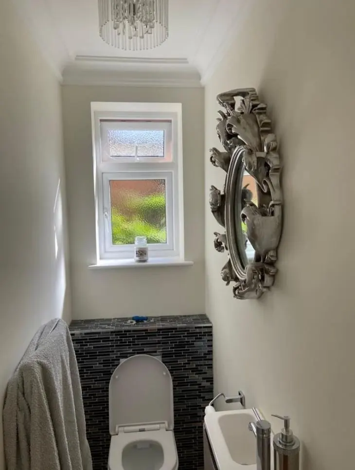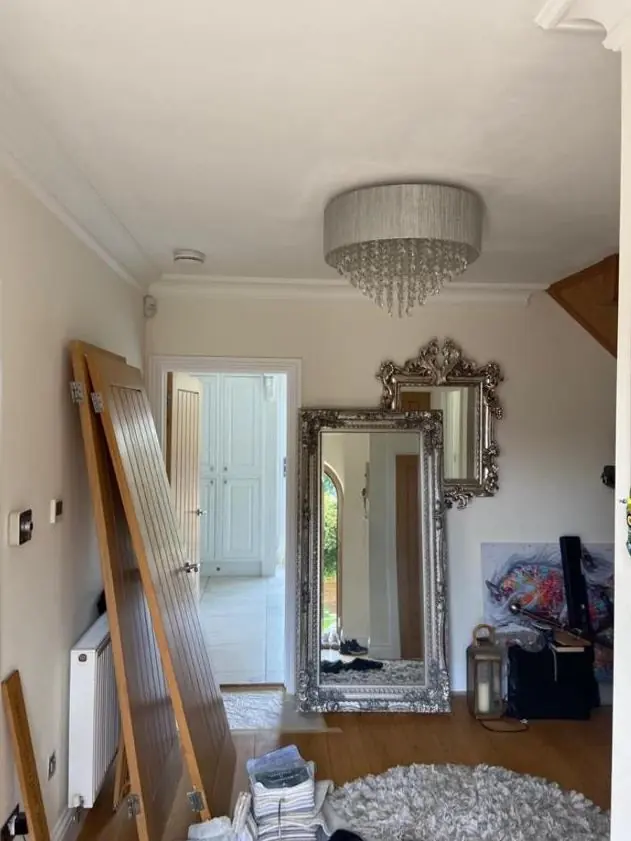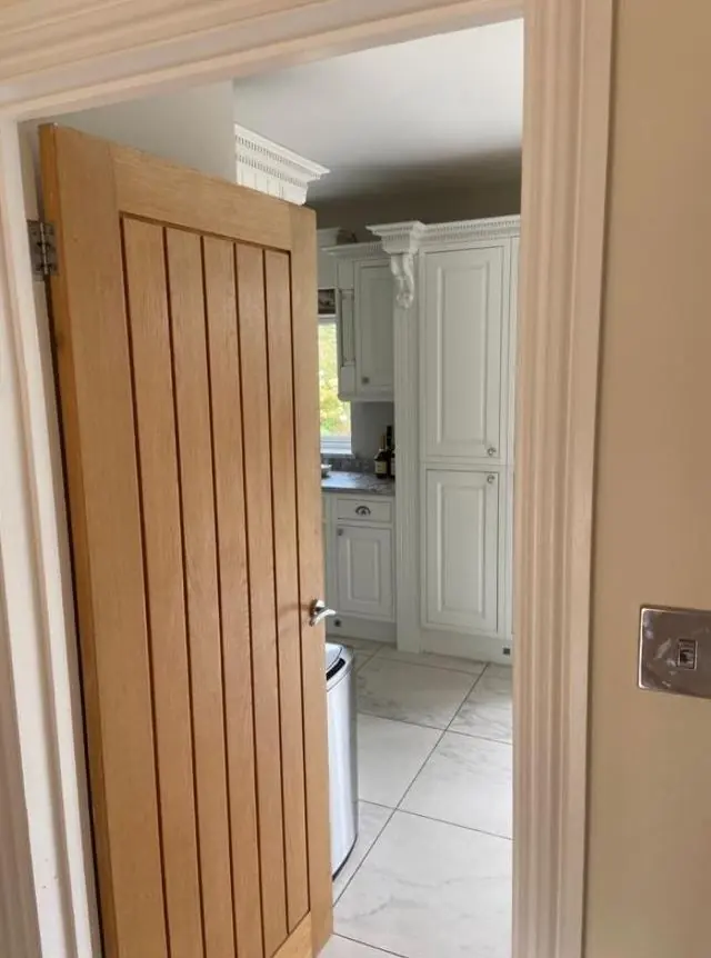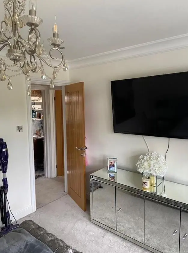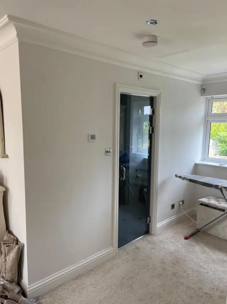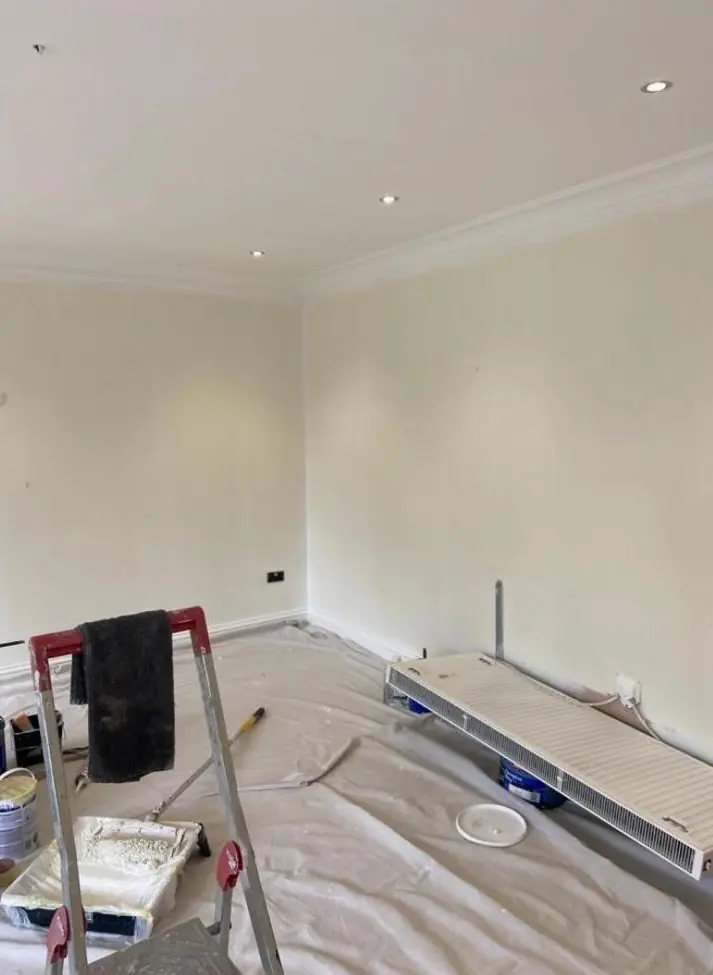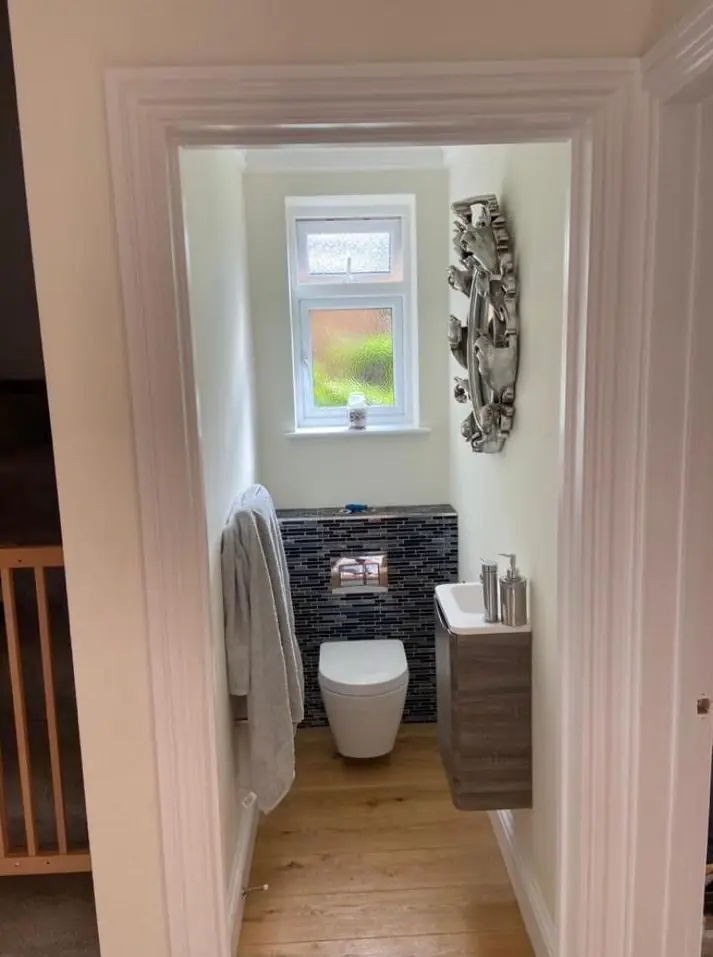
When we decorate in Briar Hill (NN4), about 1.3 miles south-west of Northampton town centre, Dean gives practical colour and finish advice as part of the job. It covers front doors and woodwork on the estate's look-alike terraces, shades that hold up in rooms facing away from the sun, and durable neutrals for landlords.
One front door in a row of similar ones
Briar Hill’s estate terraces were built as a group from 1969 onwards, so neighbouring houses tend to share the same proportions, similar windows and often the same front path. Where the windows are uPVC, the parts of the outside you can actually paint are the front door, any timber porch, the fascias and soffits. Those few surfaces carry the whole character of the house.
Our advice for a front door here is to choose the colour against the brick and the neighbouring doors, not against a fan deck in your kitchen. A deep green, navy or muted red reads well next to the window frames, and a door painted in a mid-sheen or gloss looks crisper than satin from the footpath. Some doors on the estate face pedestrian paths rather than the road, so the door is seen close up, and a well-prepared gloss finish matters more than an unusual colour.
How the slope changes the way paint looks indoors
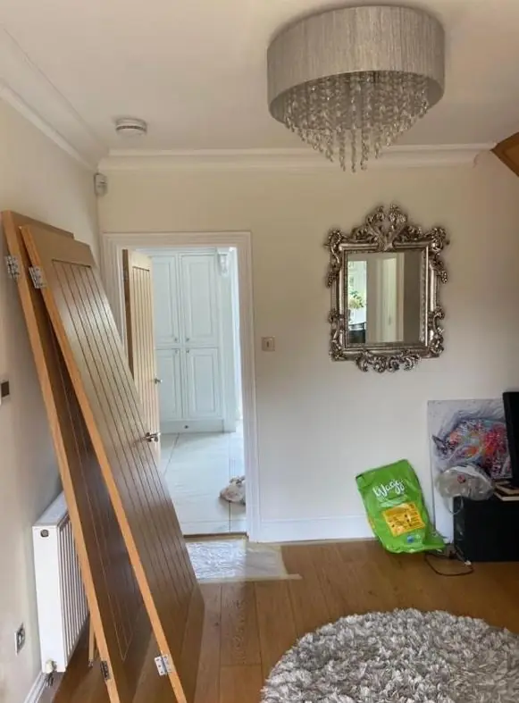
Briar Hill’s houses are spread down a slope that falls northwards towards the Nene. In a typical terrace, one side of the house gets good sun and the other gets mostly cool, indirect light all day. That affects colour choice more than anything else:
| Room situation | What tends to happen | What usually works |
|---|---|---|
| Shaded rooms facing down the slope | Greys and cool whites go flat or bluish | Neutrals with a warm, yellow or red undertone |
| Sunny rooms on the opposite side | Very pale colours wash out at midday | A shade or two deeper than you think |
| Small back bedrooms | Dark colours close the room in | Mid-tones in a matt finish, lighter ceiling |
Dean looks at samples on your own walls at the time of day you use the room. A sample pot painted onto lining paper and moved between walls tells you more than any chart.
Sheen choices for busy homes and rentals
Briar Hill has a mix of owner-occupiers, private landlords and social-rented retirement housing. For a let terrace, the sensible choice is a wipeable matt or soft-sheen emulsion in one neutral throughout, so touching up after a tenancy is quick and the colour can be matched from the same tin. Woodwork in eggshell or satin hides knocks better than high gloss on skirtings in the estate’s narrow terrace hallways. In the retirement bungalows managed by Northampton Partnership Homes, any colour scheme normally needs the landlord’s agreement, and there we would also think about contrast: a door frame or handrail in a tone clearly different from the wall helps residents with poorer eyesight.
A different conversation for Briar Hill House
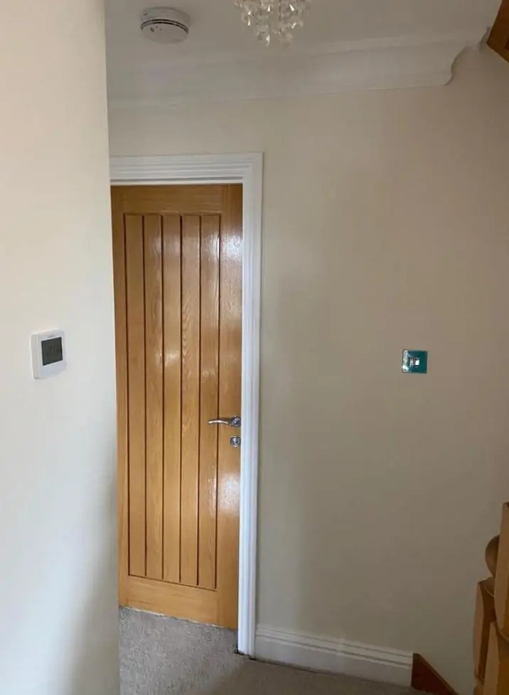
The one building on the estate where colour is not simply a matter of taste is Briar Hill House, the former farmhouse from the early 19th century, Grade II listed since 1976. Its stone walls, sash windows with glazing bars and six-panel door in a Doric pilaster surround are part of what the listing protects. Changing the colour of those features may need listed building consent, and any paint used on them should be traditional and breathable. For that house, advice starts with what the joinery was painted before, not with this season’s colours.
Colour advice comes as part of our decorating, as explained on the colour consultation page. You can see the rest of the services we offer here on the Briar Hill area page.
Last updated by Dean, DH Painter & Decorator.