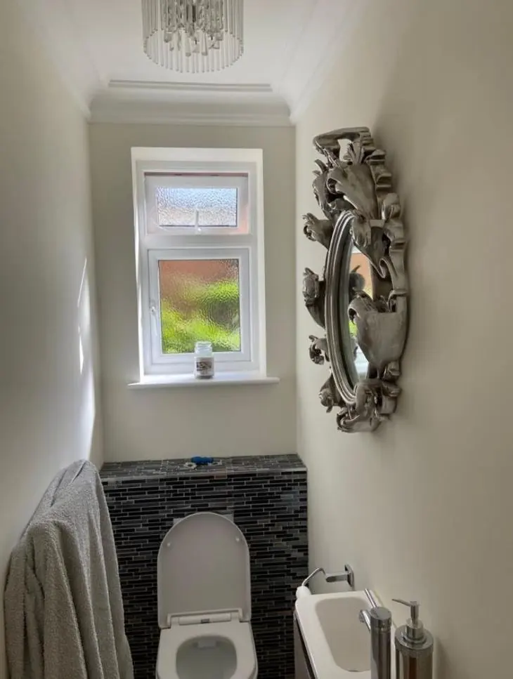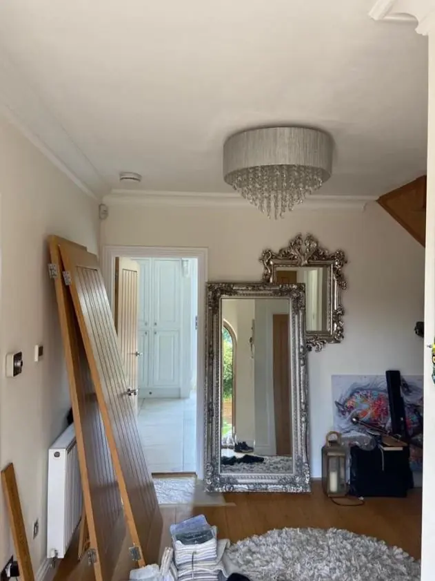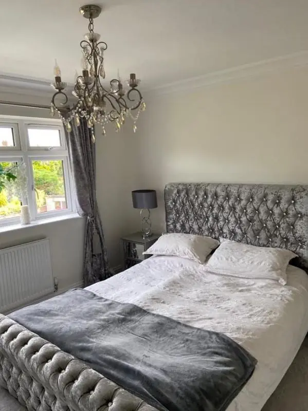
Dean gives colour and finish advice to people decorating in Queen's Park, NN2, the district straddling the A508 1.3 miles north of the town centre. It comes as part of a decorating job and covers period interiors, front elevations and the conservation-area rules that apply to frontages just to the south.
Choosing colours for red brick and painted stone
On the outside, the starting point in Queen’s Park is the brick. The terraces are mostly red brick, and on the older houses along the Kingsthorpe Road approach the brick is set off by painted stone sills, lintels, architraves and cornices with console brackets. The dressings are there to frame the windows against the brick, so the colour you put on them matters more than the size of the area suggests.
Traditional choices for dressings are off-whites and stone shades. A bright brilliant white can look harsh against weathered red brick, while a warmer off-white or pale stone sits more comfortably. Front doors and sash windows give you more room: deep greens, blues and blacks have long been used on Victorian terraces and tend to suit the brick. Dean will paint small sample patches on the actual surfaces, since a colour card held against brick at arm’s length tells you very little.
When the council needs to see the colour first
Next door to Queen’s Park, the Barrack Road Conservation Area takes in the Kingsthorpe Road terraces down to Kingsthorpe Hollow. Its Article 4 Direction, in place since 2000, lists painting the exterior walls among the front-of-house works that need planning permission when they can be seen from the road. In practice:
- Painting brick that has never been painted, or changing the wall colour on a front that faces the road, needs checking with West Northamptonshire Council before any work is booked.
- Even like-for-like repainting of a painted stucco front or its dressings is worth confirming for your address, rather than assuming it falls outside the Direction.
- On the far side of the Racecourse, to the south-east, the Kingsley Conservation Area carries its own heritage Article 4 Direction, so homes there need the same check.
We can help you put together colour references and sample photos if you need to ask the council, but the approval itself is between you and the planning authority.
Light inside a bay-fronted terrace
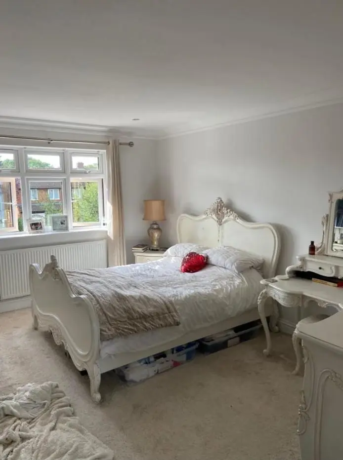
Indoors, the layout of these houses does most of the work in deciding colours. The bay lounge at the front takes in light from three directions and can carry cooler or paler colours. The separate dining room behind it often gets light only from the back, and a pale grey that looks clean at the front can turn dull there. Warmer neutrals, or a deliberately deep colour that makes the most of the room being darker, usually work better.
Picture rails and cornices let you split a wall into two tones: a stronger colour below the rail, a lighter frieze and ceiling above. It’s an easy way to lower a tall Victorian room visually without papering. Our main colour and finish advice page explains how light direction affects undertones in more detail.
Picking a sheen that will last
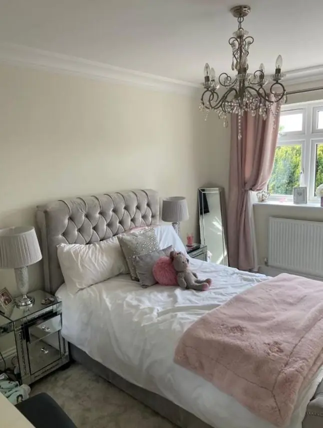
Finish matters as much as colour in these houses. Halls with the stairs going straight up from the front door take bags, bikes and shoulders all day, so a scrubbable matt or eggshell lasts far longer there than standard emulsion. On woodwork, the choice is between gloss, satin and eggshell, and between oil and water-based paints; four-panel doors and deep skirtings show brush marks less in satin.
Outside, front walls and railings facing the A508 pick up road grime, so a harder, wipeable finish on railings and gates and a dirt-resistant masonry paint on painted fronts will look fresh for longer. For the wider picture of what we do in the district, see our Queen’s Park page.
Last updated by Dean, DH Painter & Decorator.