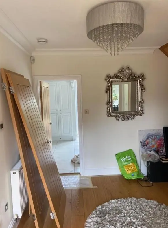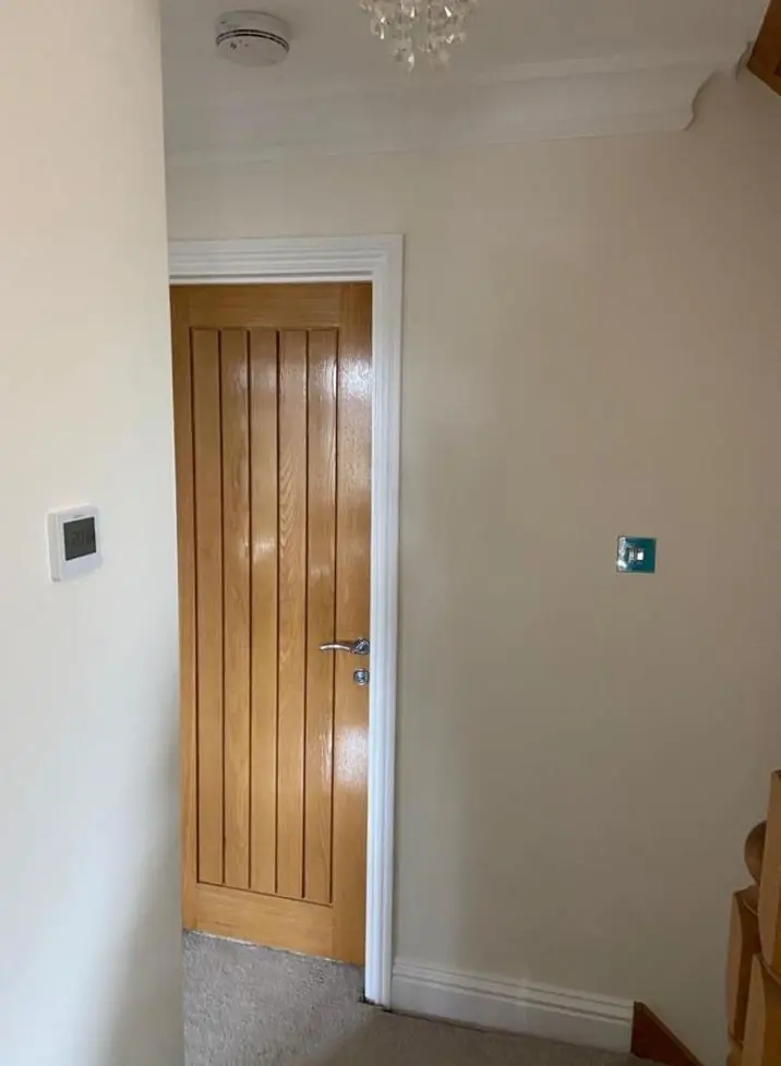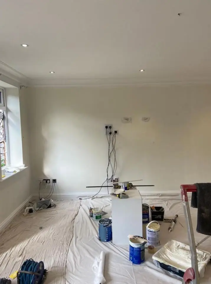
Dean gives colour and finish advice to Westone homeowners as part of a decorating job, in person and in the rooms concerned. Westone is the NN3 district on the north side of the Wellingborough Road, 2.6 miles north-east of Northampton town centre, mostly mature semis and detached houses.
One scheme across an old house and a new extension
On an extended Westone semi, the colour question is usually how to make the extension feel like part of the house. Many of the district’s semis have had a rear extension added and the back wall opened up, so a much newer kitchen-diner runs straight into a dining room or hall that has been there since the interwar or post-war years. The two halves often have different ceiling heights, different window sizes and different light.
The approach Dean usually suggests is to choose one colour family and vary its strength rather than switch colour at the join. A slightly deeper version of the main wall colour in the older, darker part of the room and a lighter one in the glazed extension can make the light levels feel even. Keeping the woodwork and ceiling colour the same throughout does a lot of the joining-up on its own. For the sealing of new plaster before any of this goes on, see our main interior painting page.
Trees, long gardens and rooms at the back
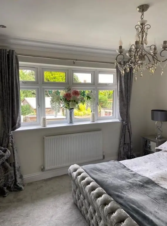
The Northamptonshire Historic Environment Record notes a possible 20th-century designed landscape around Westone, and the district still has mature trees and large rear gardens. That is pleasant to look out on, but it affects colour. A back bedroom or dining room looking into tall trees gets filtered, greenish light for much of the year and noticeably less of it in summer, when the leaves are out.
In those rooms, pale greys with a blue base can turn cold and flat. A white or neutral with a warmer undertone usually holds up better, and greens tend to look settled because they echo what is outside the window. We test sample patches on more than one wall and look at them at the time of day you actually use the room.
Deeper shades in bigger rooms
The 1920s detached houses on Westone Avenue have larger rooms and higher ceilings than the semis around them. Those proportions can carry stronger colours that would close in a smaller lounge: deep greens, inky blues, warm terracottas and the darker heritage-style shades. Picking out original joinery or a fireplace in a contrasting colour works well in these rooms.
Sheen matters as much as shade. We generally recommend:
- Flat matt on the walls of the Westone Avenue houses, where it hides small waves in older plaster across tall wall areas.
- Washable matt in the semis’ side halls and the extended kitchen-diners, which take most of the family wear.
- Eggshell or satin rather than high gloss on the many-times-painted doors of the interwar semis, where gloss shows every old run.
Outside: the road side and across the road
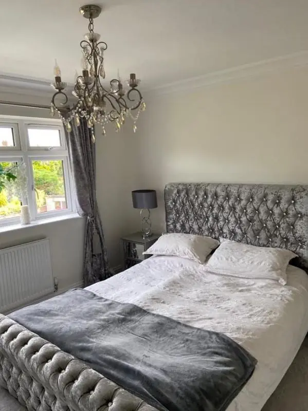
Houses facing the A4500 Wellingborough Road get a constant film of traffic grime on their front elevations. Very pale masonry paint and bright white front doors show it fastest. A mid-tone off-white or a slightly darker joinery colour stays presentable for longer between washes.
Westone is not in a conservation area. Weston Favell village directly across the road is, designated in 1972, with stone cottages and stone boundary walls as its unifying feature. If you own property on that side too, colour choices there should suit the stone, and the walls themselves need breathable, mineral-compatible finishes rather than a plastic masonry paint.
How the advice works
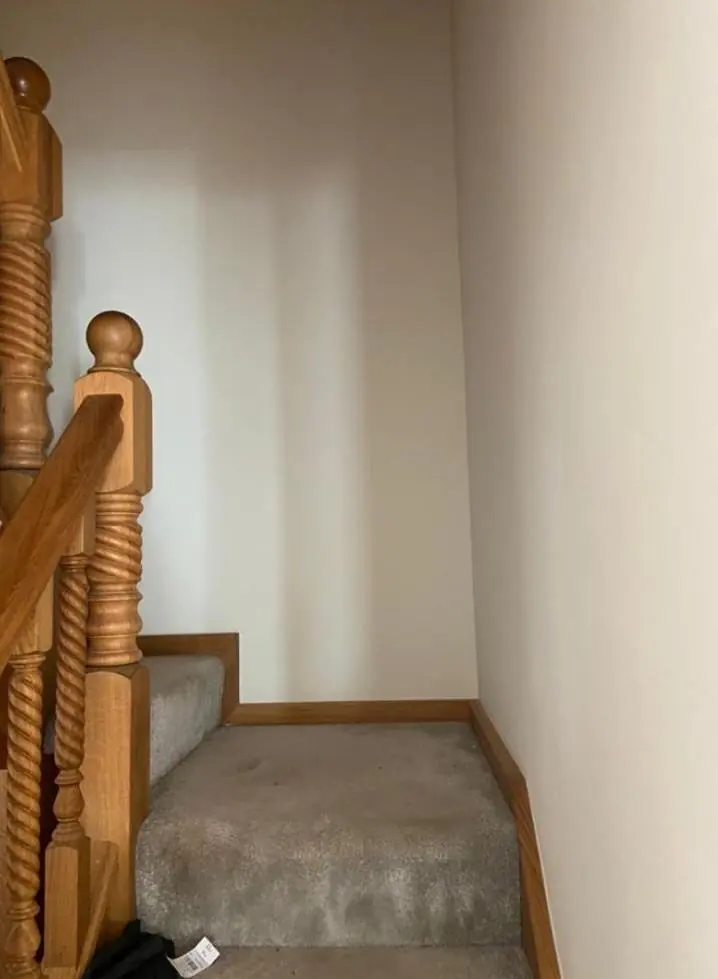
Colour help comes as part of a decorating booking in Westone rather than as a separate design service. Dean looks at the bay front, the extension or the stairwell with you, suggests a short list and talks through sample pots before you commit. Our colour and finish advice page sets out the general principles, and our Westone page covers the rest of what we do in the district.
Last updated by Dean, DH Painter & Decorator.