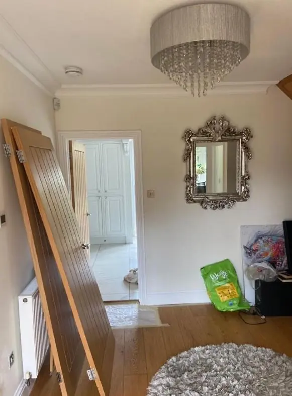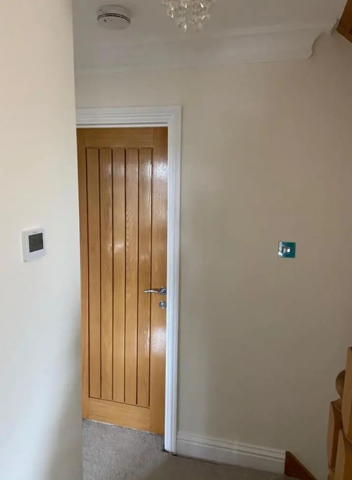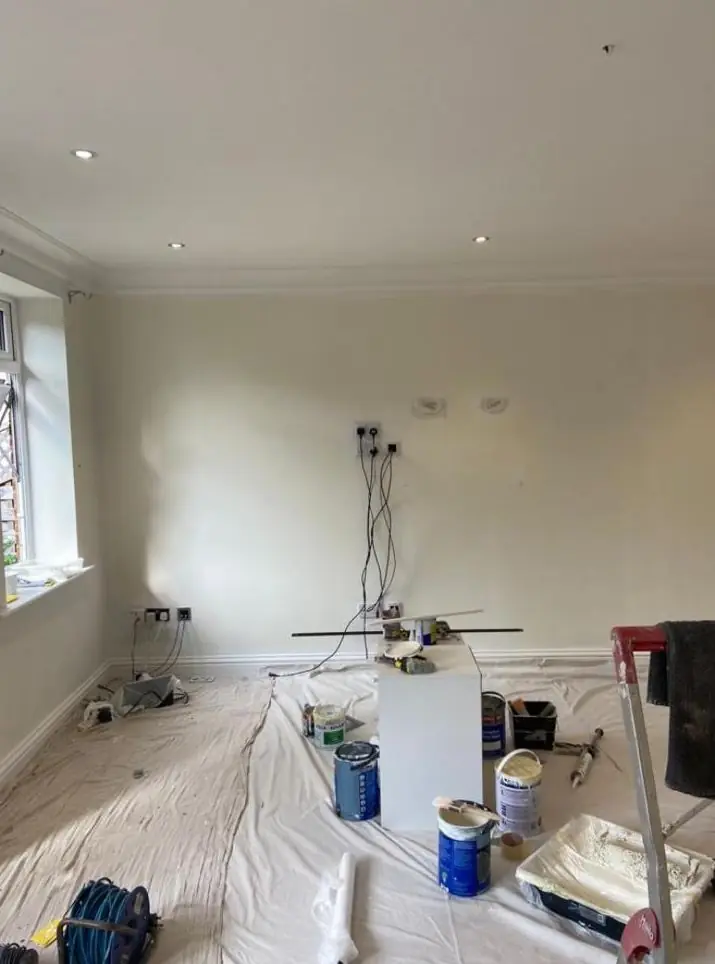
Dean gives colour and finish advice to Weston Favell homeowners as part of a decorating job, about 2.9 miles north-east of Northampton town centre. In the conservation area that means picking door and window colours that suit bare limestone and the council's described palette; elsewhere it is about light and room use.
A village where the stone sets the palette
West Northamptonshire’s conservation area appraisal for Weston Favell, approved in March 2010, describes the old village as harmonious in its muted reddy-browns and limestone tones. That is a useful brief for anyone choosing colours on High Street or Church Way. The cottage walls are coursed limestone rubble and should stay as bare stone, so almost all the colour a house shows to the street comes from its front door, window frames, sashes, shutters and gates.
That makes each choice more visible, not less. One front door in a sharp modern shade stands out against a row of warm stone in a way it never would on a painted terrace.
Joinery shades that sit well against limestone
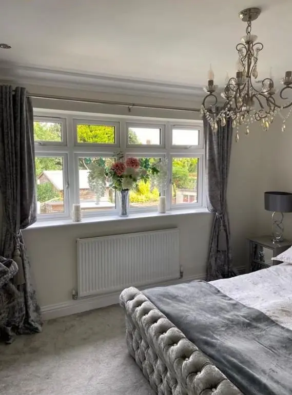
For doors and windows in the village core, Dean tends to suggest colours with some earth in them:
- Window frames and sashes in an off-white, cream or soft stone colour rather than brilliant white, which can look blue and harsh next to limestone.
- Front doors in deeper heritage shades such as dark green, deep red-brown, muted blue-grey or black.
- Shutters and exposed timber lintels, like those at Rixon’s Farm, 91 High Street, in a colour that keeps them as part of the wall rather than a feature.
- Railings and metal gates in black or a very dark finish.
Sheen matters too. A full high gloss reads as modern; an eggshell or traditional-looking gloss suits the period better on many cottage doors.
If your house is one of the 13 listed buildings, a change from the existing colour can count as an alteration, so ask the conservation officer before we buy paint. We found no heritage Article 4 direction for Weston Favell at the time of writing, but unlisted owners in the conservation area are still wise to keep to the established palette.
The villas, the brick buildings and the pebble-dash
The imposing 19th-century villas along the Wellingborough Road have lost many of their original doors and windows. Where timber survives, a period colour does far more for them than a glossy modern shade. Red-brick buildings in the village, such as the Rectory at 48 Church Way and the 1853 former Wesleyan Chapel, should keep their brick face unpainted, so colour is limited to their joinery and metalwork.
Pebble-dash, like the side elevation at 32 High Street, and the rendered walls of later infill houses are the one place where wall colour comes into it. Muted, warm masonry tones keep them in step with the stone around them.
Shade, trees and how colours read indoors
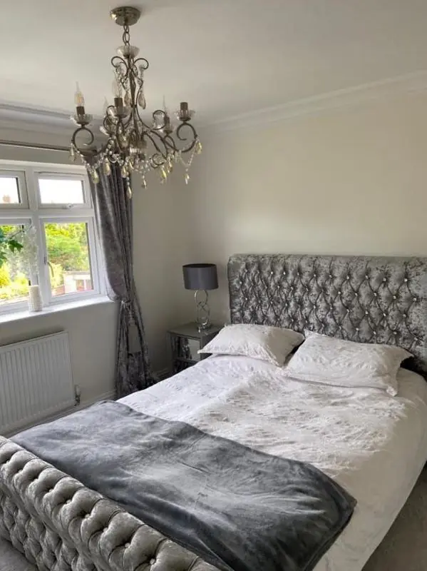
Mature trees around St Peter’s Church, the churchyard and the High Street junction are protected and stay put, and they cut the daylight reaching nearby rooms. Small cottage windows set in thick walls cut it further. In rooms like that, cool greys and blue-whites can turn flat and cold. Whites and neutrals with a little warmth in them hold up better, and a deeper colour can make a dim room feel deliberate rather than gloomy.
Dean looks at colour cards and samples on your actual walls, at the time of day you use the room, before you commit.
Outside the conservation area
The suburban streets that grew around the village after the 1920s carry no heritage colour guidance. There the advice is simply about light, the size of the room and how you use it. The main colour and finish advice page explains how we approach that, and our Weston Favell area page covers the other work we take on there.
Last updated by Dean, DH Painter & Decorator.