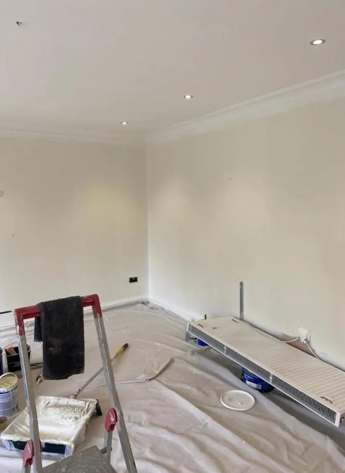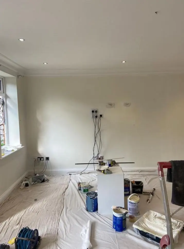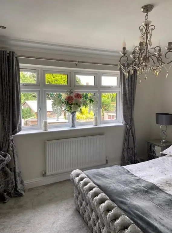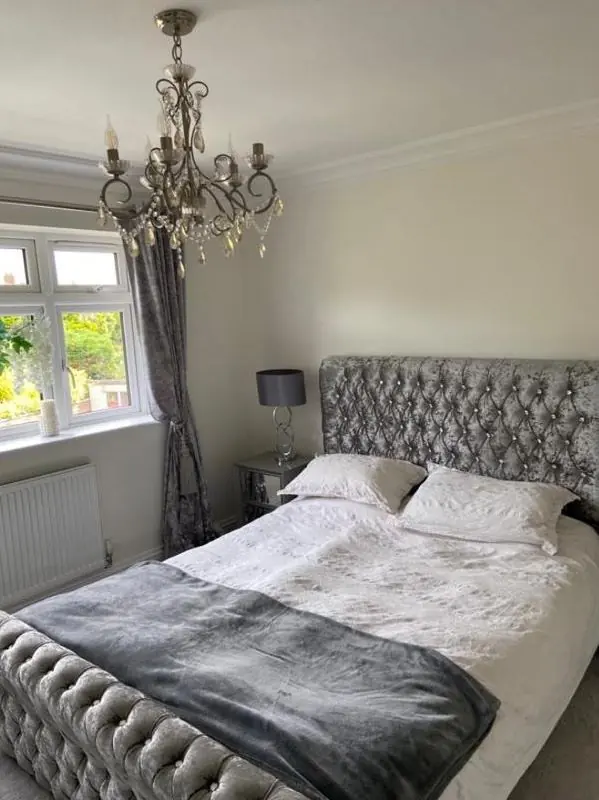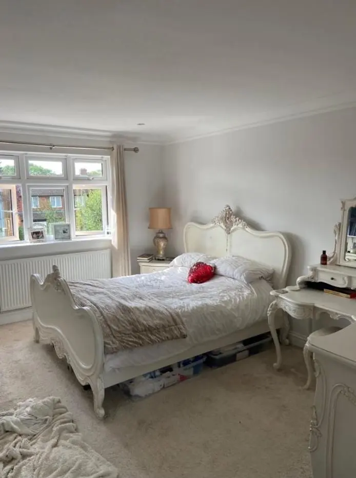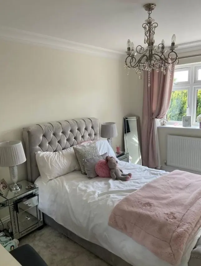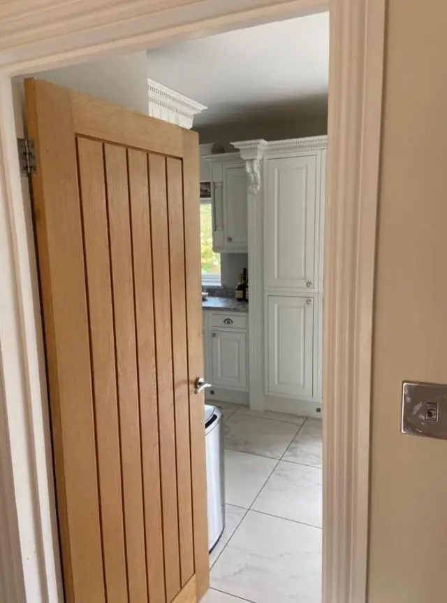
Dean gives practical colour and finish advice as part of decorating jobs in Dallington, about 1.3 miles north-west of Northampton town centre. In the 1970 conservation area that means choosing shades that sit well with sandstone and thatch, and checking what needs consent; elsewhere it is about light, layout and finish.
Dallington’s conservation area and what it means for colour
Before anyone opens a colour chart in the old village, it helps to know whether the house is protected. Dallington’s historic centre was made a conservation area in 1970. Inside that line sit fifteen listed buildings, from the church and Dallington Hall to the almshouses and cottages on the green.
That changes the question from “what colour do I like?” to “what colour am I allowed, and what will look right beside old stone?” Getting it wrong can mean repainting at your own cost, so we settle it early.
For colour, the important distinction is between listed and unlisted homes:
- Listed buildings such as the Raynsford Almshouses, Brookside, The Old Forge or the house known as Dallington Weir need listed building consent for changes to external finishes and colours. Repainting a door or window in the existing colour is like-for-like; switching it to something new is a change.
- Unlisted houses in the conservation area carry more general restrictions on some exterior alterations. We did not find an Article 4 direction in the sources we read, but it is still worth a quick check with West Northamptonshire Council before a dramatic change to a front elevation.
Dean will help you work out which side of that line you are on before you fall for a shade.
Colours that sit well against sandstone, thatch and slate
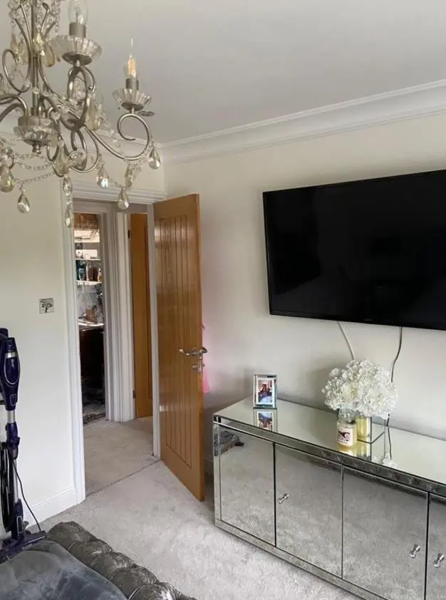
The village core is a palette of warm sandstone, Welsh slate, plain clay tiles, red brick stacks and, on the Wheatsheaf, thatch. Joinery colours that work with that tend to be muted and slightly earthy: off-whites with a warm undertone, soft greys with green or brown in them, deep greens, and dark heritage blues or near-blacks on doors. Brilliant white often looks harsh beside warm sandstone, and very cool greys can make it look dull.
Finish matters too. Leaded casements and stone mullions on the older buildings look right with a lower-sheen paint, while a front door can take a fuller gloss. We bring sample cards and, where it helps, paint test patches so you can see them against your own stone in daylight.
Light inside a house in the brook valley
The old village sits low in the valley of the Dallington Brook, with mature trees round the greens and along the water. Rooms behind those trees, and cottages with small casement windows set in thick walls, get less daylight than you might expect. In those rooms, warm-leaning pale colours keep the space from turning grey, and a flat or matt finish hides the undulations of old plaster better than a sheen.
The taller Georgian rooms at Dallington Hall are a different case: big sash windows, eared architraves and panelled joinery give you scope for picking out detail in a second tone or sheen. Our main colour and finish advice page explains how we read light direction generally.
Starting from builder’s white at Dallington Grange
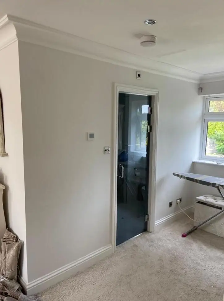
New houses at Dallington Grange are handed over in plain white, which gives you a blank sheet but also a lot of decisions at once. Rather than picking every room in isolation, Dean suggests choosing a small family of colours that run through the hall, stairs and open-plan spaces, then varying the bedrooms. Remember that fresh plaster will need a mist coat whatever colour you choose.
Dean talks colour through on the same visit as the quote. If you want a rough idea of what a full repaint involves before choosing, our cost guide sets out the factors. To see what else we cover locally, visit our Dallington area page.
Last updated by Dean, DH Painter & Decorator.