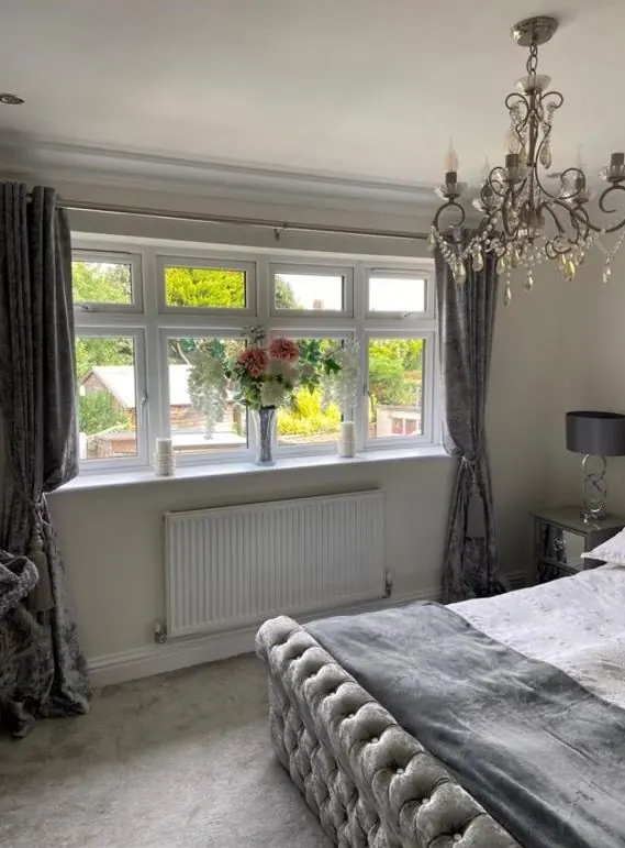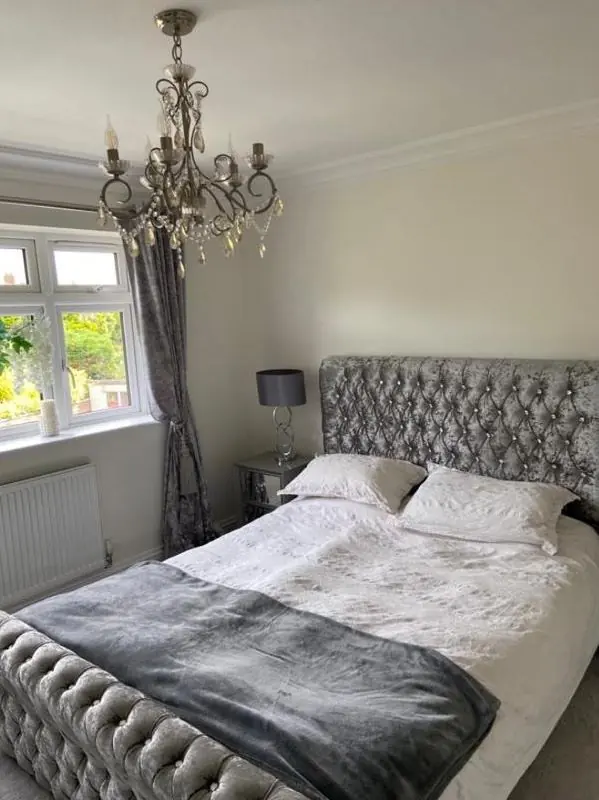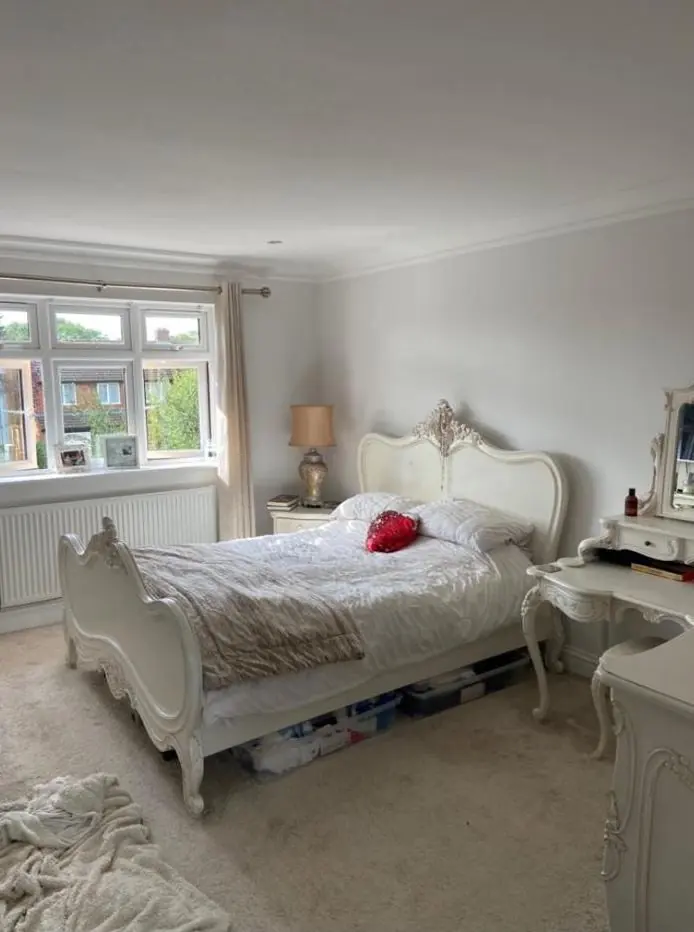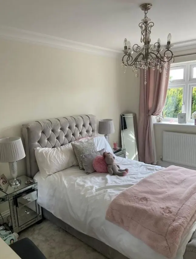
Dean gives colour and finish advice as part of decorating jobs in Hanslope, about 8.9 miles south of Northampton. In the conservation area that means colours that work with yellow limestone, red brick and white-painted frontages; on the newer estates there is more room to choose freely.
The palette the village already has
Hanslope’s historic core has a small, consistent set of materials. The neighbourhood plan’s Policy HAN3 names them: red brick, Jurassic yellow stone, full or part-rendered frontages, and roofs of clay tile, slate and thatch. Several of the buildings people notice most are painted white over brick and stone, including the Watts Arms of 1821 on Castlethorpe Road, Green Manor on Market Square and Vicarage Court on Park Road. St James the Great, its limestone rubble walls topped by the 186 ft spire, sits over all of it.
That gives exterior colour choices in the old village a clear starting point. Warm off-whites, soft creams and muted heritage shades sit comfortably next to yellow stone. Pure brilliant white can look harsh against weathered limestone, while a stone-coloured masonry paint next to real stone often looks like an imitation. On a painted building that is already white, the useful question is usually which white, not whether to change colour.
Conservation area frontages and the council
No Article 4 direction for Hanslope turned up in the sources we checked; that is the usual tool councils use to control paint colours on unlisted houses. The village’s 31 listed buildings are a different matter: there, a change of colour or a new material can need listed building consent. Before committing to anything bolder than a like-for-like repaint on a listed or historic frontage, raise it with Milton Keynes City Council. Dean can help you narrow the choice to a short list worth asking about.
How light on the ridge changes a colour
Hanslope sits on a wide ridge at around 112 metres, with open views west across the Tove valley and east to the Ouse valley. Rooms facing those views can get strong, unfiltered light, and a west-facing room on the valley side will turn warm and golden in the evening. A pale cream that looks right on a sample card can go noticeably yellow there, and cooler greys and greens often hold their character better.
The opposite happens in the conservation area, where mature trees and large shrubs are part of the village’s character. Rooms behind those trees can be dim and green-tinged for much of the year, so very cool greys turn flat. Warmer neutrals and colours with a little red or yellow in them keep those rooms from feeling cold. Old cottage rooms with small windows and low ceilings add to the effect, and we usually suggest testing samples on more than one wall at the time of day you use the room most.
Finish, not just colour
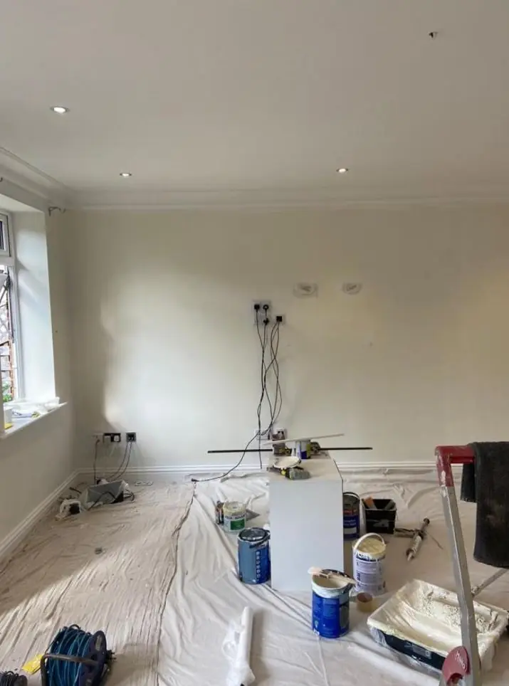
The sheen and type of paint matter as much as the shade. On old limestone and lime plaster, a breathable flat or matt mineral finish suits the surface, both technically and visually, because it takes on the soft, chalky look these walls have always had. A modern wipeable eggshell on the same wall can look plasticky and trap moisture. In the newer homes at Hayfield, Hanslope Fields, The Wheatfields and off Long Street Road, scrubbable matt emulsions on walls and a satin or eggshell on woodwork are hard-wearing choices for busy family rooms.
- Old stone cottage: breathable matt, warm whites and earthy heritage shades
- 1960s buff-brick house on Western Drive or Eastfield Drive: colours that work with the buff tone rather than against it
- New-build: free choice, with durable finishes on hallways and kitchens
Colour advice comes with our decorating work rather than as a separate design service. You can read how Dean approaches it on our main colour and finish advice page, and see the rest of what we cover locally on the Hanslope area page.
Last updated by Dean, DH Painter & Decorator.