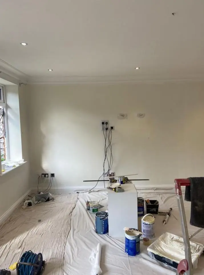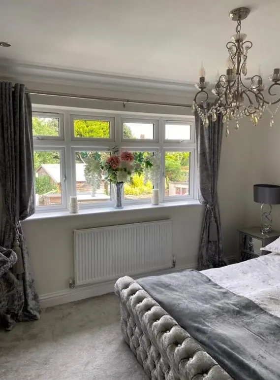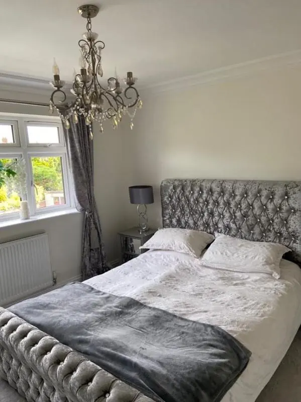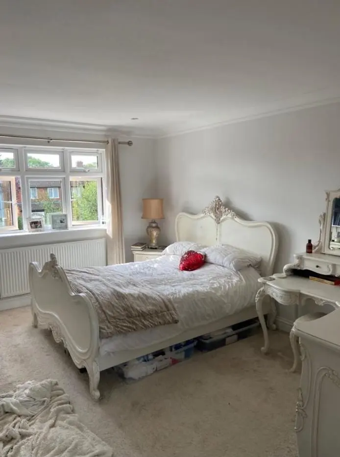
Dean offers colour and finish advice as part of decorating jobs in Paulerspury, the NN12 village about 9.8 miles south of Northampton town centre. Advice is built around the local limestone, the 23 listed buildings in the parish and the way light falls in deep-walled cottage rooms.
Start with the stone, not the colour card
Almost every older building in Paulerspury is limestone: coursed rubble on the 18th-century cottages, squared stone on the church and The Former Rectory, and fine ashlar on The Hunt House, which also has darker ironstone sills, jambs and heads. Roofs are slate, plain tile or straw thatch. Those materials are the fixed palette of the village, and any paint colour has to sit beside them.
Limestone of this kind usually weathers to a warm cream or buff, shifting with the light and rain. That warmth is why stark brilliant whites and cold blue-greys can look harsh on joinery against it. Softer off-whites with a touch of yellow or grey, muted greens, stone colours and deep traditional shades such as dark green or near-black on doors tend to settle in. Where ironstone dressings appear, as on The Hunt House, the stone itself should stay unpainted, and joinery colours can pick up its rust-brown tone without copying it.
When colour needs consent
The parish has 23 listed entries: the Grade I Chain Gate and lodges on the A5, the Grade II* Church of St James the Great and 21 Grade II buildings, many of them homes. Paulerspury has no designated conservation area in the sources we have checked, but listed status alone is enough to matter. Changing the external colour of a listed building, or its finish (say, from a traditional painted timber to something modern), may need listed building consent from West Northamptonshire Council. Changing the character of an interior may need it too.
So for a listed home, our advice comes in two parts: what will look right, and what you should check with the council before anyone opens a tin. The Barley Mow and No. 55 on High Street show the other side of this. Their limestone rubble frontage is already painted, so the question there is keeping the existing colour and a vapour-open finish, not introducing a new one.
Light inside thick stone walls
Cottage rooms in the village have small 2- and 3-light casements set deep into solid walls. The reveal cuts down the light, and what does come in falls at a narrow angle. Mid-tone greys can turn muddy in these rooms, and very pale colours can look dull rather than bright. Often the better answer is to accept the cosiness: warm, chalky mid-tones, or a lighter colour on the window reveal itself to bounce light into the room.
The taller early 19th-century rooms, with 12- and 16-pane sashes, behave quite differently. They take stronger colours, and they can carry period combinations such as a deeper wall colour with paler joinery.
Finish matters as much as shade
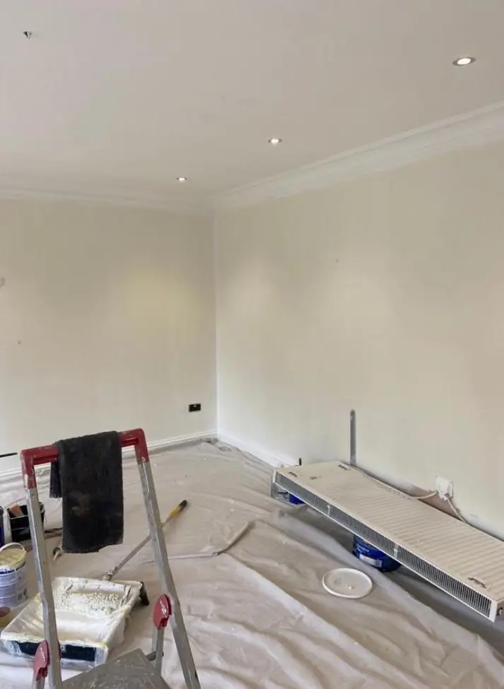
On old stone and lime plaster, the finish is not only about looks. Breathable mineral and clay paints tend to have a flat, chalky surface and a slightly softer colour than the same shade in a vinyl emulsion. That is worth knowing before you fall for a chip. We can paint test patches in the actual finish you will use, on the actual wall, and look at them morning and evening.
- Flat or matt for lime-plastered walls and ceilings
- Eggshell or satin for cottage casements and boarded doors
- Traditional gloss, if you want it, for front doors and sash joinery on the more formal houses
More on how Dean approaches colour choices is on the main colour and finish advice page, and the village’s buildings are described on our Paulerspury area page.
Last updated by Dean, DH Painter & Decorator.