Dean gives colour and finish advice as part of decorating jobs in Stoke Bruerne, a canal village about 6.6 miles south of Northampton. Outside, that means front door and window colours that sit with limestone, slate and thatch across two conservation areas; inside, shades that cope with low cottage light.
The village palette is already set by its materials
Stoke Bruerne’s look comes from a short list of materials: coursed limestone with some ironstone and red brick detail, thatch, red clay tile and Welsh slate. The slate arrived on the canal after 1805, and the lock-keeper’s house and Wharf Cottage were probably among the first roofs in the village to use it. Later came red brick: the 1879 Wesleyan chapel on Chapel Lane was built from George Savage’s village brickyard, and The Laurels on the same lane is brick too. Any exterior colour you choose is seen against those, so we start with the stone and roof above your door rather than a fan deck.
Brilliant white on timber casements can look stark against limestone. Softer off-whites, stone, putty and muted green or blue-grey shades usually settle in better, and front doors can carry a deeper heritage colour. Bare stone and the dry stone walls, some with cock and hen coping, define the conservation area, and the appraisal names unsympathetic repairs as a threat, so we won’t suggest painting them to match the joinery.
Listed buildings and two conservation areas
The Stoke Bruerne Conservation Area has three character areas, named for the canal, the Lanes and the Green. The Grand Union Canal Conservation Area overlaps it along the water, taking in the Navigation Inn, the lock bollards and Canal Cottage. Within it sit twelve listed buildings, and the Grade II entries in the village include Old Dower House, Rosebud Cottage, Canal House and The Boat Inn.
- Listed buildings: changing a front colour or stripping historic finishes may need listed building consent. Check with West Northamptonshire Council before committing.
- Unlisted houses in the conservation area: refreshing joinery in a colour close to the existing one rarely raises questions, but the appraisal flags the loss of traditional windows and doors as the main threat, so keep timber and choose colours that suit it.
- Article 4 directions: the appraisal suggests considering them for significant buildings, but none is confirmed in the published sources. It is worth asking the council if your house is prominent.
Colour by the water
The canalside buildings around the top lock face the towpath at two and three storeys, and they are among the most looked-at walls in the village. The pubs, restaurant, tearooms, gift shop and B&B guesthouses all trade here, mostly in conservation-area buildings and some listed. For these frontages a colour also has to cope with damp air off the canal and still look tidy after a season of visitors. Deeper, more saturated colours on doors and joinery tend to show weathering less than very pale shades, and a hard-wearing finish on handrails and door furniture is worth the extra coats.
Inside: thick walls, small windows and tree shade
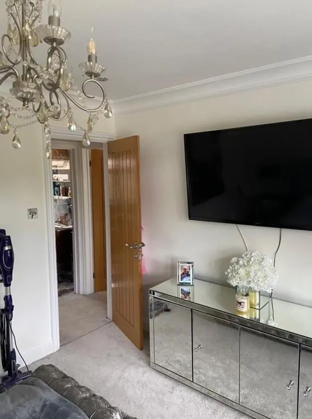
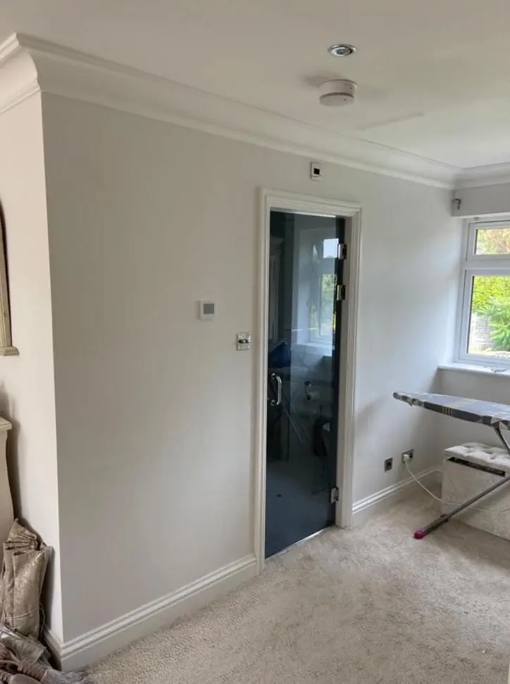
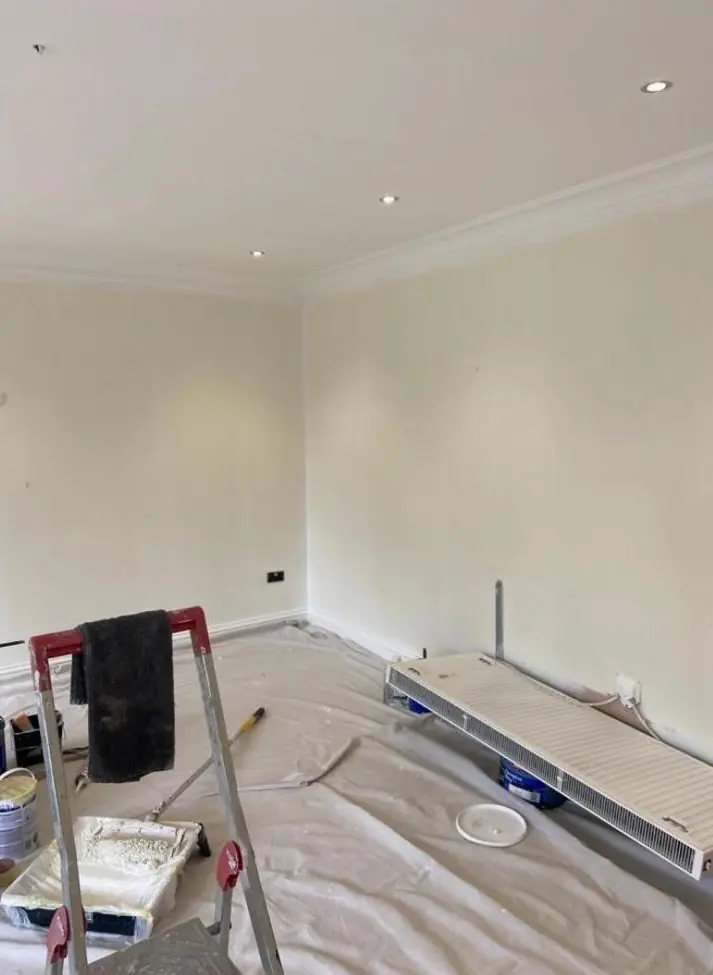
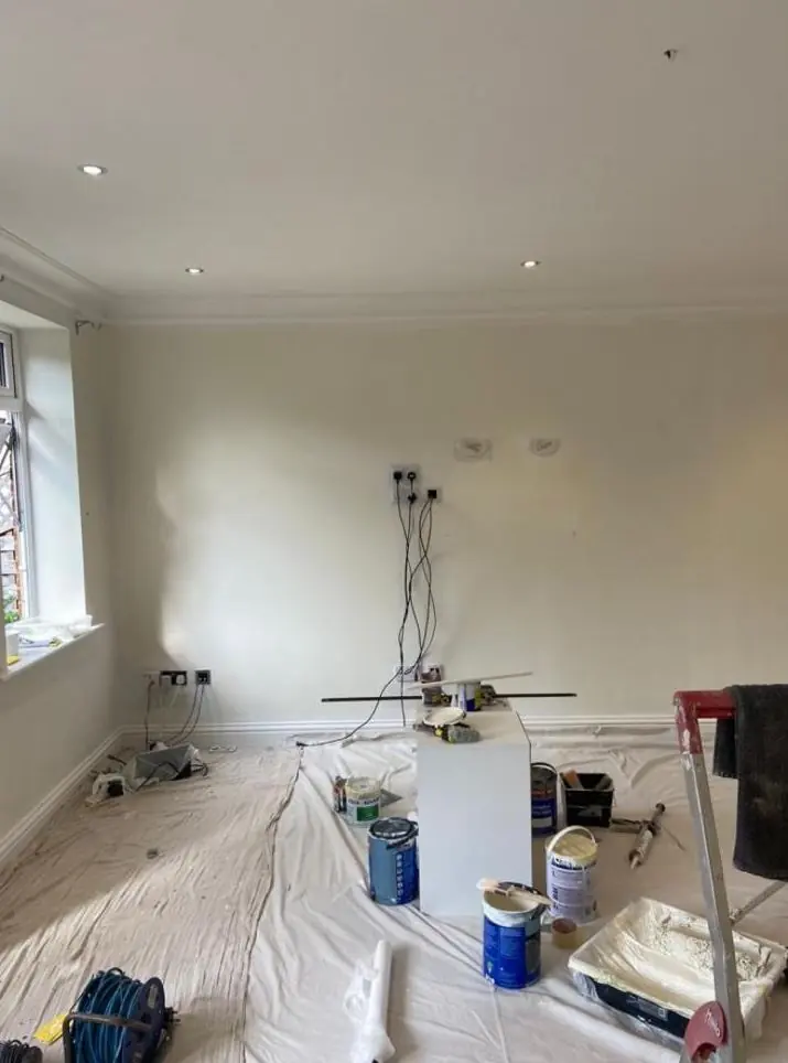
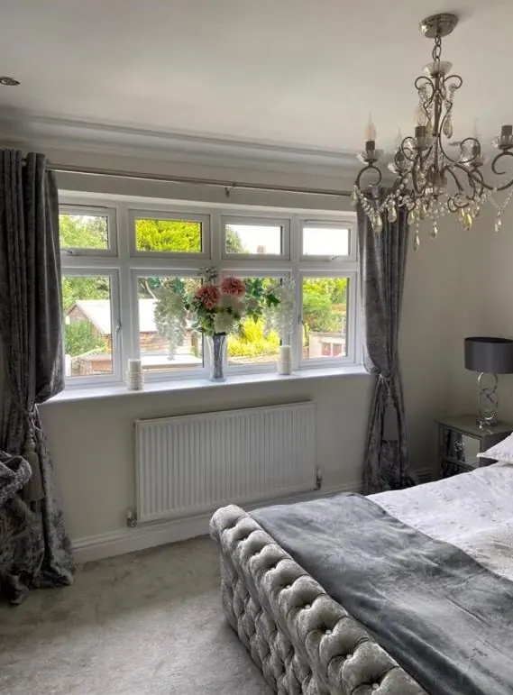
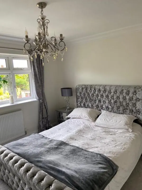
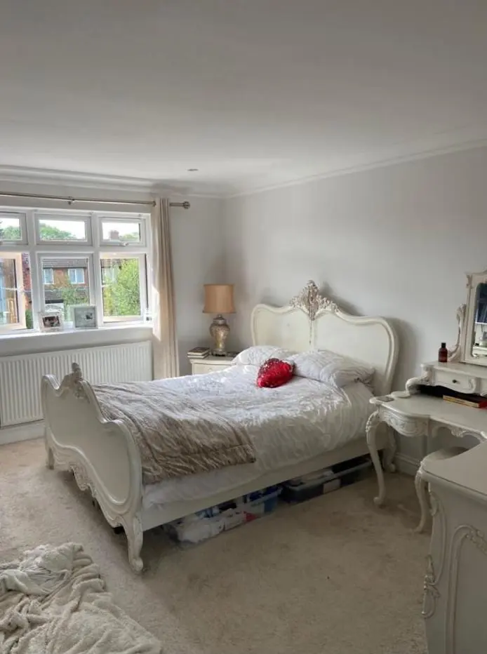
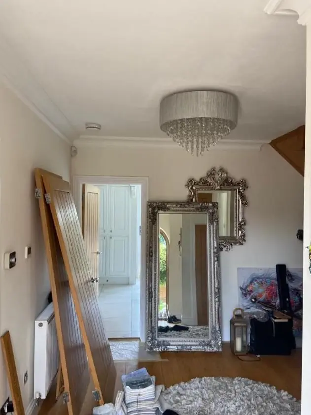
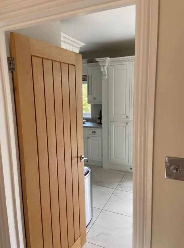
Indoors the challenge is light. Cottage rooms behind solid stone walls have deep reveals and small casements, and many plots sit under mature trees such as the canopy along Rookery Lane, so daylight is low and often green-tinged. Cool greys turn flat and gloomy in those rooms, while warm whites, soft earth tones and chalky flat finishes hold what light there is. The houses on Wentworth Way and the newer infill have bigger windows and can carry cooler or bolder schemes. We paint test patches in the room and look at them at the times you use it.
More on undertones, sheen and light direction is on our main colour and finish advice page. If you are still choosing who to hire, our guide on how to choose a painter and decorator may help, and the Stoke Bruerne area page covers our other work in the village.
Last updated by Dean, DH Painter & Decorator.