DH Painter & Decorator gives colour and finish advice in Hackleton, about 4.7 miles south-east of Northampton, as part of a decorating job. Dean helps owners of the limestone cottages on Main Road pick joinery colours that suit buff stone and ironstone, and helps estate homeowners plan rooms around light and furnishings.
Colours that sit beside buff limestone and ironstone
The look of Hackleton’s main road comes from its stone. The older houses are pale buff limestone laid in courses, and several, including Hackleton House, the White Hart, Pine Trees Farmhouse and Yew Tree Cottage, use darker ironstone for quoins, window heads or banding. Whatever colour goes on a front door, a casement or a porch hood in the old core will be seen right next to both. Brilliant white can look stark against warm buff stone. Soft off-whites, stone shades, muted greens and deep traditional colours such as dark green, navy or a dull red usually sit more comfortably with it.
The ironstone dressings themselves stay unpainted. They are part of the character of these houses, so the joinery colour should work with their orange-brown tone, not cover it.
Heritage paint for Main Road joinery
Hackleton has no conservation area, but the Neighbourhood Plan asks for traditional local materials in the historic stone core, and seven Grade II buildings stand along Main Road. For six-panel doors, pedimented surrounds, timber casements and the 12-pane sashes at Hackleton House, a heritage paint range offers colours made with period joinery in mind. On a listed building, keeping to the existing colour or something very close is the safe route. A marked change could need consent, so check with West Northamptonshire Council before committing. The butcher’s at No. 84 is a case in point: its hipped bay shop window is listed along with the 1754 house it is attached to.
Sheen matters as much as colour here. Panelled doors and moulded surrounds were made to catch light, and a satin or gloss picks out their mouldings. A completely flat finish on the same door can look dull and also marks more easily.
Low light inside the stone cottages
Thick limestone walls and small, deep-set casements keep daylight low inside the old cottages. Rooms facing the road often get light from one side only, and the cottages on the south side that sit below road level can be dimmer still. Pale colours with a warm undertone usually help. Very bright whites tend to look grey in poor light. Breathable and mineral paints, which suit solid walls, come in a narrower range than standard emulsion, so here the shade and the type of paint are chosen together. We paint sample patches on more than one wall and look at them at the time of day you use the room.
Low ceilings change how colour reads as well. A ceiling in the same soft tone as the walls, or a shade lighter, stops a small cottage room feeling boxed in, while a stark white ceiling above coloured walls draws attention to how low it is.
Estate homes: fewer rules, different questions
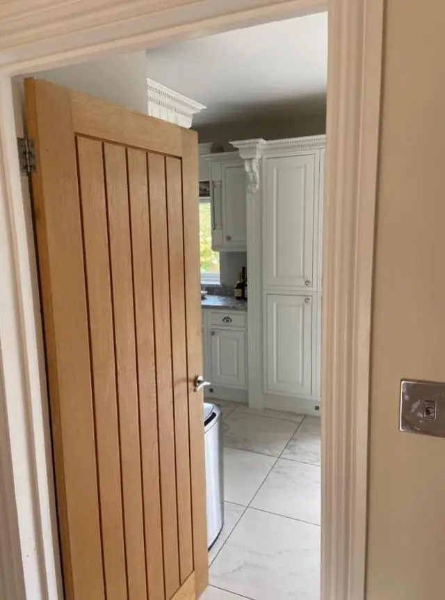
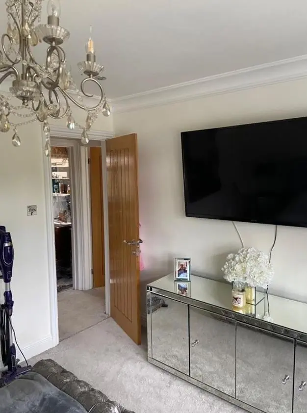
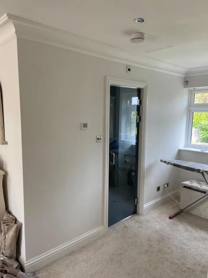
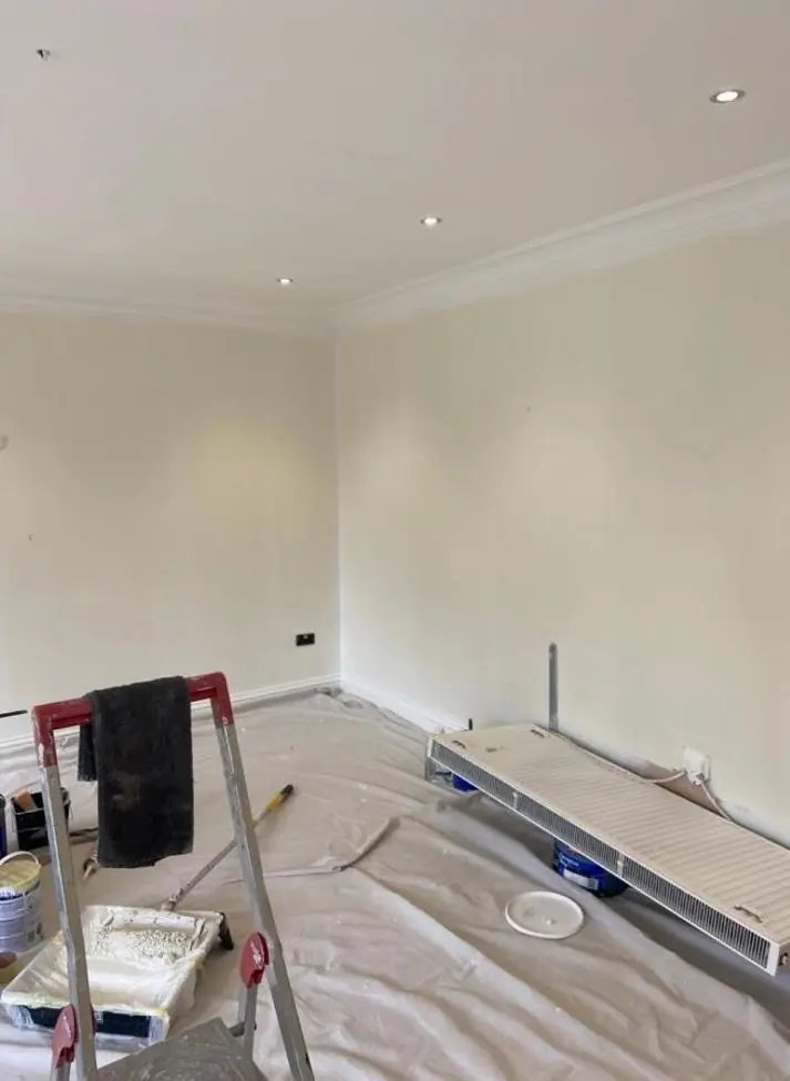
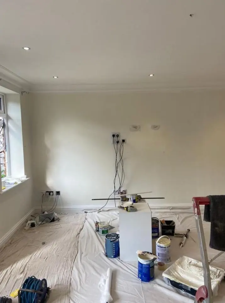
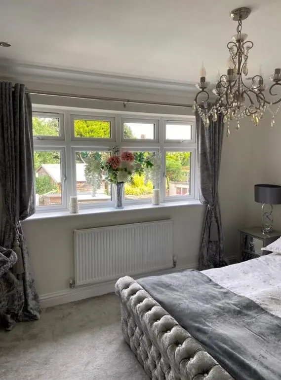
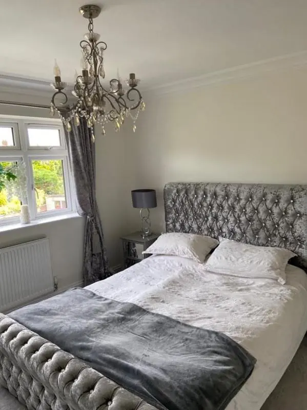
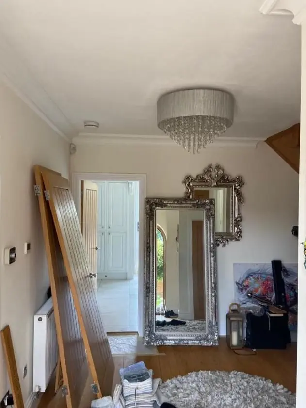
On the cul-de-sacs built between 1939 and 2000, and on the newer streets such as Oak Way, there is no heritage constraint. The questions become which way the room faces, what flooring and furniture are staying, and how hard the walls have to work. Hallways and landings in two-storey semis take knocks, so a wipeable eggshell or durable matt is worth considering there. Owners getting a house ready for new occupants often want calm neutrals that suit any furniture, and Dean can suggest shades that are not flat magnolia.
Our colour and finish advice page explains how we test undertones and sample colours. Dean gives this advice as part of decorating work in Hackleton, and our Hackleton page covers the other jobs we take on in the village.
Last updated by Dean, DH Painter & Decorator.