Dean gives colour and finish advice in Brixworth, the NN6 village 6.5 miles up the A508 from Northampton, as part of any decorating job there. In the conservation area that starts with the council's guidance on joinery colours; elsewhere in the village it is about light, the local stone and how a room is used.
The rules that come before taste in the conservation area
Much of old Brixworth lies inside the conservation area first drawn up in 1979. Its 2017 appraisal recommends that painted window joinery is white, or a sensitive colour based on the original. Two years later, in October 2019, Daventry District Council went further. On the houses named in its Article 4(1) direction, a new paint colour on the main elevation, or on any side seen from a road, waterway or open space, now needs planning permission. The named houses run along a dozen streets, from Cross Hill and Froghall to stretches of Holcot Road and Northampton Road.
In practice that means:
- Repainting front windows and doors in the existing colour is maintenance.
- Changing the colour of a front or roadside elevation on an Article 4 property needs planning permission first.
- Painting bare ironstone or lias is discouraged altogether, and so is render.
So before we talk shades for the outside of an older house in the core, we check whether the address is on the Article 4 list. If it is, colour advice becomes a question of matching or recovering the original, and of choosing a good white rather than any white.
Not all whites suit warm stone
White painted timber casements are the village norm, but a brilliant white can look harsh against the gold-to-orange of Northamptonshire ironstone and the grey-buff of lias. Softer, slightly warm whites tend to sit more comfortably in the stone and age more gently. Where a house still has old paint layers on the joinery, it is sometimes possible to see the earlier colours under the current coat, which gives a basis for the original-colour route the appraisal mentions. Front doors on cottages, often plank doors, can carry more colour, but the same Article 4 caution applies on named properties.
Using the stone as a reference indoors
The ironstone itself is a useful starting point for interiors, especially in houses where it shows around window reveals or in a fireplace wall. Earthy colours drawn from it, such as ochres, muted terracotta and warm stone neutrals, tend to look settled in these houses, while cold blue-greys can fight it. In one-room-deep cottages with small windows and deep reveals, the light is limited, so the depth of a colour matters as much as its hue.
Light under the trees and on the open plateau
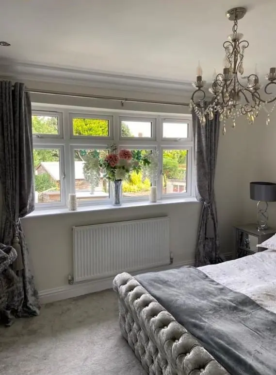
Brixworth sits high on an undulating plateau, with open countryside and a Special Landscape Area to the west. Houses on that side and around the high ground near All Saints’ get broad, clear light. By contrast, the conservation area has around 59 tree preservation orders plus 9 TPO groups, and Brixworth Hall Park keeps its mature parkland planting. Rooms that look into heavy tree cover get green-tinted, filtered light, which can make greys go cold and some whites look slightly green. Sample patches on two walls, checked at different times of day, matter more here than in an open site.
Free choice on the newer estates
Outside the conservation area, in the brick housing built from the 1960s onwards to the south and east, there are no colour controls on ordinary houses and the advice is purely practical: aspect, how the room is used, and finish. The brick is a useful guide here too: red brick houses take warmer neutrals and deeper door colours well, while buff brick suits paler stone and putty shades on windows and doors.
Our main colour and finish advice page covers how light direction changes a colour. Everything else we offer locally is gathered on the Brixworth hub.
Last updated by Dean, DH Painter & Decorator.