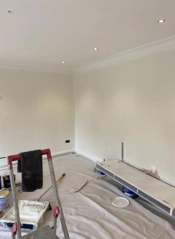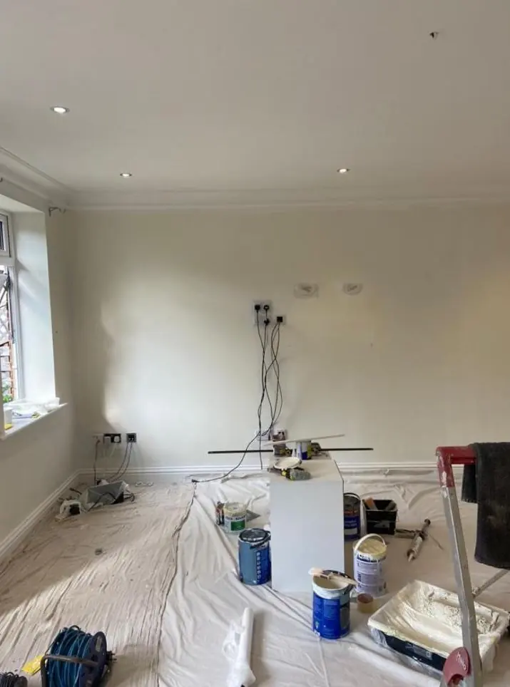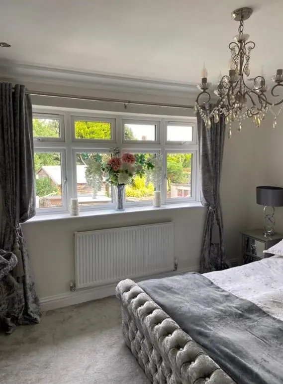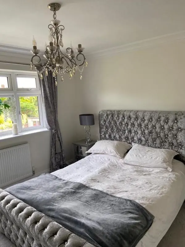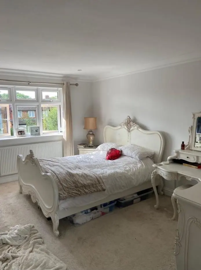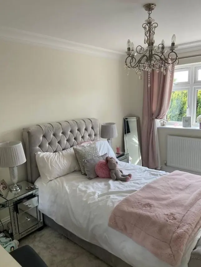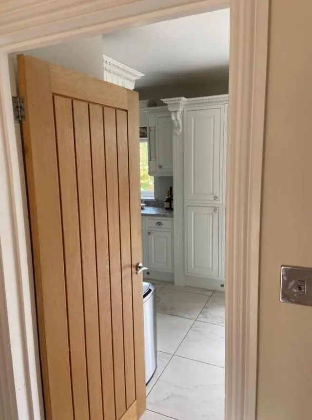
Dean gives practical colour and finish advice to homeowners in Creaton, 7.8 miles north of Northampton, as part of a decorating job. Outside, choices in the conservation area are shaped by council guidance; inside, they depend on the walls, the light and the paint the surface can take.
In most places colour advice is a question of taste and light. In Creaton’s historic core there is a third factor: the 2021 Creaton Conservation Area Appraisal and Management Plan, which sets out what suits the village’s buildings. Dean gives this advice as a decorator choosing paint for a real job, not as an interior designer. More on how that works is on our colour and finish advice page.
What the appraisal says about windows, lintels and walls
The conservation area takes in about 8.2 hectares: The Green, High Street and parts of Brixworth Road, Violet Lane and Welford Road. Its guidance that bears on colour is fairly specific:
| Surface | Guidance | What it means for your colour choice |
|---|---|---|
| Window frames | White, or a colour based on the originals | Bold modern greys or blacks on sashes and casements are unlikely to fit |
| Timber lintels | Painted black or white, a village feature | Keep to whichever the house has; re-coat in the same colour |
| Polychrome brick | Should not be painted or rendered | Applies to The Manse, Woodbine Cottage, 8 The Green and the United Reformed Church |
| External walls | Painting and rendering should be avoided | Bare ironstone stays bare; colour goes on joinery and ironwork |
The appraisal also proposed Article 4 Directions on named buildings, which would cover painting exterior walls, but at adoption these were only being explored. No confirmed direction has turned up in our checks. If a wall is already painted and you want a new colour on it, ask West Northamptonshire Council whether anything now applies to your building. Owners of the listed houses, Morningside Cottage or the Manor House for example, may also need consent to alter a finish.
Working with ironstone and orange brick
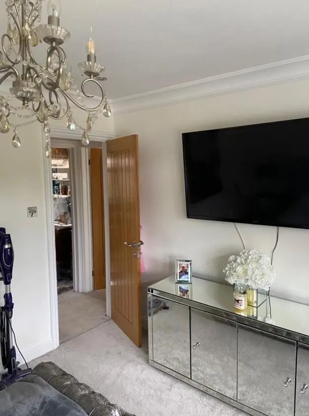
Creaton’s palette is already set by its materials: rust-brown ironstone from the Northampton Sand Formation, orange/red brick from the two village brickworks, and grey Welsh slate. A door colour has to sit against that. Warm stone tends to make a cold blue-grey look harsh, while deep greens, muted reds and off-whites with a little warmth usually look settled. A stark brilliant white beside ironstone can glare, so on doors and gates we often suggest a softer white with a touch of warmth. On window frames, though, the appraisal limits you to white or the original colour, so keep that choice within what is allowed. We bring sample pots and paint test patches against the actual stone, because a chart held up in a kitchen tells you little about how a colour sits on a wall outside.
Light on the ridge, and walls that limit the finish
The village sits at about 125m on a ridge with long views east, north-east and north, so plenty of rooms look east or north. North-facing rooms get cool, even light that can turn pale greys flat; colours with a warm undertone hold up better there. Mature trees on The Green and around the larger houses also shade some rooms.
Inside the cob and ironstone cottages, the wall decides the finish before you choose the colour. Limewash and breathable mineral paints come in a narrower range than vinyl emulsion, and limewash dries noticeably lighter than it goes on. We show you a dried sample before committing. In the post-war homes set back along Brixworth Road and in Court House Close, outside those limits, every finish is open to you.
For other work in the village see our Creaton area page.
Last updated by Dean, DH Painter & Decorator.