Dean gives colour and finish advice as part of decorating jobs in Walgrave, NN6, about 7.9 miles north-east of Northampton. On the village's listed lias buildings that means heritage-led colours and consent checks, while the 20th-century streets allow a much wider choice.
Start with the stone, not the colour card
The building material that dominates Walgrave’s historic core is lias, a local limestone that weathers to a warm brown, laid in squared courses and sometimes banded with paler limestone ashlar, as on Walgrave House on the High Street. Any colour on doors, windows, gates or render is seen against that stone. A shade that looks crisp on a chart can look harsh beside it, and a pure brilliant white on window frames often reads blue and stark against brown stone.
For joinery on the older houses, Dean usually steers people towards softened whites, stone and putty tones, deep greens and muted blues that pick up the earth tones in the lias. Tested against the actual wall in daylight, a sample tells you far more than any screen. We paint larger samples on card so you can hold them against the stone at different times of day without marking the house.
Listed buildings and like-for-like colours
Holcot Road alone has three listed houses (Cross Farmhouse, The Old House and The Hollies), and the parish total is 18 entries, from St Peter’s Church at Grade I to The Old School on Gold Street and Walgrave Hall Farmhouse on Hannington Road. With no conservation area recorded for the village, the colour rules come from listing: on a listed house, a visible change of external colour may require consent, and the council is the body to ask. Repainting in the existing colour is the safe default, so if you want something different, raise it with the council before the job is booked.
- Leaded-light casements under timber lintels, as at Cross Farmhouse, suit quiet traditional colours in a microporous finish rather than heavy high-gloss.
- Sash windows like those at The Hollies, a brick house with a slate roof, traditionally take white or off-white, with the front door as the place for a stronger colour.
- Cast iron, like the 19th-century arch-headed windows set in brick dressings on Gold Street’s Old School, looks right in dark greys, blacks or deep greens.
- Gates on listed stone piers, like those at Walgrave Hall Farmhouse, should stay in traditional dark colours.
More freedom on the later streets
Houses on Jubilee Drive (around 1929), Townsend Road and Springfield Road (around 1949), Amber Drive (around 1975) and the infill closes such as Walker’s Acre and Manor Farm Close are not listed, so the choice is yours. Even so, the setting still counts. Gardens here look out over farmland and towards big trees such as the Home Field Oak, and against that backdrop greens, greys and soft neutrals on rear walls and fences sit back rather than shout.
Light inside a village on a hill
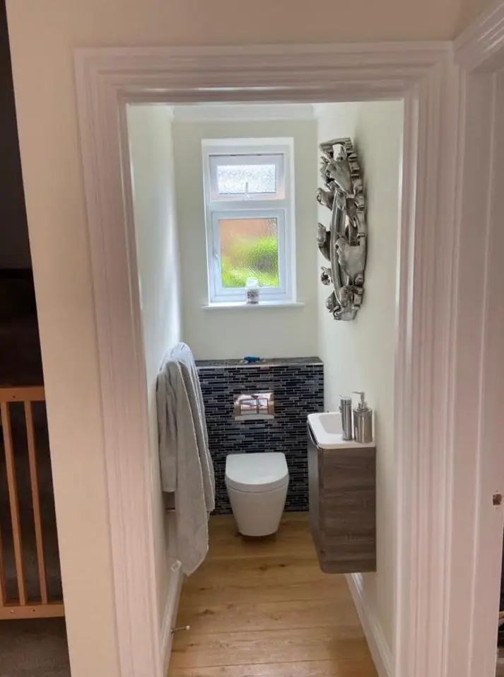
The historic core is on higher ground around the church, and older houses often have small windows set deep in thick walls. Those rooms get less light than their size suggests, so cooler greys can turn flat and cold. Warmer whites and colours with a yellow or red base usually hold up better. Newer houses with larger windows can carry cooler or deeper shades without feeling gloomy. Finish matters too: flat or matt finishes suit uneven old plaster because they don’t show every ripple, while eggshell copes better in busy kitchens and hallways.
Our colour and finish advice page explains how Dean judges light direction and undertone in any room. For more about painting in the village, see our Walgrave area page.
Last updated by Dean, DH Painter & Decorator.