Dean gives colour and finish advice as part of decorating jobs in Wootton (NN4), around 2.4 miles south of Northampton town centre. In the conservation area that means shades that suit local stone and traditional limewash tones; on the modern estates it covers room colours, sheens and front doors.
Let the stone set the palette
The old village is built of two stones side by side: a warm, iron-rich sandstone and a pale limestone, sometimes laid in striped courses, under Welsh slate or clay pantile roofs. Any painted element in the conservation area, from a front door to a casement or a garden gate, is seen against that background. Colours that work here tend to come from the same family: soft off-whites with a little warmth, putty and stone shades, muted greens, and deeper earth tones on doors. Brilliant white on casements against ironstone tends to look harsh, and very cool greys can look dull beside the orange-brown of the rubble.
The council’s 2010 appraisal of the village says coatings rarely belong on Northamptonshire stone; at 20 High Street the render was even taken back off so the rubble could be seen. So the most useful colour advice for a bare stone cottage is often to leave the walls alone and put the thought into the joinery.
Limewash and colourwash on listed fronts
A handful of buildings are traditionally washed rather than left bare: colour-washed rubble at 20 High Street, colour-washed brick and stone at 16 and 18 High Street, and whitewashed brick at 11 Church Hill. These are listed, so renewal should be like-for-like in limewash or a traditional colourwash, after checking with the council about consent. Lime-based colours use earth pigments and dry far lighter than they look when wet, so we test on a small patch and let it dry fully before anyone decides.
Light on a south-facing slope
Wootton falls gently south towards Wootton Brook, and many houses have a front and a back that get very different light. Inside, south-facing rooms take warm sun for much of the day, which lifts pale colours and can wash them out, while north-facing rooms stay cool and grey. Outside, south-facing paint fades faster, and shaded north faces, along with walls under the churchyard yews or the trees on Church Hill and Green Lane, stay damp and green for longer. Our usual suggestions:
- slightly deeper or warmer interior tones on the north side, so they do not read cold;
- fade-resistant, mid-depth colours for south-facing doors instead of strong reds or dark blues that bleach;
- a sheen and paint type chosen for each surface, not only a colour, because a microporous gloss on a casement behaves differently from a flat mineral paint on a wall.
Newer homes beyond the old core
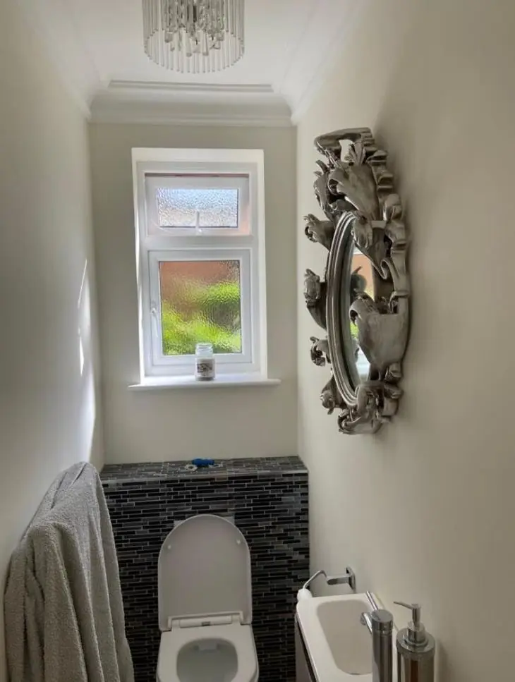
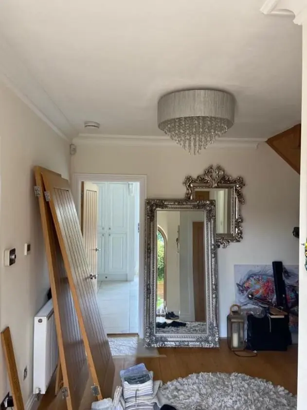
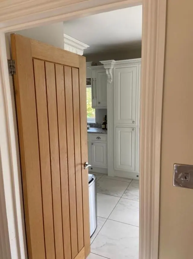
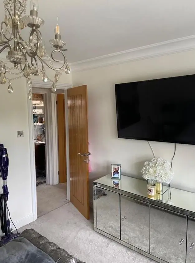
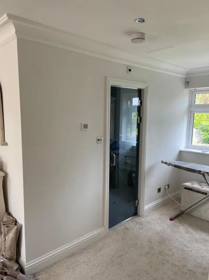
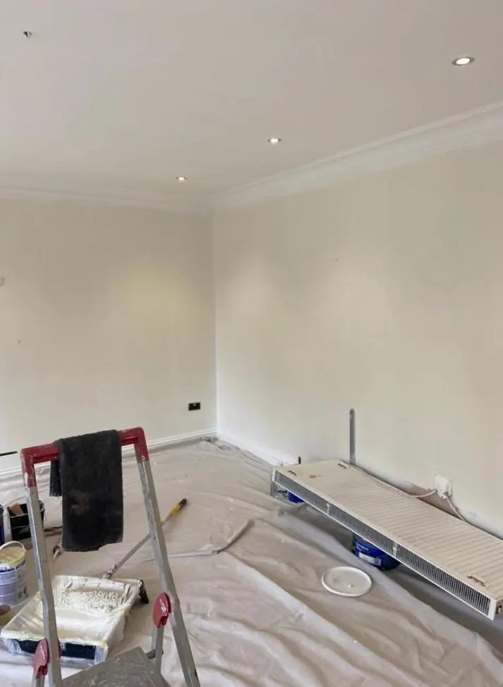
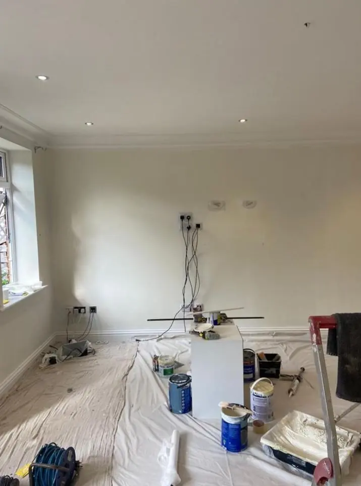
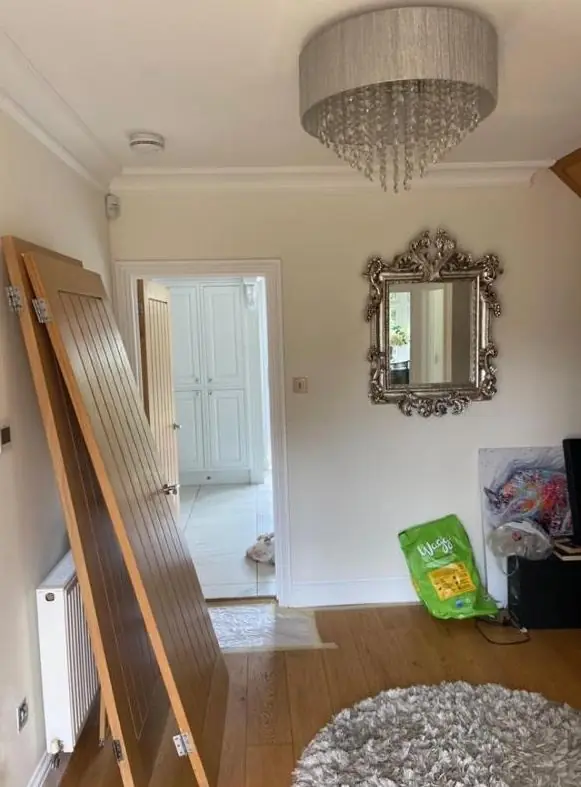
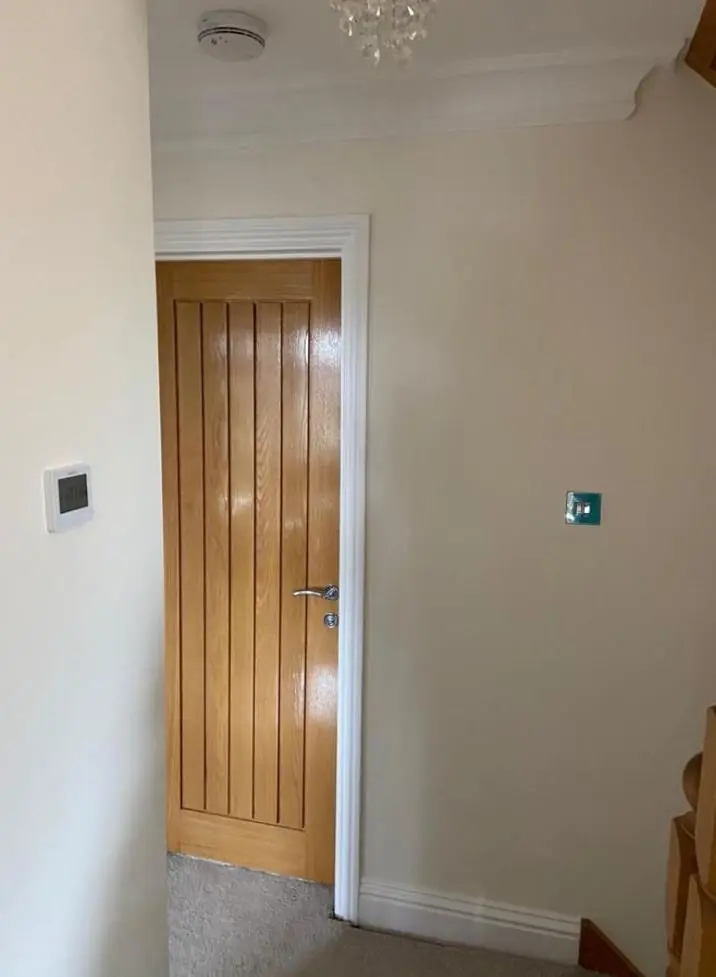
Wootton Fields, Simpson Manor and the other estates are a different exercise. Most of these houses sit outside the conservation area, so the advice is about the room itself: a warm white for a north-facing lounge, a hard-wearing finish for a busy hall, or one colour carried up a three-storey stairwell so the top landing does not feel like a separate house. Front door colours can still take a cue from the old village a short walk away. In open-plan ground floors, Dean usually suggests one base colour with a deeper accent at a natural break, such as a chimney breast or the wall behind the dining table, so the rooms still feel connected.
Colour advice comes with the decorating work we quote for, and the wider approach is set out on our colour and finish advice page. The Wootton page lists the other services we offer here, and our guide to choosing a decorator covers what to ask at the quote stage.
Last updated by Dean, DH Painter & Decorator.