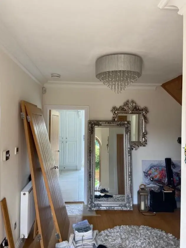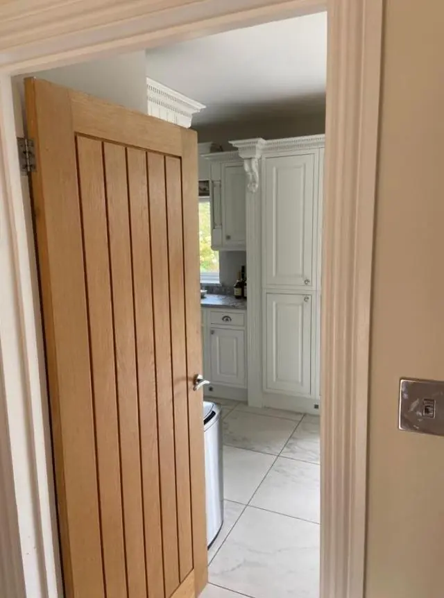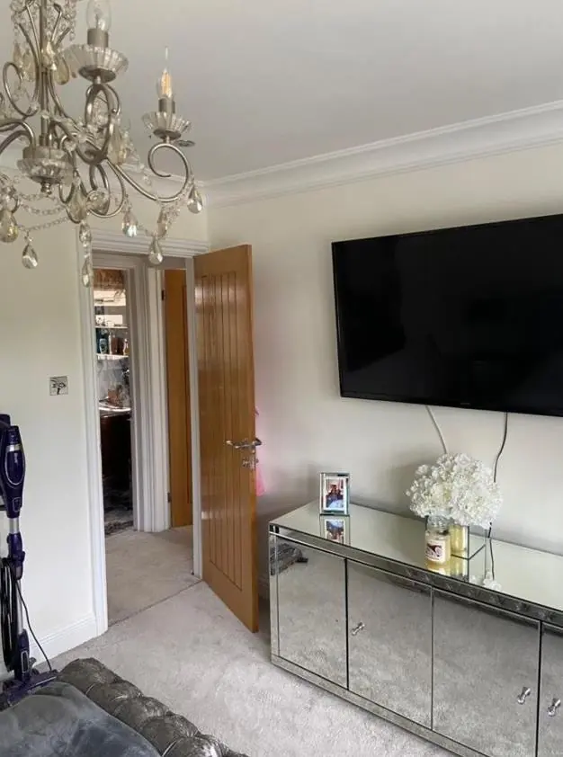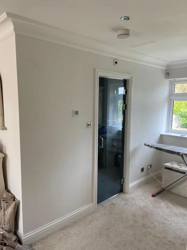
Dean gives colour and finish advice as part of decorating jobs in Harlestone, the NN7 village 4.3 miles north-west of Northampton. Outside, the local stone and conservation-area guidance narrow the choice, and inside, solid walls and tree-shaded rooms change how colours read.
Start with the stone
Almost every old building in Harlestone is built of lias, a honey-coloured local stone, laid as squared coursed walls or smooth ashlar on the grander buildings. That warm, slightly golden tone is the background against which every exterior colour is judged. Cool blue-greys and stark modern greys can look harsh next to it. Off-whites with a little warmth, soft stone colours, muted greens and deep traditional colours on doors tend to sit comfortably beside the walls.
The stone itself shouldn’t be painted. The 2017 conservation area appraisal ties unsuitable masonry paint to historic walls losing their ability to dry out, so colour advice here is mostly about joinery, metalwork and the few rendered buildings, such as the pebble-dashed half of Cotherstone Lodge and the pale render of the Village Institute.
White frames, bright doors and the Article 4 question
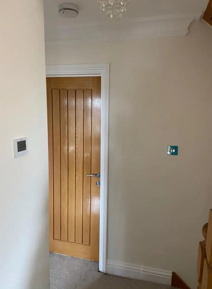
Window frames are the tightest constraint: the conservation area guidance asks for white or a sensitive colour, and most frames in the village are white already. Front doors are more varied. The appraisal records some in bright colours and some left natural, so there’s more freedom on a door than on a window.
There is a catch. The appraisal proposed an Article 4 Direction that would remove permitted development rights for painting a house exterior that hasn’t been painted before, or for a significant change of colour, and we have found no record of whether it took effect. Before you choose anything that’s a clear departure from what’s there now, check with West Northamptonshire Council. We’d rather pause a job for a phone call than repaint a front in the old colour.
- Windows: white or a soft off-white, unless the council agrees otherwise.
- Doors: heritage colours or a natural oiled finish on plank and panel doors.
- Estate cottages: the cast iron diamond-pane casements look right in a single dark or neutral colour that keeps the glazing pattern clear.
- Swedish Houses: the timber cladding looks right kept in a dark, consistent stain.
Inside: tree shade, solid walls and small rooms
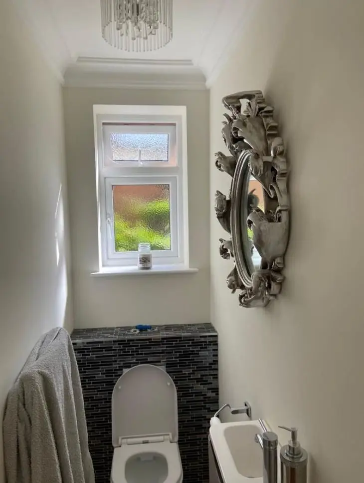
Harlestone sits in a wooded valley, with Harlestone Firs and tree belts around the two settlements and mature trees near the Rectory and the old parkland. Rooms facing those trees get a filtered, slightly green light, which can make cool greys look murky and pale whites look dull. Warmer neutrals with a yellow or red undertone usually hold up better. We look at sample patches at the time of day you use the room, not at midday on the doorstep.
Finish matters as much as colour in the old cottages. A flat or matt breathable paint suits lime plaster and hides the gentle unevenness of a 17th or 18th century wall, while a sheen picks out every ripple. On the Victorian and Edwardian brick houses on Port Road, satin or eggshell on woodwork and a period colour on the walls fit the age of the building.
Finishes for timber and metal, not just colour
The choice of product affects how a colour ages. Timber sashes and casements here suit microporous or linseed-type paints that let old wood breathe, and along the A428 traffic grime means a mid-tone hides dirt better than brilliant white on a door. Cast iron needs a rust-inhibiting system, and limewash is an option where a wall has already been limewashed.
Dean’s advice comes as part of a decorating job rather than as a separate design service. You can read how he approaches light and undertone on our main colour and finish advice page, and there’s more about the village on our Harlestone page.
Last updated by Dean, DH Painter & Decorator.