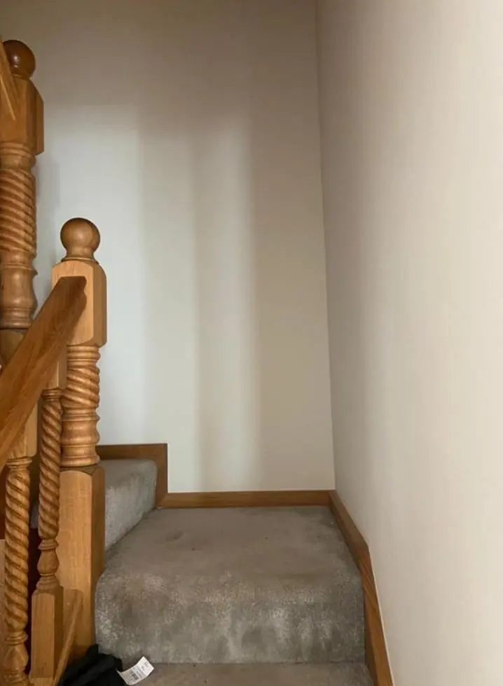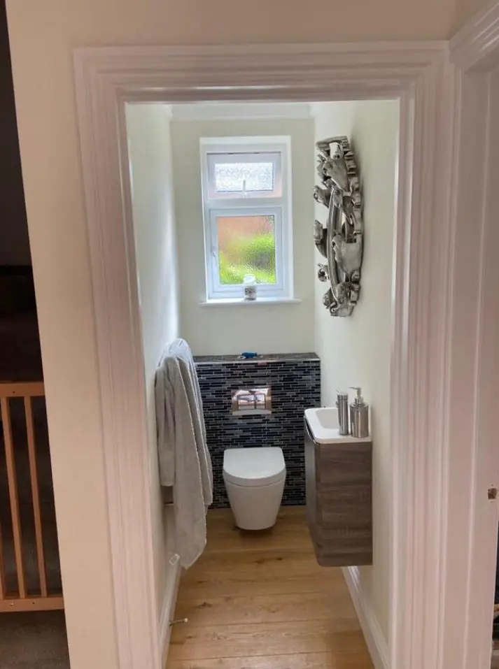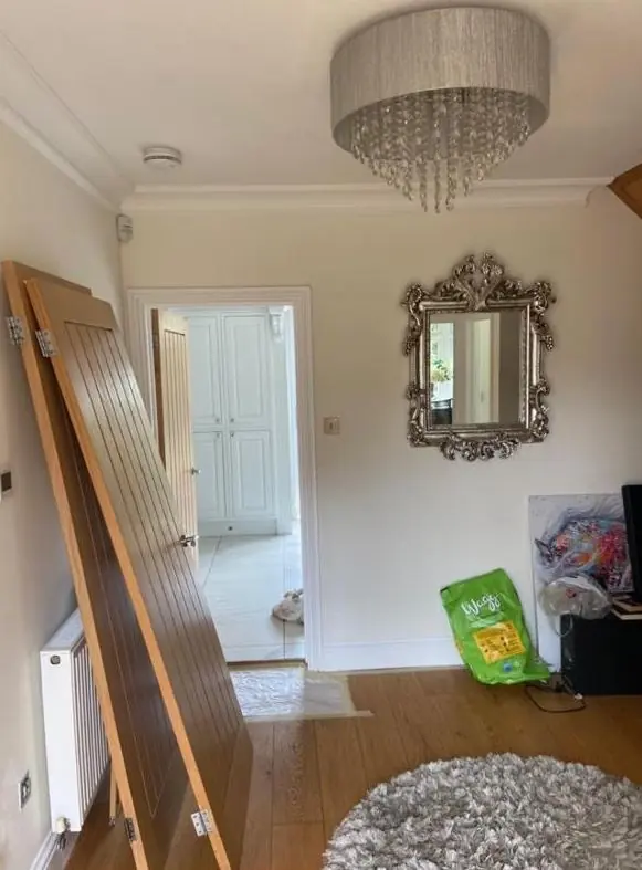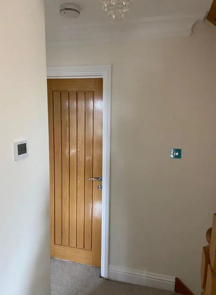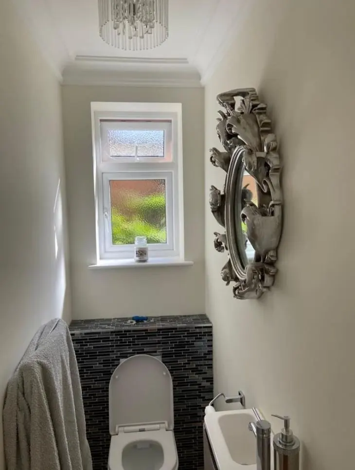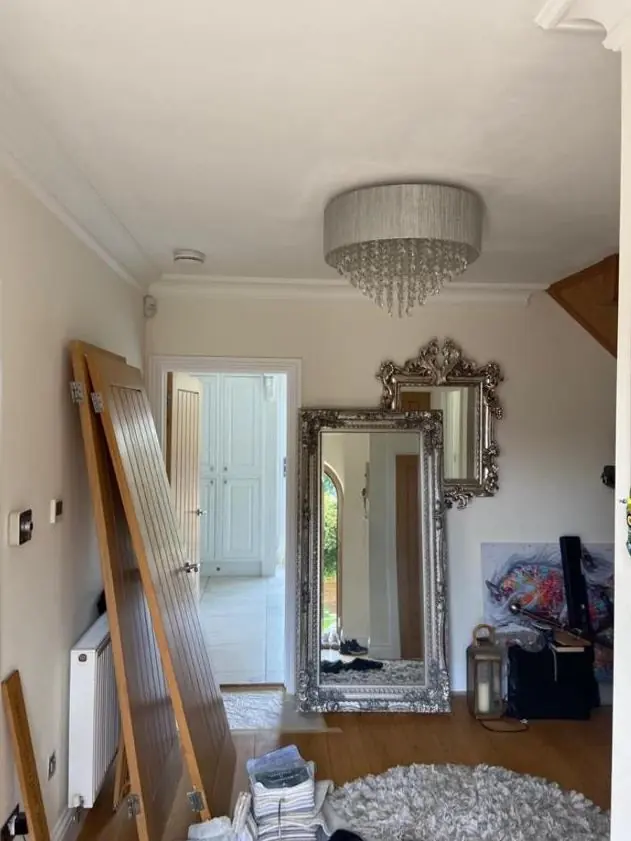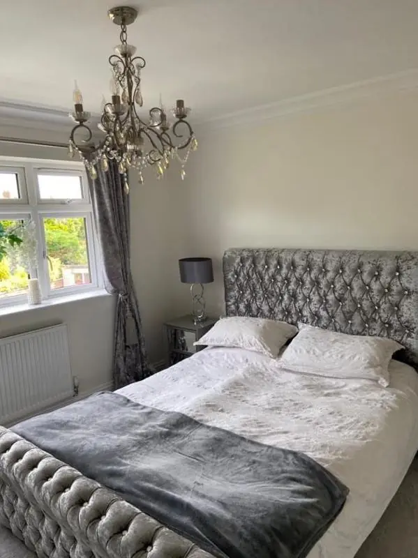
Dean gives colour and finish advice as part of decorating work in Milton Malsor, about 3.2 miles south-west of Northampton. Outside, colours need to sit well with warm ironstone, limestone, thatch and pantile, and listed houses may need council agreement. Inside, the advice is mostly about light and sheen in low, thick-walled rooms.
Starting from the stone, thatch and roof
Milton Malsor’s conservation area, designated in 1991 and last amended in 2015, covers High Street, Green Street, Collingtree Road, Rectory Lane and Malsor Lane. Its colour comes from coursed ironstone, a rusty orange-brown, mixed in places with paler limestone. Roofs are a mix of thatch, slate, pantile and plain tile. Most of those materials are never painted, so the painted parts of a house, such as sashes, casements, plank doors, porches and gates, are what you can choose. They are seen against all that warm stone.
When Dean looks at an exterior here, he looks first at the wall and roof the paint will sit beside, then at what the neighbouring houses have done, because the street is seen as a whole. As a starting point:
- Ironstone has a strong orange cast, so cool blue-whites can look harsh beside it. Softer off-whites and creams usually sit better on window frames.
- Next to brown thatch and red pantile, muted greens, greys with a little warmth and dark reds tend to look settled rather than loud.
- Ironwork such as gates and railings usually looks right in black or a very dark colour.
We paint trial patches on the actual door or frame and look at them in daylight. A swatch held up indoors tells you very little about how a colour will look against rubble stone.
When a colour change needs permission
Milton Malsor has 34 to 35 listed buildings, including the Grade II* Church of the Holy Cross and Grade II houses such as The Old Rectory, The Grange and Milton House. On a listed house, changing an external colour, the type of finish, or stripping paint may need listed building consent from West Northamptonshire Council. We check this before quoting and suggest you speak to the council first if the change is significant. None of the sources we have seen mentions an Article 4 direction in the village, but the council can confirm what applies to your address.
Painted render and stone bring a further choice. Houses such as the Manor House, which is rendered ironstone, and The Compass, which is painted rubble, need breathable mineral or lime-compatible paints, and those come in a narrower range of colours than ordinary masonry paint. Choosing the paint system first and the colour second saves disappointment.
Colour inside thick-walled cottages
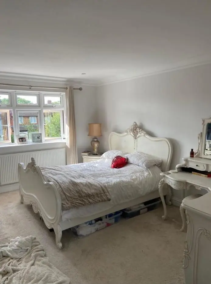
The older cottages have small casements, leaded lights and deep stone reveals, so less daylight reaches the back of the room. Pale greys with a cool base can look flat and dull in that light. Warmer whites, soft stone shades and light earthy colours usually keep a low room feeling bright. Beams and exposed timber also change things. Against dark oak, a bright white looks stark, while a slightly broken white looks more natural.
The newer infill houses and extensions are a different job, with larger windows and more even light, so a wider range of colours works. Where an extension opens off an old cottage, we often suggest one family of colours through both, adjusted a shade lighter or darker on each side.
Sheen on old plaster and joinery
Gloss level matters as much as colour on uneven surfaces. On bowed lime plaster, a flat matt hides the undulations and a mid-sheen picks every one out. On sashes, six-panel doors and classical door surrounds, an eggshell or traditional gloss suits the period and stands up to handling. We say which finishes are breathable as part of the advice.
More on how we approach colour is on the colour and finish advice page, and the Milton Malsor page describes the village’s houses. If you also need to plan the cost, see our painter and decorator cost guide.
Last updated by Dean, DH Painter & Decorator.