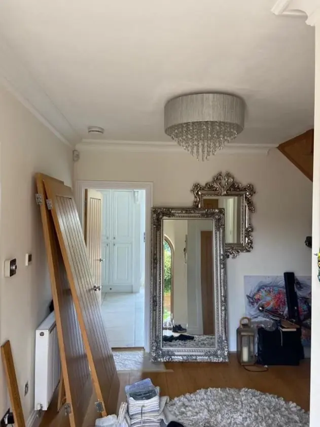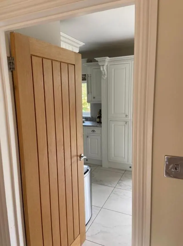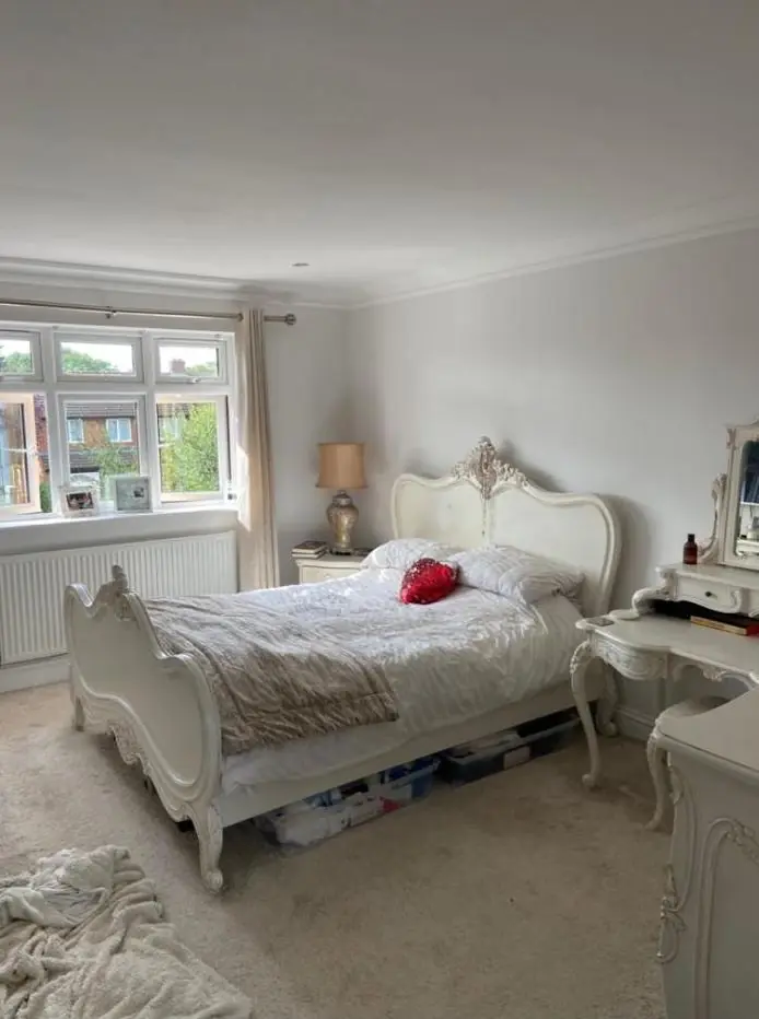
Dean gives colour and finish advice as part of decorating jobs in Blisworth, around 4.6 miles south-west of Northampton. Outside, that means choosing joinery colours that suit limestone, ironstone and the conservation area's guidance; inside, it means shades that still work in small-windowed cottage rooms and in brighter estate houses.
Starting from the stone, not the colour chart
Most houses in Blisworth’s old core are coursed limestone rubble with bands of darker, rust-brown ironstone, and the walls are meant to stay as bare stone. Stoneacre on High Street is the example usually quoted for this banding. That fixes the background for every outside colour. Joinery paint is chosen to sit with a warm honey stone and an orange-brown band, and against thatch, slate or clay tile above.
In practice, a pure brilliant white on window casements can look harsh next to warm stone, while off-whites, soft creams and muted greens, greys and blue-greys tend to settle in. Front doors can take deeper colours, but very bright modern shades sit awkwardly on a street of 17th-century cottages. We bring physical samples and look at them against your walls, outside and in daylight, before anything is ordered.
What the conservation area asks for
The conservation area appraisal West Northamptonshire adopted in September 2015 encourages owners to keep traditional materials and asks for a historic palette in the core. Four houses on Stoke Road (Nos 8, 10, 12 and 14) and four on Courteenhall Road (Nos 13, 15, 17 and 19) fall under Article 4 Directions that take away the usual permitted development rights. If your home is one of these, check with West Northamptonshire Council before changing the colour of external joinery. The same caution applies to the listed buildings in the village. Repainting in the existing colour is the safe default; a change is worth discussing with the council first.
Gates set into the village’s stone boundary walls are a good place to use a traditional colour. The walls themselves should stay unpainted, so the gate becomes the one painted element in a long run of stone.
Inside a cottage with small windows
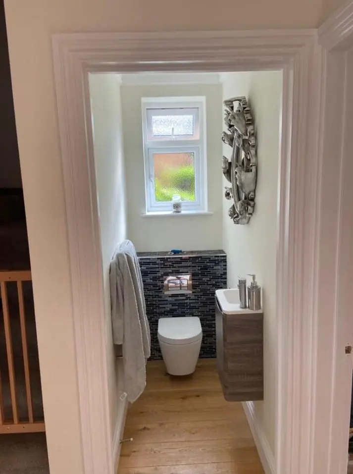
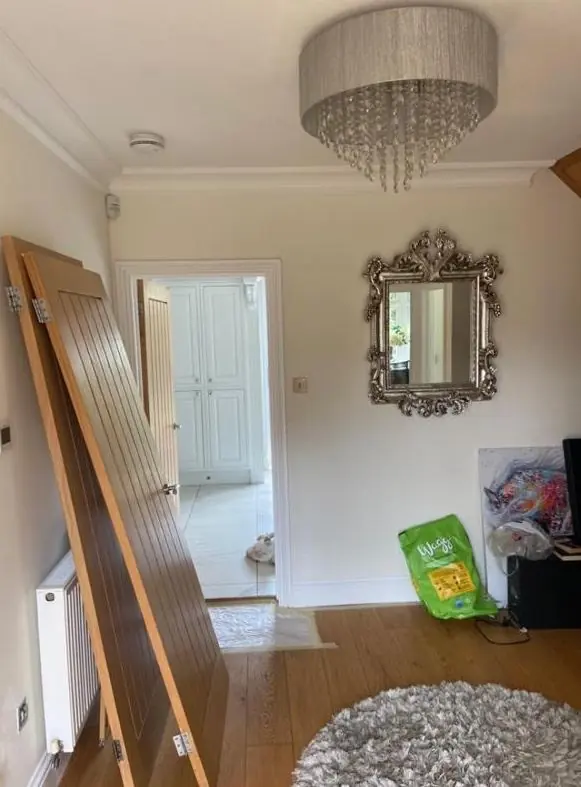
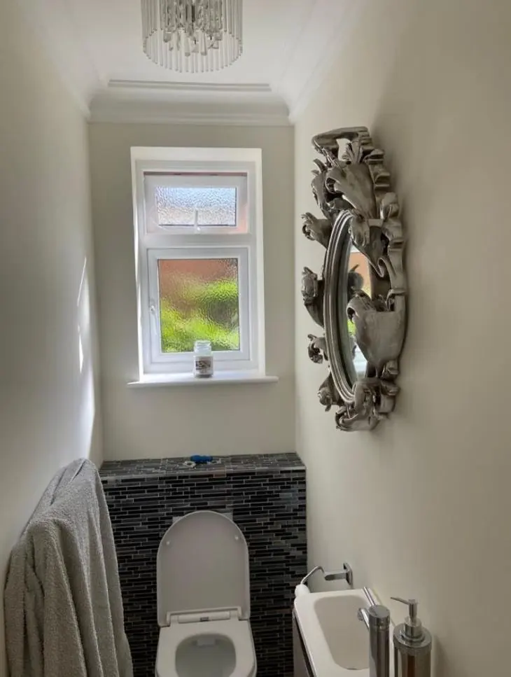
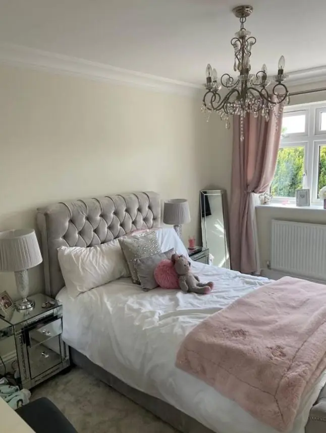
The older cottages have thick walls, small windows and low ceilings, so they take in far less daylight than a modern room of the same size. Colours read darker and greyer than they do on the card. Cool greys in particular can go flat and cold. In these rooms we usually suggest warmer whites and soft, slightly earthy neutrals that hold some light, with the woodwork a little lighter or darker to give shape to a room that has few straight lines.
Finish matters as much as colour. A flat or matt breathable emulsion hides the undulations of lime plaster, whereas a sheen picks out every ripple. On listed interiors, a traditional flat finish is also the more appropriate choice.
Light changes across the village
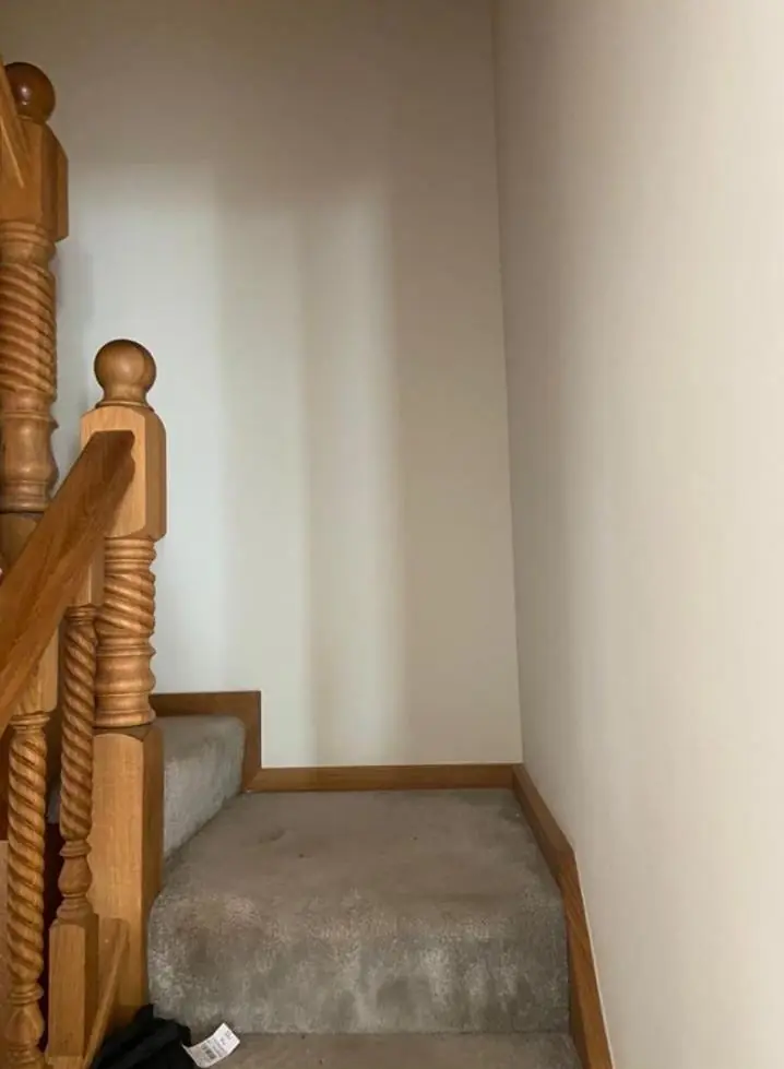
Blisworth sits on rising ground, and buildings south-west of High Street stand noticeably higher than the canal side. Houses up there get more open light, while mature trees cluster at the west end by the church, Blisworth House and the former rectory, which can cut light to nearby rooms. Rooms in the 1930s brick terraces and the 1960s-70s estates usually have larger windows, so a wider range of colours works there, including deeper feature walls. We look at which way each room faces and when you use it before suggesting anything.
How the advice fits in
Colour advice comes as part of a decorating job, not as a separate design service. It is often paired with exterior painting of casements and doors or with interior repaints. More on how Dean approaches undertone, light direction and sheen is on our colour and finish advice page, and you can see what else we do in the village on the Blisworth area page.
Last updated by Dean, DH Painter & Decorator.