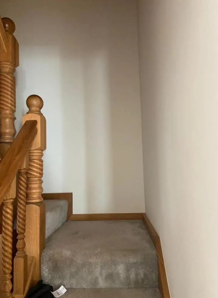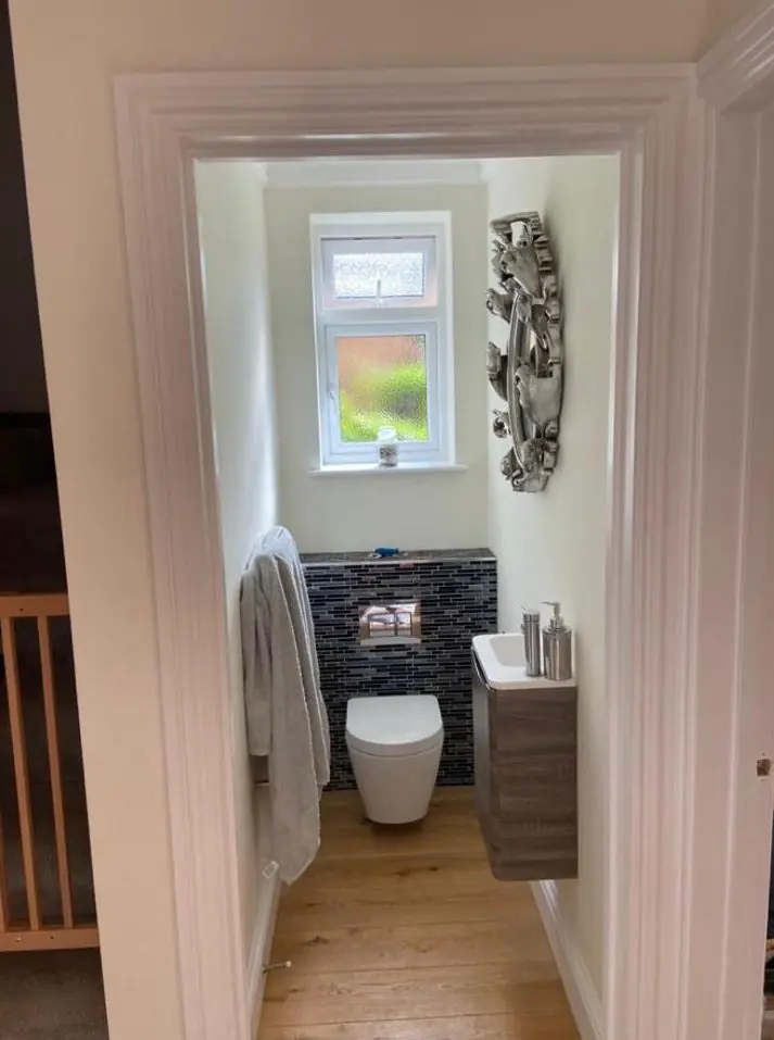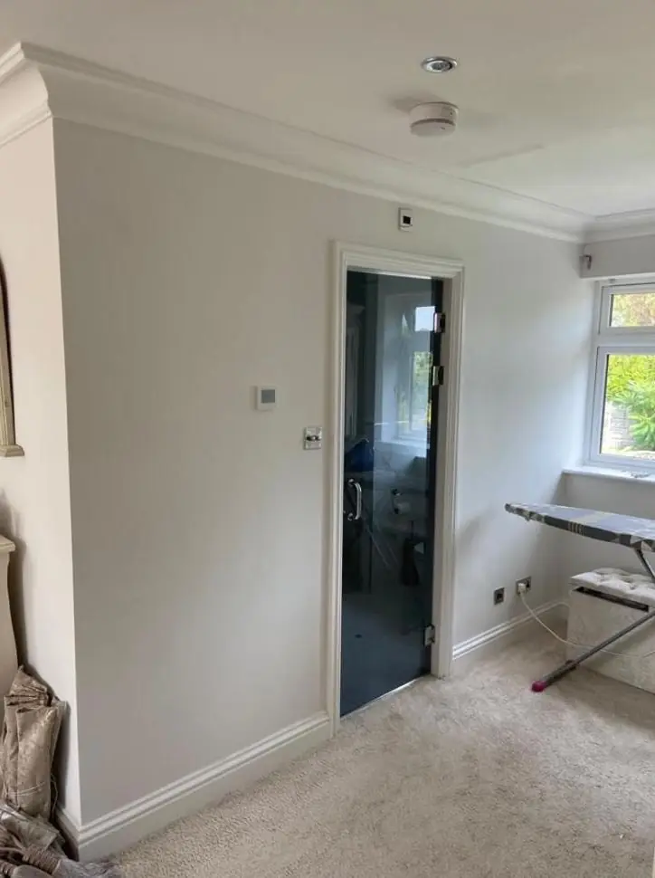
Dean gives practical colour and finish advice as part of decorating jobs in Phippsville, about 1.3 miles north-east of Northampton town centre. Outside, the choices are shaped by red brick, stone dressings and conservation controls on the park-side streets; inside, by tall villa rooms and smaller terraced layouts.
Starting from the brick and stone, not the colour chart
On most Phippsville streets the walls themselves already decide half the palette. Villas of the 1880s such as 5 The Drive are brick with ashlar stone dressings, and the Edwardian houses towards Abington Park are mostly red brick, with decorative brick dressings on Park Avenue. Bare brick and dressed stone should stay unpainted, since a masonry coating there holds damp in the wall and is very hard to strip later. So the colour questions here are usually about the parts that are already painted, chiefly front doors, sashes, bargeboards and porches.
Against warm red brick, heavily saturated reds and oranges tend to fight the wall. Deep greens, dark blue-greys, off-blacks and soft stone colours sit more comfortably, and they let the ashlar trim around the windows stay the lightest thing on the elevation. Dean will look at the brick on your own house in daylight, because the shade varies from one terrace to the next.
Where white joinery is part of the character
The edge of Phippsville that falls inside the Abington Park Conservation Area, including 1 to 17 Park Avenue, 243 to 257 Abington Avenue and 451 to 481A Wellingborough Road, has white-painted timber sash and casement windows noted as a feature of the area. West Northamptonshire Council also lists a heritage Article 4 direction for Abington Park. In practice that means:
- Keep the windows white and repaint the timber rather than swap colours on a whim.
- Choose your individual touch on the front door, where a stronger colour reads as personal without breaking the street’s rhythm.
- Ask West Northamptonshire Council first if you are thinking of altering how the front elevation looks.
Not every white is equal, either. A brilliant white can look harsh against old brick, while a softer white with a trace of warmth often looks more at home. We will show you the difference on a sample board held against the frame.
Gables, pebbledash and the black-and-white question
Many of the Edwardian semis have half-timbered gables over pebbledash or smooth-rendered upper storeys. The traditional answer is black timbers with a pale infill, and that contrast is what makes the gable read from the pavement. Swapping to grey-on-grey can make it look flat from street level. For the render, breathable masonry paint in a light stone or off-white keeps the upper floor quiet so the brick below and the gable above do the work.
Over on the north side of Wellingborough Road east of Beech Avenue, the 1920s social housing is not inside the conservation area boundary, which gives those households a wider choice. A colour that still sits comfortably beside the park-facing Edwardian fronts across the road tends to look settled for longer.
Finishes for tall rooms and busy flats inside
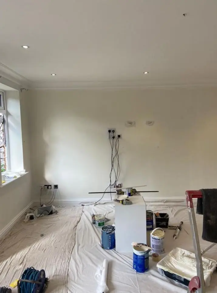
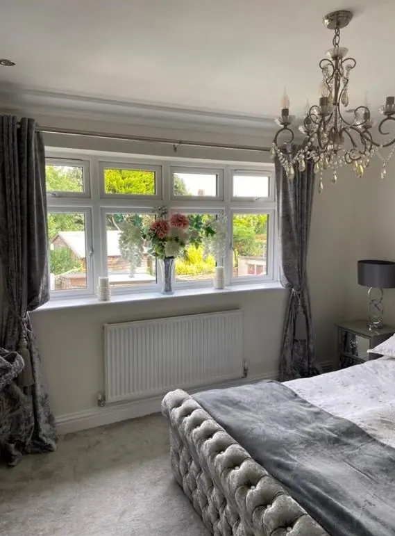
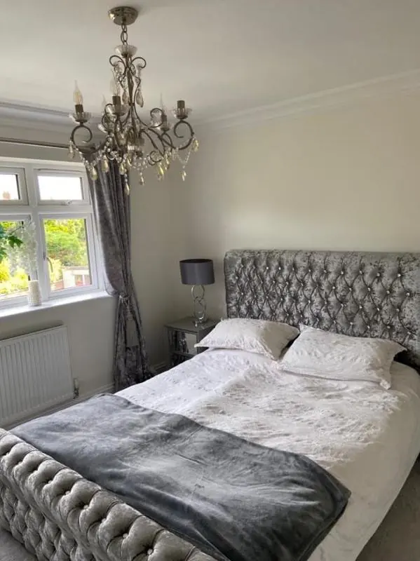
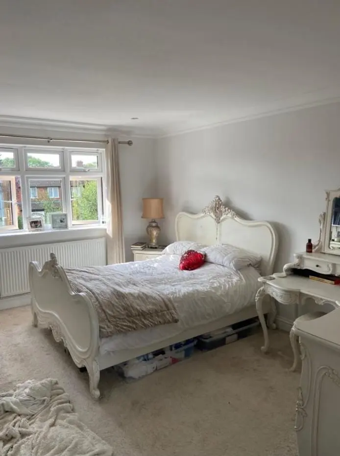
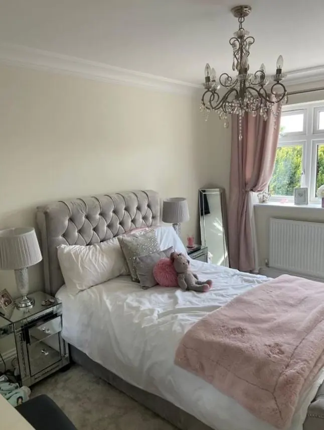
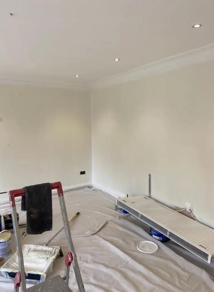
Indoors the question is often sheen as much as colour. In a tall villa room, a flat matt on the walls hides the undulations of old plaster, while an eggshell on the woodwork gives just enough contrast. In shared hallways and let flats, a durable washable matt earns its keep. Deep colours can look rich in a high-ceilinged room but close in a small terraced back bedroom, so we judge each room on its own size and light.
This advice comes alongside a decorating booking. See the full approach on our main colour and finish advice page, and for the district as a whole, visit the Phippsville area page.
Last updated by Dean, DH Painter & Decorator.