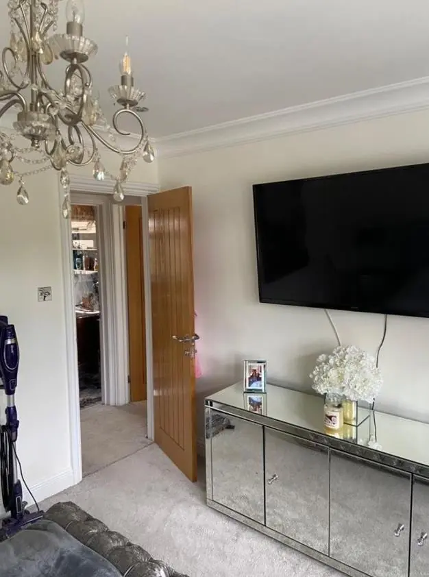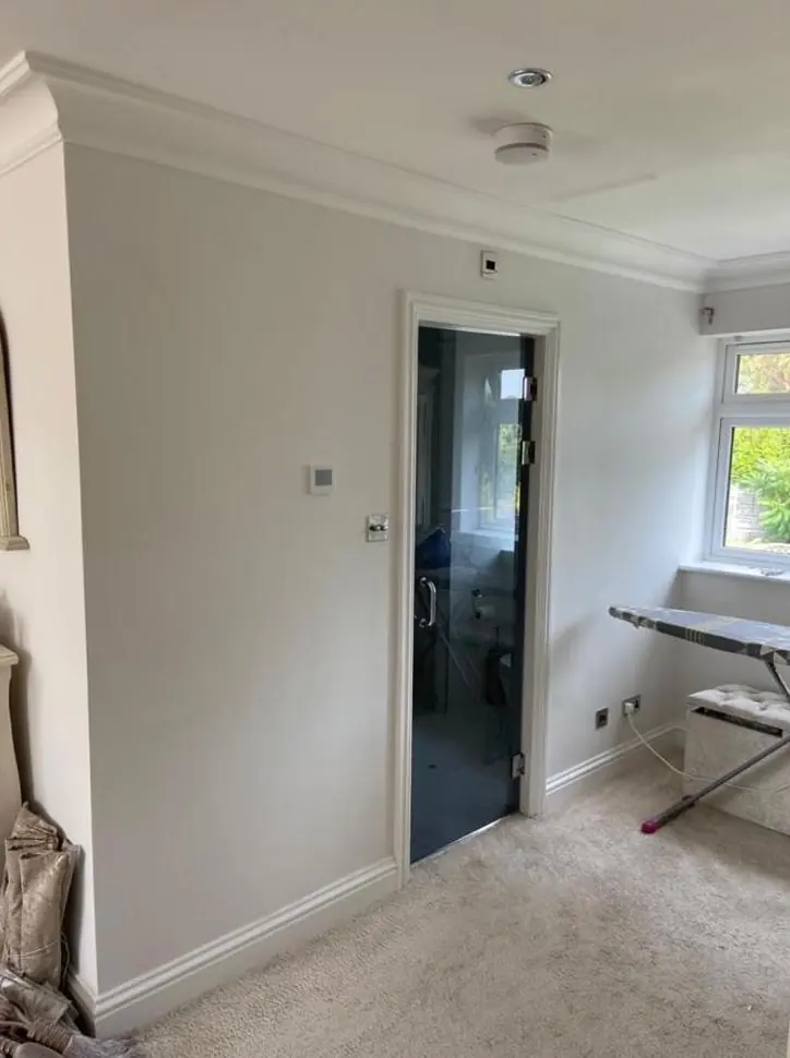
Dean gives colour and finish advice as part of decorating jobs in Gayton, which we reach by van from our Northampton base. Outside the old houses, that means joinery colours that suit limestone with ironstone dressings and the conservation area. Inside, it means shades that work under beams and in small-windowed rooms, or a scheme that runs through a whole new infill home.
What the stone decides for you
Gayton’s historic houses are coursed limestone, often with darker ironstone used for the quoins, dressings and window surrounds. The Grade I manor house is squared limestone with some ironstone, and the same pairing runs through the Grade II farmhouses and village houses of the old core. The stone stays bare, so the colour decisions are about joinery: sashes, front doors, door surrounds, dormers and bargeboards.
The palette is set by a pale, warm limestone next to a rust-brown ironstone, under plain-tile roofs. Brilliant white sashes can look stark against that. Off-whites and soft stone colours usually settle in better. Door colours can go deeper, into muted greens, blue-greys, dark reds or near-blacks. What jars is a bright, saturated modern shade. Dean brings large painted samples and holds them against your stone in daylight, because a 2cm chip on a card tells you very little about how a colour will look on a 20-pane sash.
The conservation area and listed houses
The conservation area boundary wraps around St Mary’s church, the manor, the surviving gates of Gayton House and The Weir. The county’s Historic Environment Record dates it to October 2000, with an amendment in March 2016, and the neighbourhood plan wants proposals there to preserve or enhance the area’s character. We found no Article 4 direction and no published appraisal, so there is no official colour list, but heritage colours and muted tones remain the sensible advice inside the boundary.
Listed buildings are stricter. On a listed house, a new colour or a different type of finish, whether on the front door or in a panelled room, can require listed building consent. Before choosing anything new for one of the Grade II houses or the manor, run it past the council’s conservation officers. Repainting in the existing colour is always the low-risk option.
Matching the colour to the room
Inside, the older houses have their own constraints and the new ones are more open. A rough guide:
| Setting in Gayton | What tends to work | What to be careful with |
|---|---|---|
| Low rooms with dark beams | Warm off-whites or soft lime-based tones that lift the ceiling between beams | Cold greys, which make old plaster look dull |
| Rooms lit by small stone-mullion or multi-pane windows | Mid-tones with warm undertones, flat or matt finishes | Very pale cool colours, which turn grey in low light |
| Attic rooms under gabled dormers | One colour on walls and slopes to blur the angles | Contrasting slopes that draw attention to uneven lines |
| Open-plan rooms in new infill homes | One base neutral throughout, with stronger colour on single walls | A different colour in every zone of one open space |
Light direction matters too. Rooms on the north-west and north-east sides of a house, the sides that look out from Gayton’s ridge, get cooler light than south-facing ones. A neutral that looks warm in one room can look flat in the next.
Finish as well as colour
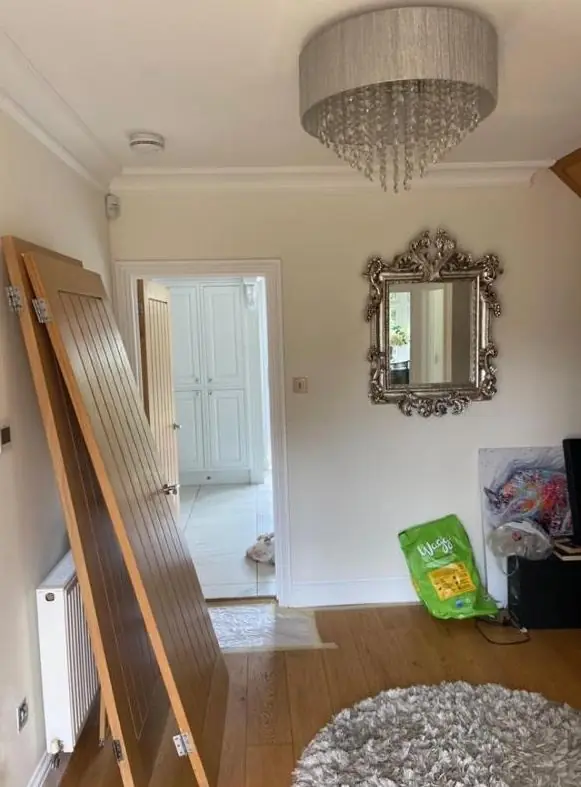
On old stone walls the finish has to breathe, so the advice often narrows the choice to mineral, clay or lime-based paints. That limits the colour range, and it is better to know before falling for a shade only made in vinyl emulsion. On new plaster in the recent infill houses and the converted barn, any finish will work once the mist coat is on. The question then is durability: washable matt for family rooms, eggshell for woodwork.
How Dean approaches colour in general, including undertones and light, is covered on our colour and finish advice page. Most people take it alongside interior painting. See the Gayton area page for the rest of what we do in the village.
Last updated by Dean, DH Painter & Decorator.