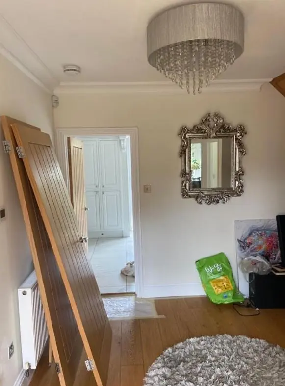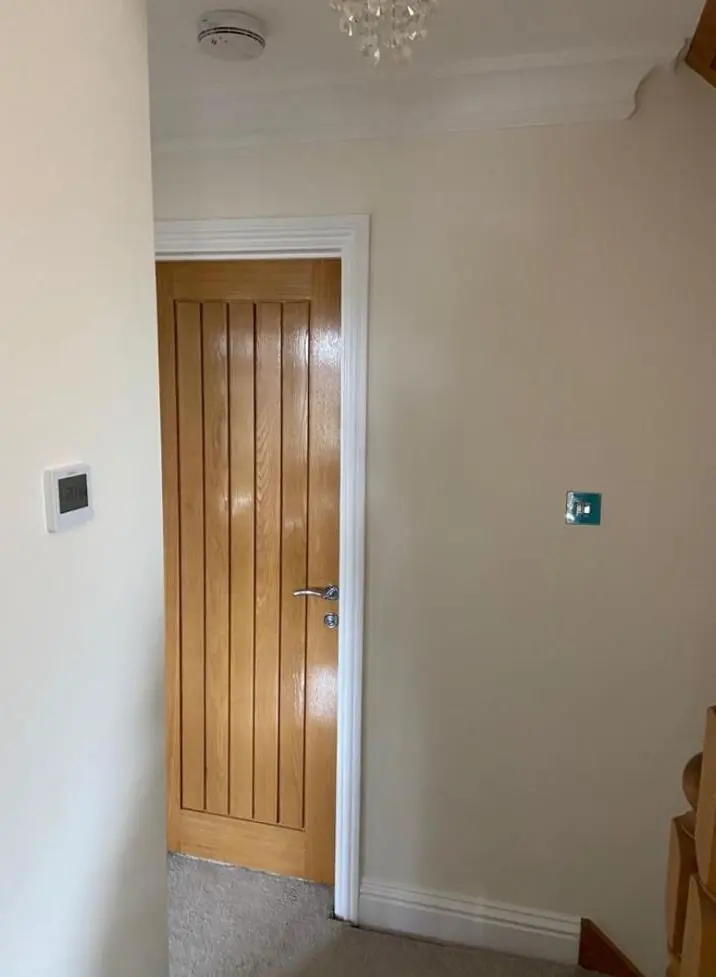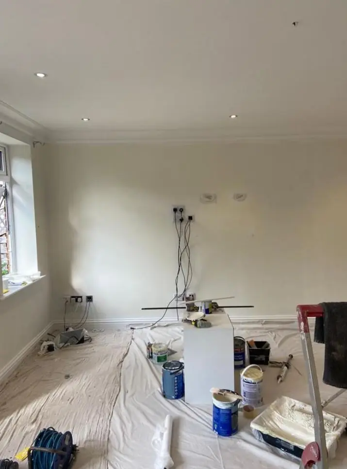
Dean gives colour and finish advice as part of decorating jobs in Long Buckby, about 9 miles north-west of Northampton in NN6. Outside, the 2021 conservation area appraisal sets a clear palette for historic frontages. Inside, the hilltop light and small cottage windows shape which shades work.
The palette the village already has
The Long Buckby Conservation Area was designated in March 2021, and its appraisal describes the colours that hold the historic core together. The walls are honey-coloured coursed ironstone and local red brick, both meant to stay bare. Timber casements and sashes are traditionally painted white, with black frames on some buildings. Ironwork is black: The Manse’s wrought-iron railings on Brington Road, the infants’ school railings and the village’s lampposts, bollards and benches all share it.
So for a frontage on High Street, Market Place, King Street, West Street or Nuns Lane, the useful question is rarely which bold colour to try. It is which white, which black and which door colour suit that stone or brick.
Whites and blacks are not all the same
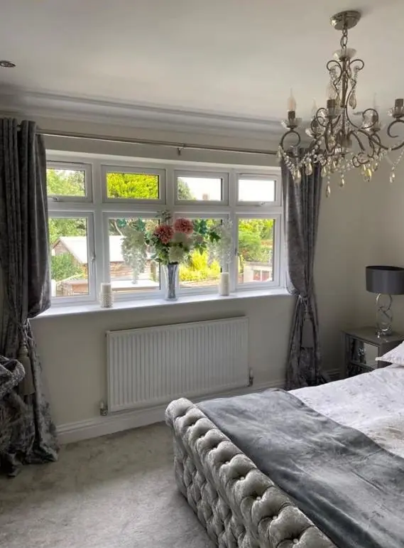
A brilliant white gloss can look harsh and slightly blue against warm ironstone. A softer white with a hint of warmth usually suits the stone better while still reading as white from the street. On red brick, a cleaner white can look crisper. Dean brings samples to hold up against your own walls in daylight, because a chart in a shop gives very little idea of how a white will look next to honey-coloured stone.
The same applies to black. A pure black on railings and gates matches the established street furniture, while an off-black can look slightly washed out next to it. Gloss or a traditional satin finish both suit metalwork; matt black tends to chalk on exposed ironwork.
What needs permission and what doesn’t
| Building | Colour guidance |
|---|---|
| Listed buildings (37 in the parish) | A change of exterior colour or finish usually needs listed building consent, so we check before quoting. |
| Unlisted pre-1919 houses in the conservation area | The appraisal steers windows to white or a sensitive colour based on the originals, and walls to remain unpainted or limewashed. |
| Shopfronts on High Street, Market Place and King Street | Traditional, sympathetic colours on timber fascias and pilasters are encouraged. |
| Estate houses outside the conservation area | No historic colour guidance, so your choice. |
A dark grey or a strong colour on cottage windows in the historic core goes against the appraisal. Front doors give more room, and a deep green, red, blue or brown on a four-panel door often looks right on both stone and brick.
Inside: hilltop light and small windows
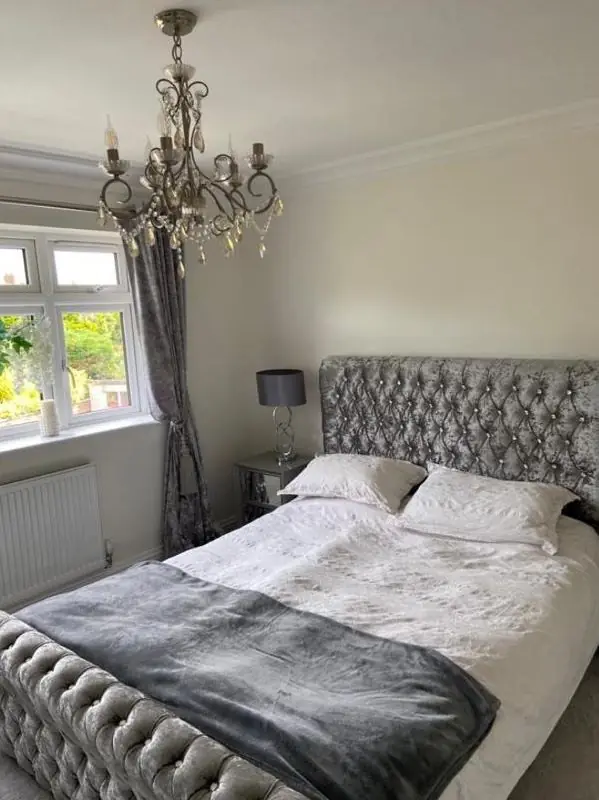
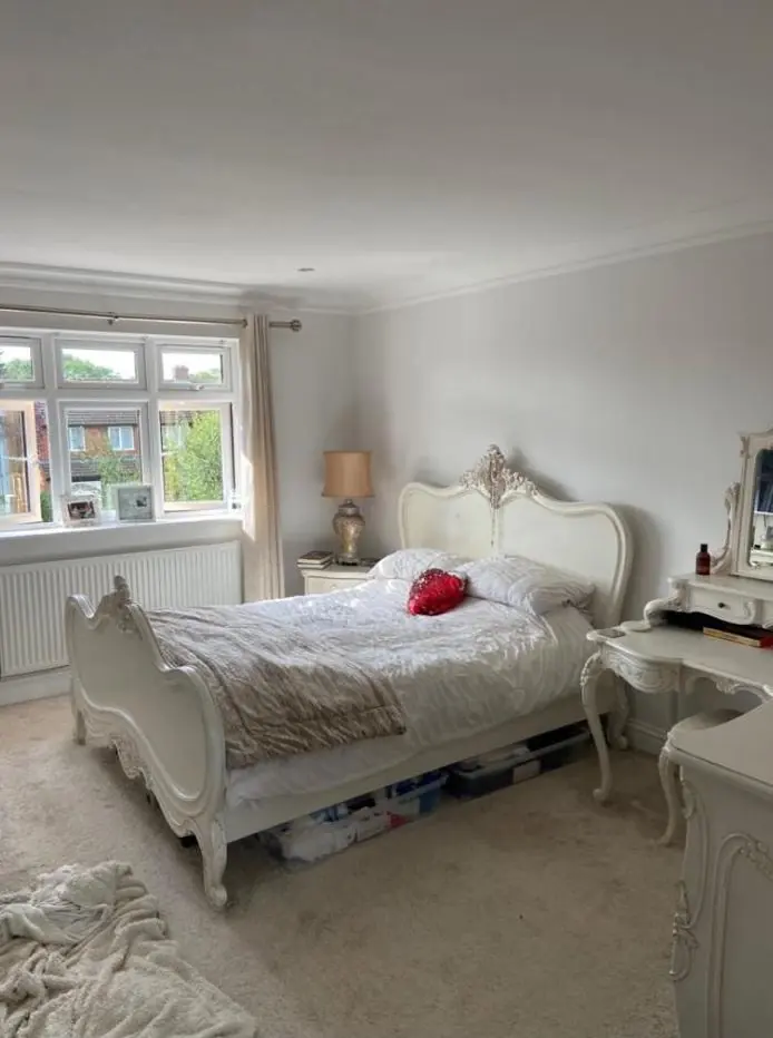
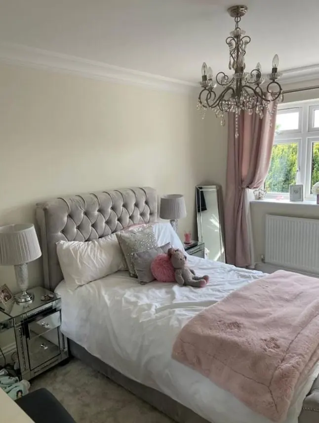
Long Buckby sits on a ridge with open views to the north and west, so rooms on those sides can get a lot of cool light, while the older cottages, with timber casements set in thick solid walls, can let in much less. In those darker rooms, cold greys tend to look dingy. Warm off-whites, soft yellows and earthy colours often look better, and a matt or flat finish hides the uneven lime plaster better than a sheen, which shows every bump.
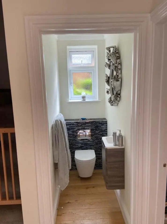
In the 1960s-onwards houses of Salem or off East Street, with larger windows and flat walls, there is more freedom. A wipeable eggshell or durable matt in kitchens and halls is often the practical choice there.
For more on how light, undertone and sheen interact, see our main colour and finish advice page. This advice comes with the decorating work we do; it is not a separate design service. Our other services in the village are on the Long Buckby page.
Last updated by Dean, DH Painter & Decorator.