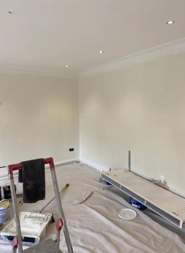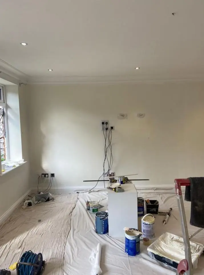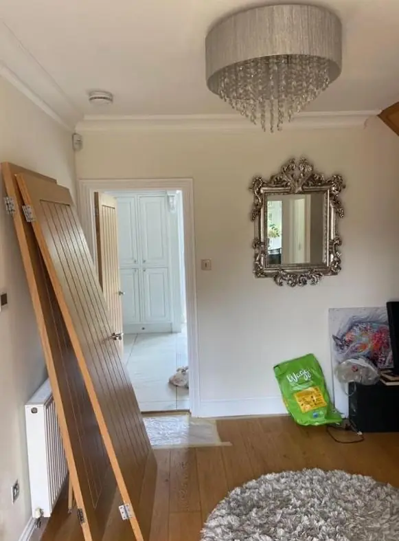
Dean gives colour and finish advice as part of decorating jobs in Bugbrooke, around 5.1 miles west of Northampton. Outside the starting point is the stone or brick each house is built from and, on listed buildings, the historic finish already there; inside it is the light that small cottage windows actually let in.
Three building materials, three different backdrops
Bugbrooke’s old core is built mostly of coursed squared ironstone, a warm orange-brown stone. Some houses mix in limestone: The Homestead is limestone rubble with ironstone dressings, and the Manor House and 2 High Street are coursed limestone with ironstone and blue brick bands. Then there’s the yellow brick of the early 19th century, used for New Creation Hall in 1815 and the former National School cottages on Church Lane in 1844. The listings describe the stone fronts as bare, and they should stay that way, so painted colour is limited to doors, casements, sashes, lintels and porches.
Each material pulls a colour in a different direction. Against ironstone, cold brilliant white on a casement can look stark, and warm off-whites, stone colours, muted greens and deep reds tend to sit better. Pale limestone is cooler and lighter, so softer greys and blue-greys are less likely to clash with it. Yellow brick suits traditional whites and creams on sashes, with darker colours for front doors. These are starting points, not rules, and the stone on one Bugbrooke front can be noticeably more orange or more grey than its neighbour, so samples go up against your own walling before anything is ordered.
Listed houses: begin with what is already there
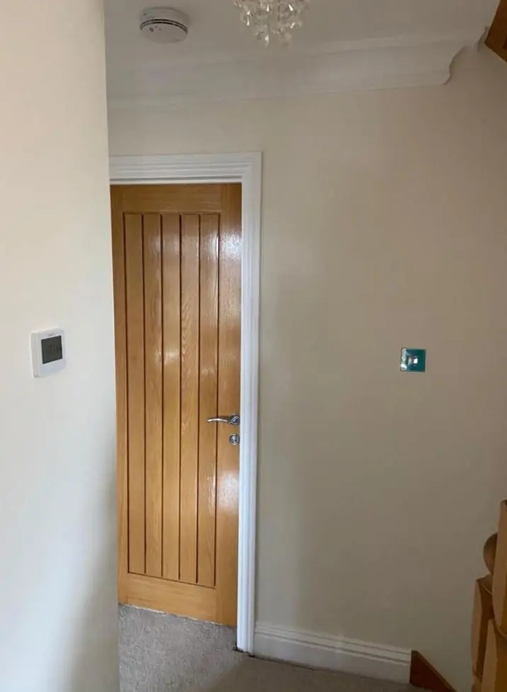
The Bugbrooke Conservation Area, designated in 1991, has more than 30 listed buildings. On those, a change of exterior colour or finish can need listed building consent from West Northamptonshire Council, so the safe approach is to start with the colour and type of finish the building has now. Repainting the same colour is straightforward. If you’d like something different, it’s worth speaking to the council before we order paint. Inside the conservation area, unlisted houses should still have joinery colours that suit the stone around them.
Finish matters as much as colour. A high-gloss modern finish on leaded casements under old timber lintels can look out of place, whereas a lower sheen often looks more natural on old joinery.
Indoors, under low beams and small windows
The 17th and 18th century cottages have thick stone walls, low ceilings and small casement windows, and many have attic rooms under gable dormers. Little daylight gets in, so colours look darker and greyer than on the card. A pale shade with a cold grey undertone can look dull in a room like that, and slightly warmer whites and soft earthy colours usually hold up better. Under a chamfered spine beam, a ceiling a shade lighter than the walls helps the beam read as the feature instead of a dark band across the room. Our colour and finish advice page explains how room direction affects colour.
The later houses on streets such as Levitts Road and Meadway have bigger windows and modern proportions, so a wider range of colours works there.
Roadside frontages and road dust
Lorries travelling to and from Heygate’s flour mill use the main road, and road dust settles on the frontages that face it. Very pale doors and window frames show that grime quickly. On a roadside house, a mid-tone or a deeper heritage colour on the front door, and an off-white rather than a pure white on frames, will look clean for longer between washes. Whatever colour you choose, the surfaces need washing down properly before repainting, or the new paint won’t stick well.
See our Bugbrooke area page for the other work we do in the village.
Last updated by Dean, DH Painter & Decorator.