Dean gives practical colour and finish advice to Kislingbury homeowners as part of a decorating job, from joinery colours against ironstone to paint types for lime-plastered rooms. Quotes in Kislingbury, 3.6 miles west of town, are free.
Start with the stone
Most of the Kislingbury Conservation Area is built of coursed squared ironstone, a warm brown stone that varies from house to house and darkens when wet. The walls themselves are largely left bare, so outside, colour decisions come down to joinery: casements under timber lintels on the cottages, 12- and 16-pane sashes on the larger houses, painted doorcases, front doors and garden gates. Against ironstone, a brilliant white can look harsh and a pure cool grey can look cold. Off-whites with a little warmth, stone and putty shades, deep greens and muted blue-greys tend to sit comfortably with it. We usually suggest painting a sample board and holding it against your own wall in daylight before committing to anything.
Listed buildings and the conservation area
There are 27 listed buildings in the conservation area, which was designated in 1991 and amended in 2014. If your house is listed, changing an external colour, or switching from a traditional paint to a modern one, may need listed building consent, which West Northamptonshire Council decides. No Article 4 direction turned up in the sources we checked for the village, but a strong change on a prominent frontage is still worth raising with the council first. Dean can help you work out what to ask; the decision itself rests with the council.
Paint type is part of the advice. On old softwood joinery, flexible microporous or traditional oil-based paints cope with movement better than a hard modern gloss. A painted classical doorcase like the one at Kislingbury Hall shows where a period-appropriate sheen matters as much as the shade.
Light inside low, thick-walled rooms
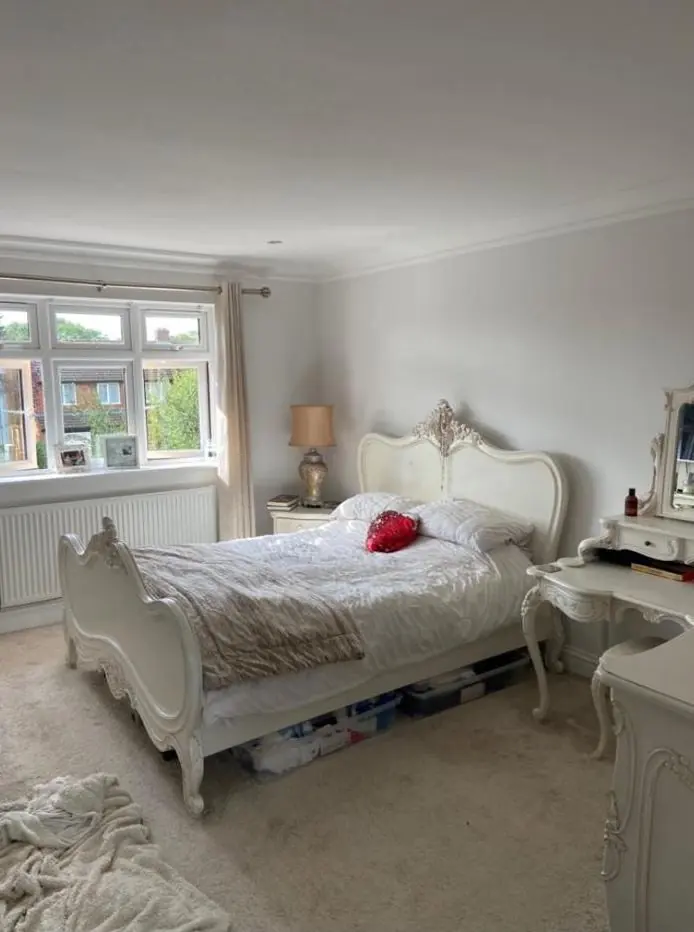
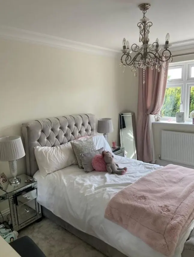
Inside, the older cottages have small casement windows set deep in stone walls, low ceilings and dark beams. Those rooms get much less daylight than a colour card assumes, so a pale grey can turn flat and a cool white can look grubby. Warmer neutrals, soft earth colours or a lime-friendly white usually work better, and a slightly deeper colour can make a small snug feel deliberate rather than gloomy. The Georgian-era houses with tall sashes take in more light, which opens up a wider palette, including stronger colours in panelled rooms.
Finish narrows things too. On lime plaster we recommend breathable clay or mineral paints, which mostly come in flat or matt finishes and a shorter colour range. Knowing that before you fall for a shade that only exists in a vinyl emulsion saves a rethink later.
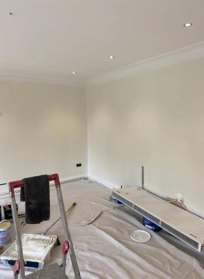
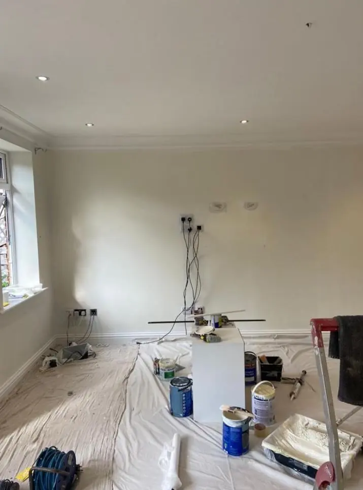
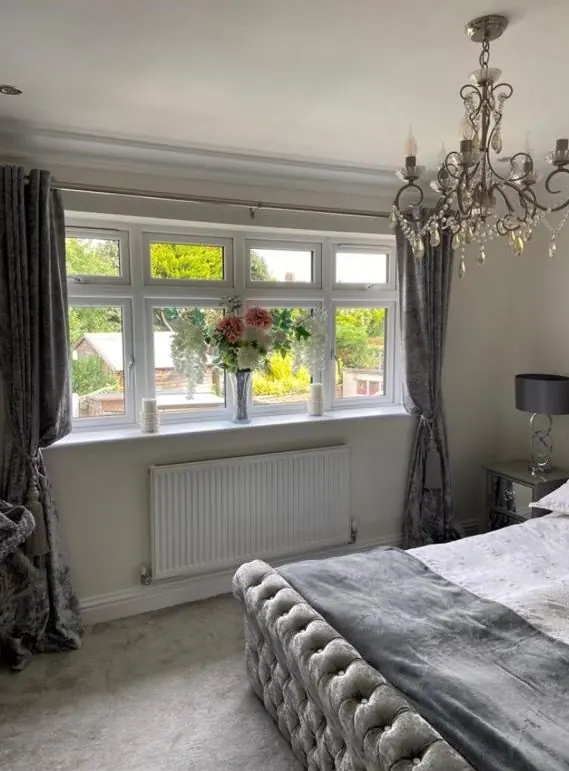
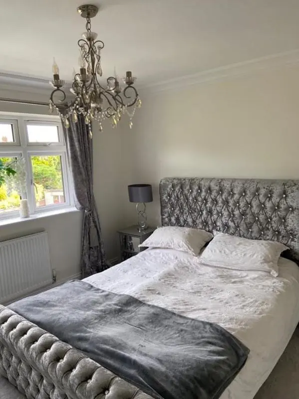
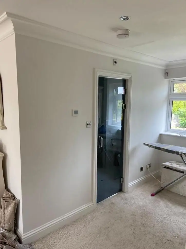
The later houses beyond the conservation area are a different exercise. With modern plaster and larger windows, almost any range is open, and the questions are the usual ones about which way a room faces, how it is used and which sheen will stand up to wear in a busy hall or kitchen. Matching woodwork to wall colours, or choosing a single trim colour for the whole house, keeps a scheme coherent.
What the advice covers here
| Situation | What Dean looks at |
|---|---|
| Joinery on an ironstone frontage | A shortlist of warm-leaning shades, sample boards, and a paint system suited to old softwood |
| Listed building or prominent conservation-area elevation | Whether a colour or paint-type change may need consent, and period-appropriate options |
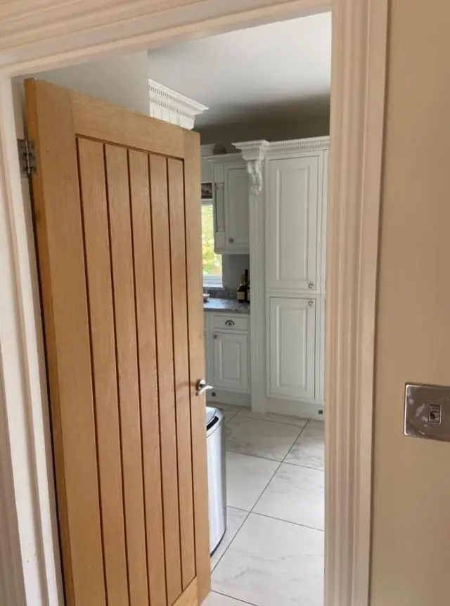
| Beamed cottage interior | Warm neutrals for low light, breathable finishes, how beams and plank doors read against the walls |
| Later house outside the core | Room-by-room colours and sheen choices for kitchens, halls and woodwork |
Advice comes with a decorating job rather than as a separate design service. How Dean weighs undertones and light direction is explained on the main colour and finish advice page, and the other services we offer in the village are on the Kislingbury area page.
Last updated by Dean, DH Painter & Decorator.